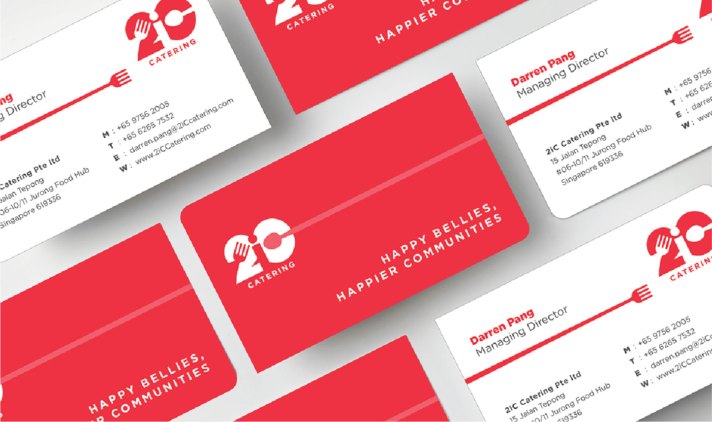
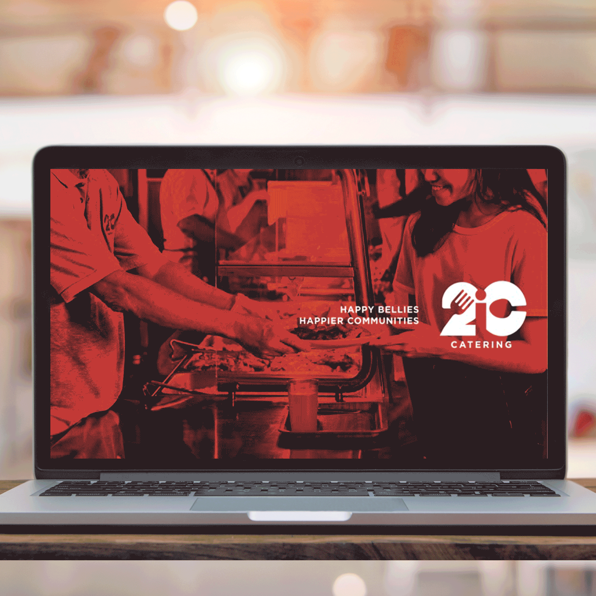
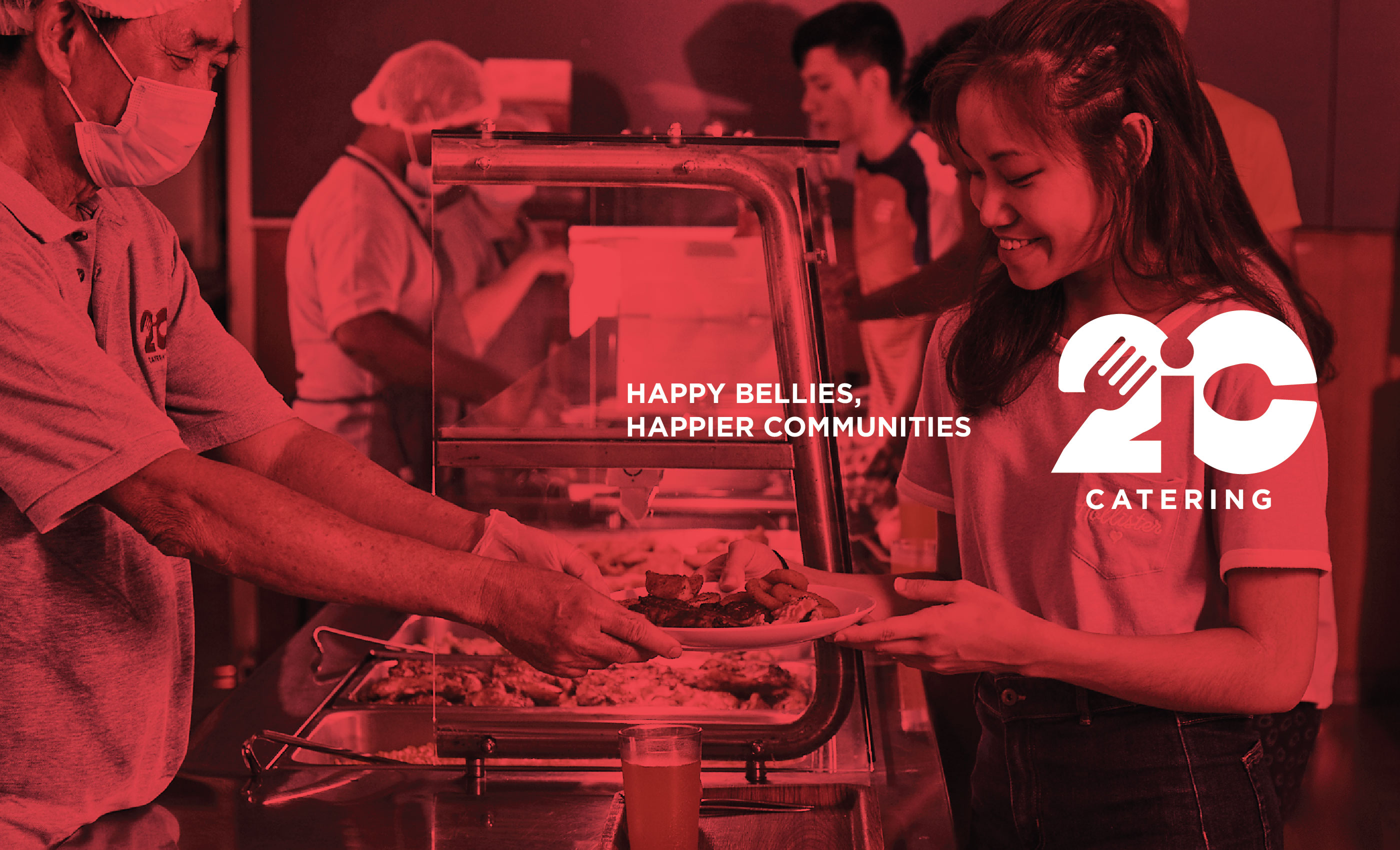
Rebranding 2IC

Overview

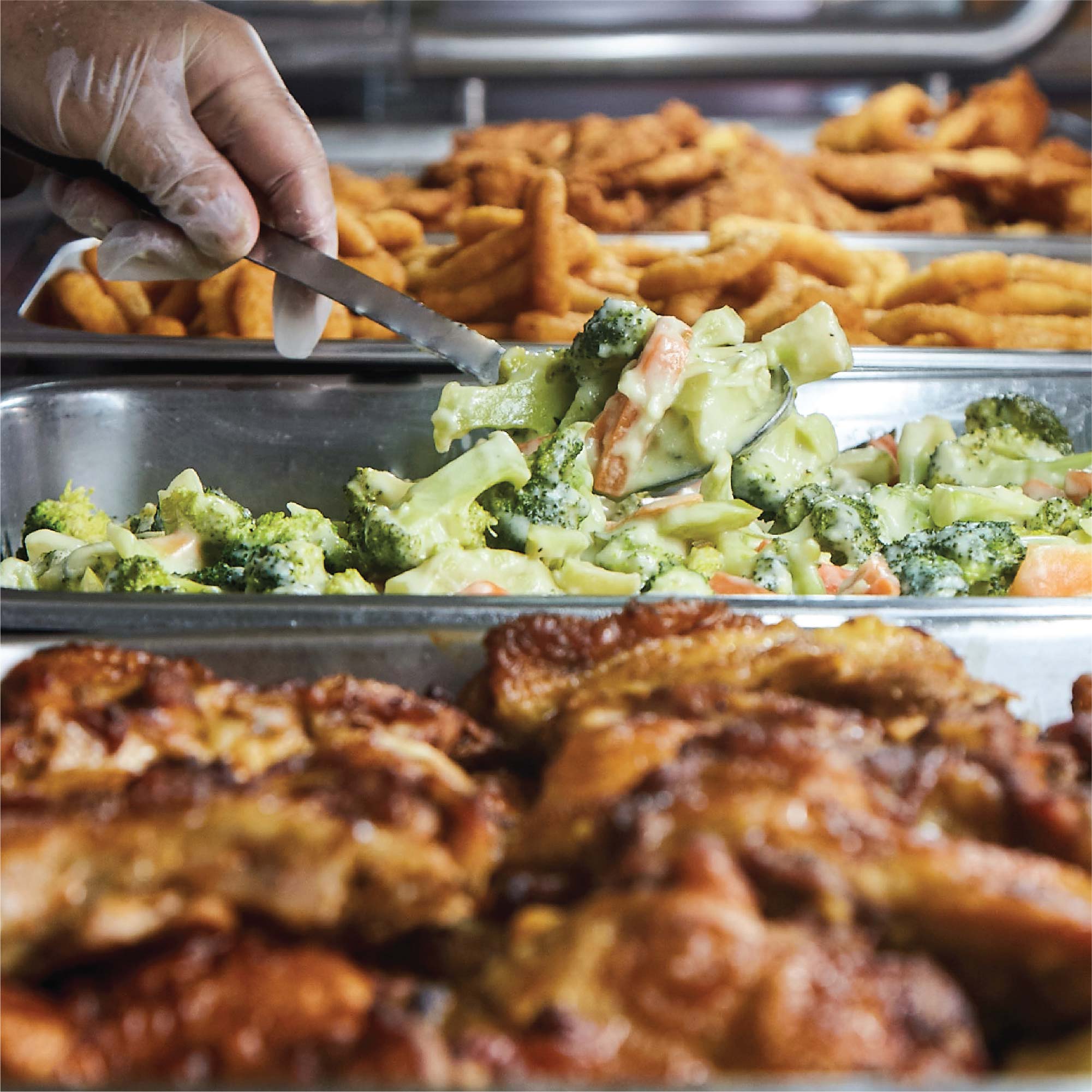
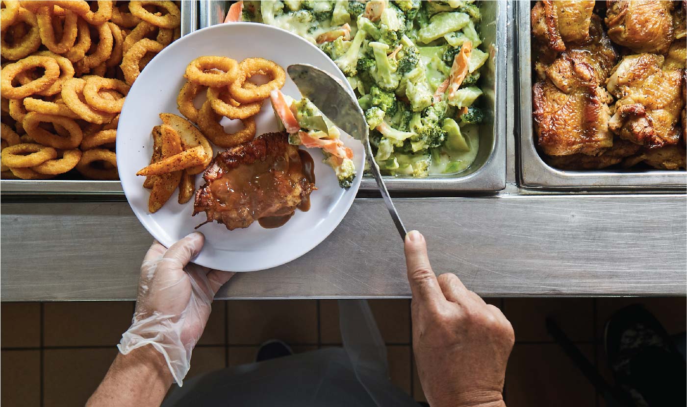
2IC Catering (2IC) was founded in 2013 by two like-minded individuals, who shared the same passion and vision for food catering. The company caters to the hostels of educational institutes and staff canteen of large organisations. 2IC oversees the entire production to serving process of its catering operations.

Challenges

2IC Catering aims to differentiate themselves from other institutional businesses. The brand’s vision is to be the top institutional canteen provider of quality food and services.

Solutions

Adwright conducted a brand audit with the founders of 2IC to determine the direction and identity of the brand. Through the audit session, Adwright identified that 2IC hopes to change the perception of catering from just food-serving to building a bonded and happier community through food and communal eating. In order to create a set of photography assets and brand imagery unique to 2IC, Adwright took charged of photography and art direction. The set of photography captured the essence of the brand through the potraits of the chefs and service staffs at work and patrons enjoying the offerings of 2IC.

Brand Storytelling and Tagline

Adwright crafted a humble yet ambitions-driven brand story for 2IC. The brand story sparks a sense of camaraderie by emphasising on the brand’s ideology about how communities can be empowered, and be at their best through the passionate and dedicated food and service provided by 2IC. The entirety of the story was then embodied in a tagline, “Happy Bellies, Happier Communities”. The aptly phrased tagline aims to deliver 2IC’s positive beliefs and attitudes about food catering in a succinct and easily digestible way.

Brand Logo

Adwright designed a brand logo for 2IC which symbolised the brand’s love for food and community. The overall structure of the logo resembles a heart. By making use of negative space in the shape of a fork and spoon, Adwright turned the heart into a bold “2” and “C” typography design. The logo was then completed with an “I” negative space placed in the middle. Adwright was able to fuse the heart symbol – which represented the love, bond, and “building communities through food” vision of 2IC – with the spoon and fork which depicted the brand’s offerings.

Brand Asset Materials

Adwright prepared a corporate pitch deck for 2IC that enabled them to succinctly present their brand and services to their new customers. The brand pitch deck aimed to tell the story of the brand, spark conversations through clear messaging, and boost 2IC’s brand credibility. Adwright also created professional business cards which were associated with the newly curated brand identity.

Results

Overall, Adwright had crafted and refined 2IC’s brand identity through the branding process. The process resulted in a suite of brand materials, which are synonymous with the philosophy the founders had for 2IC.

Enquire

Enquire

Talk to us today to see how we can help build your brand further and beyond.