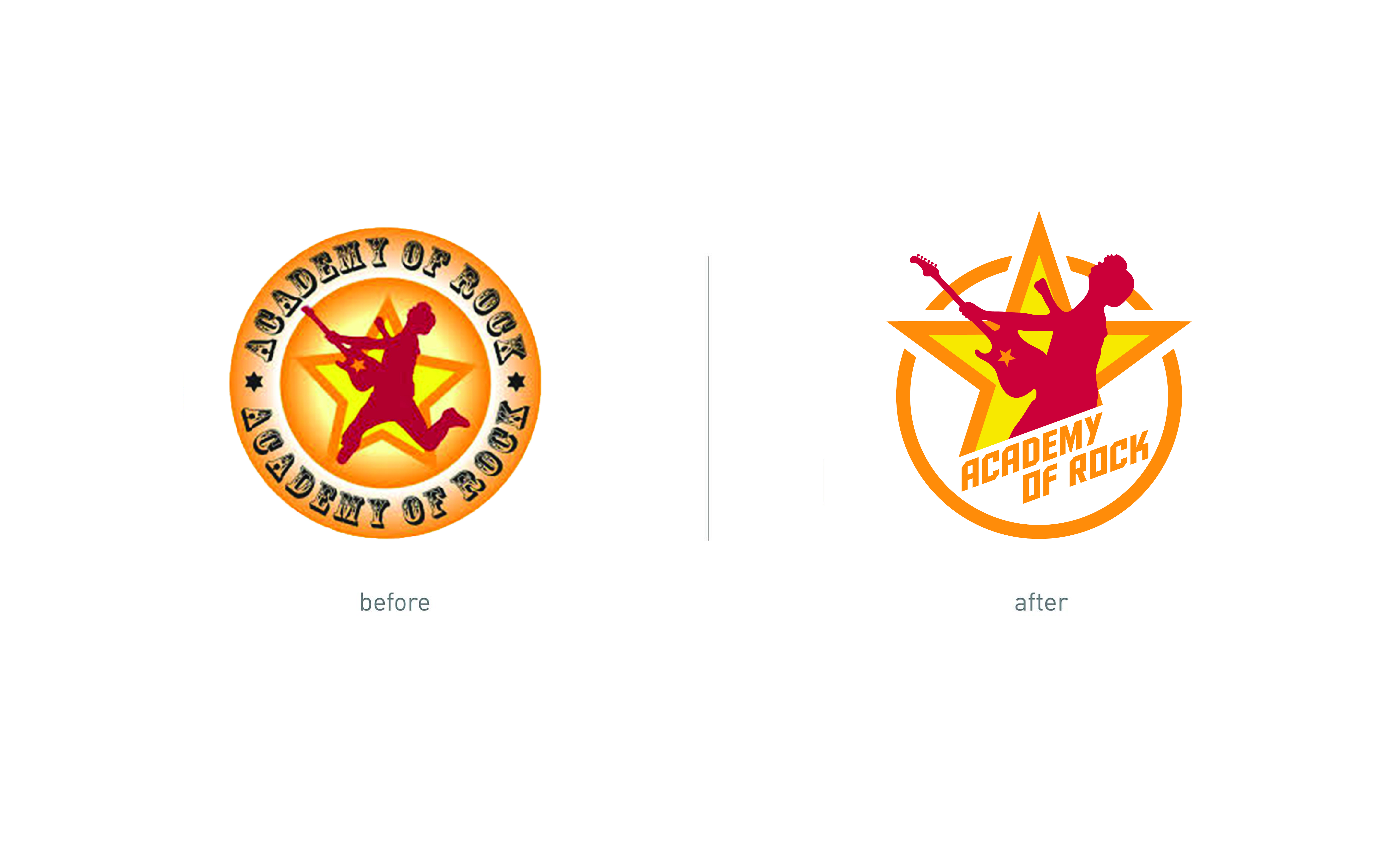
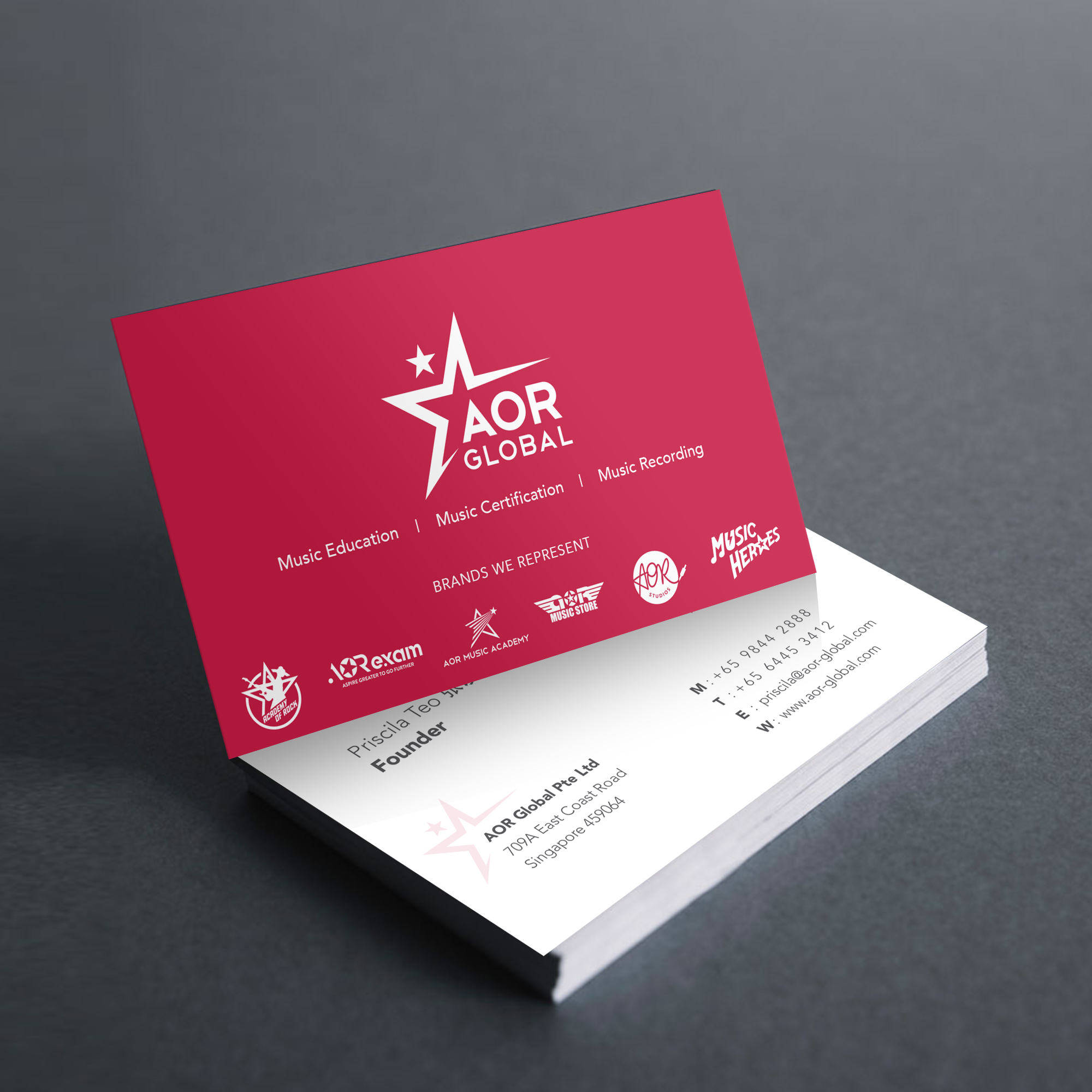
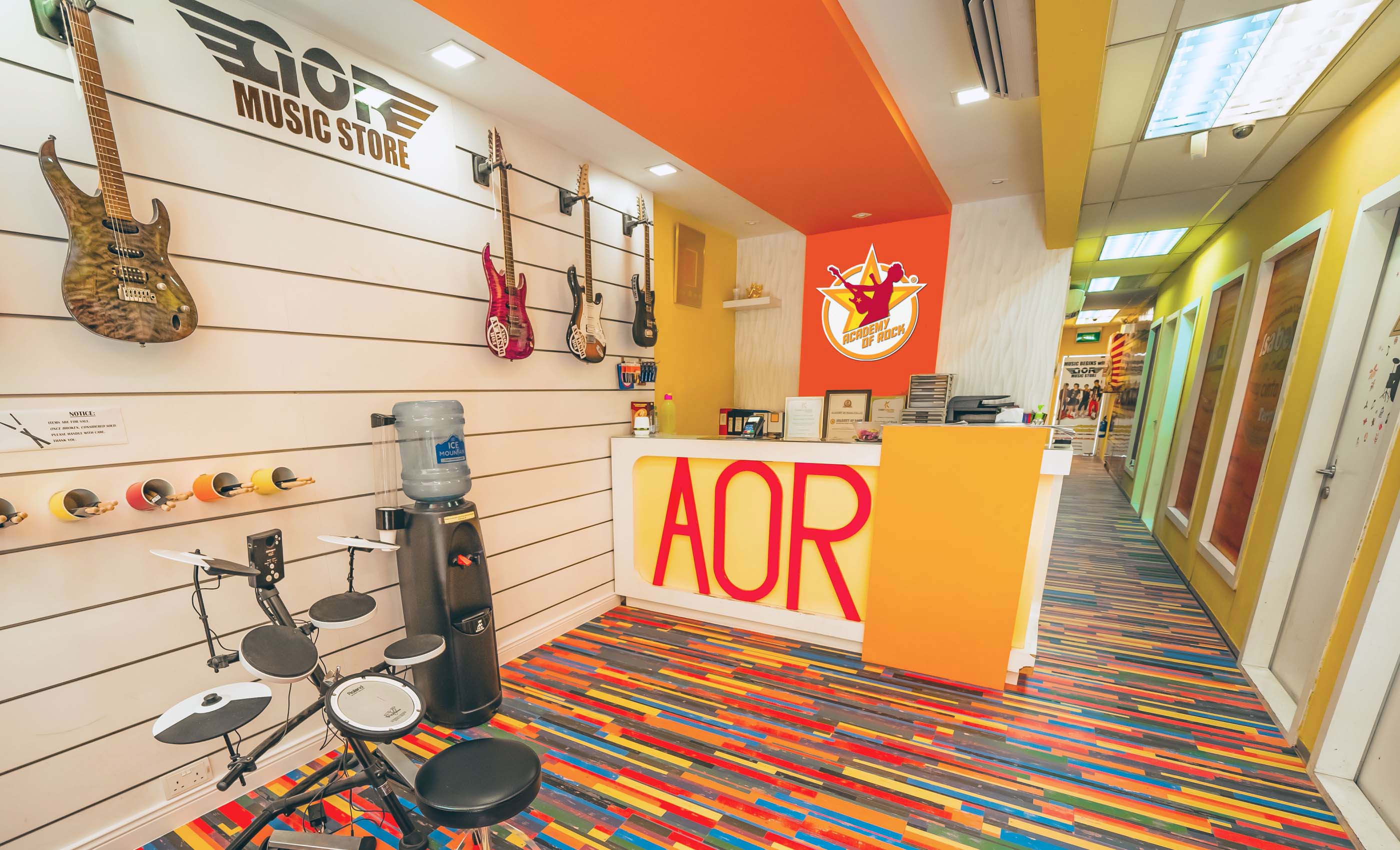
Redefining the Academy of Rock brand

Overview

Academy of Rock (AOR) started as a Pop and Rock music school in 2007. The founder noticed a gap for proper contemporary music education in Singapore, she also wanted to provide a venue for musicians to build their careers in contemporary music. AOR has since become a music institute that offers its proprietary syllabus and exams. The company also provides students with a platform to perform, hone their talents, and create original tracks.

Challenges

AOR aims to enhance its brand image and revamp its logo of more than 10 years to look more upbeat and refined. The brand also aims to strengthen its brand architecture by housing its various music operations – AOR Exam, AOR Studio, and Music Heroes – all under a single Academy of Rock brand.

Solutions

To understand what AOR stands for, Adwright performed a brand audit with the founder and stakeholders. The brand audit resulted in a deeper understanding of AOR’s goal and purpose in reshaping the Pop and Rock music community.

Brand Mission & Vision, and Story

Adwright produced a vision and mission statement in-line with the founder’s vision for the AOR brand. The statements aim to instil a sense of purpose and belief in AOR’s operations and staff. An inspirational brand story was crafted to differentiate AOR from other music institutions and schools. It was written with a passionate tone that weaved the collective aspiration of students and instructors as a unified audience group that AOR had envisioned to inspire.

Brand Logo

AOR wanted a fresher looking logo, yet it had to retain the essence of the original as the brand logo was still recognisable to the public. Adwright revitalised the logo and gave it a clean and bold design, followed with striking typography style which enhanced the brand’s name. The star graphic was recreated and emboldened with attention-grabbing visual. The overall logo was designed with bright colours to exude a sense of unwavering passion for music.

The star logo design was translated and uniquely designed for each of AOR’s business operations in accordance with their vision of integrating all business units in a single brand unit. The renewed AOR logo was applied to a variety of brand assets such as signages, brand posters and their outlets’ façade. The logo was also designed on brand merchandises such as t-shirts, caps, and other accessories.

Brand Poster

Adwright created a set of brand posters as a visual medium to tell the AOR’s brand story. The brand posters featured differently aged models individually – a child, a teen, and an elderly. This highlighted AOR’s openness to audiences of all ages. The new position of AOR’s poster aimed to empower people of all ages to take up music. The headline, “My Age Does Not Define My Stage” represented a strong message of empowerment served to emphasise AOR’s uplifting philosophy regarding music education and passion. Each of the age category posters carried a conceptualised quote that strived to empower and encourage its intended audience to pursue their passion for music.

Enquire

Enquire

Talk to us today to see how we can help build your brand further and beyond.