Defining the TOTARESCUE Brand

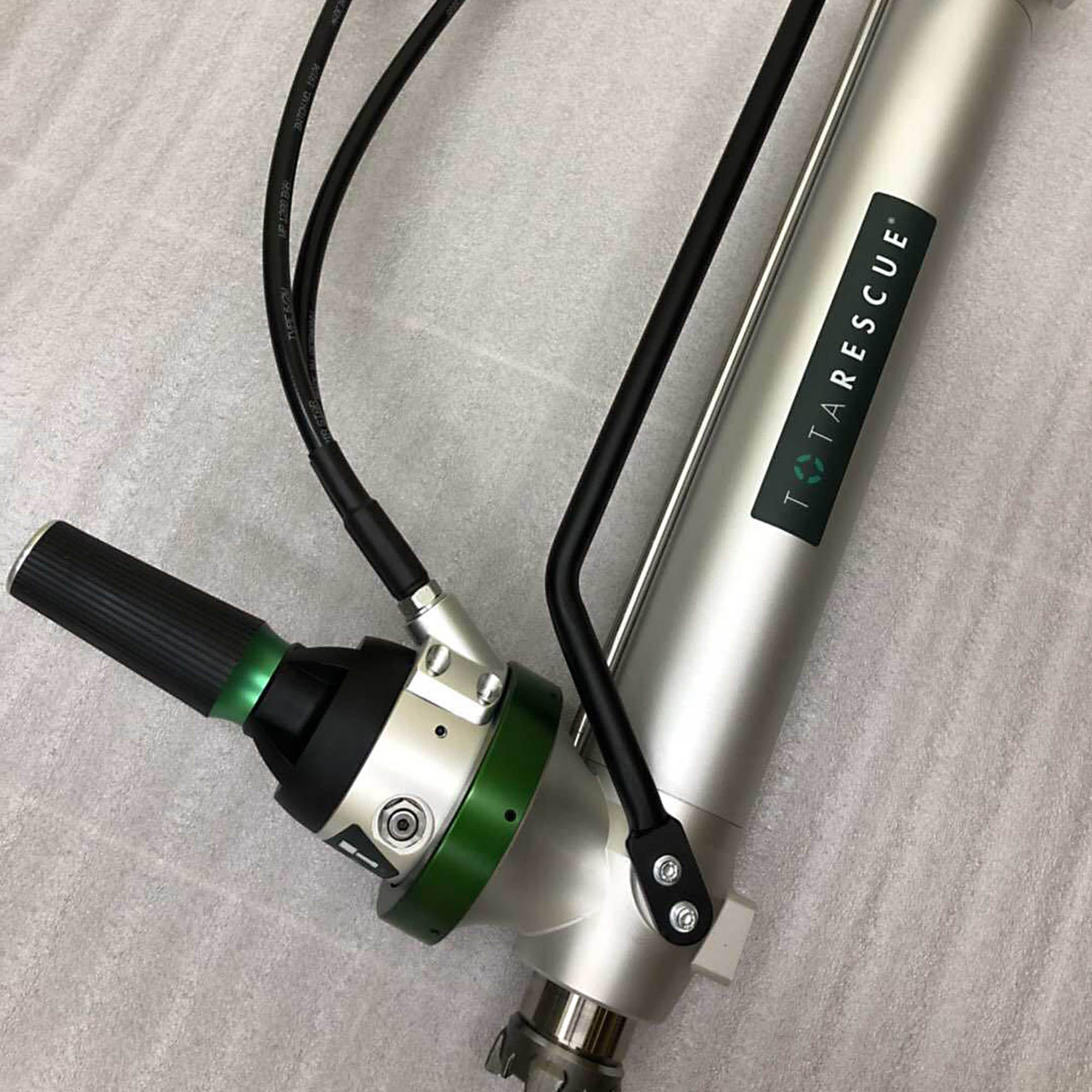
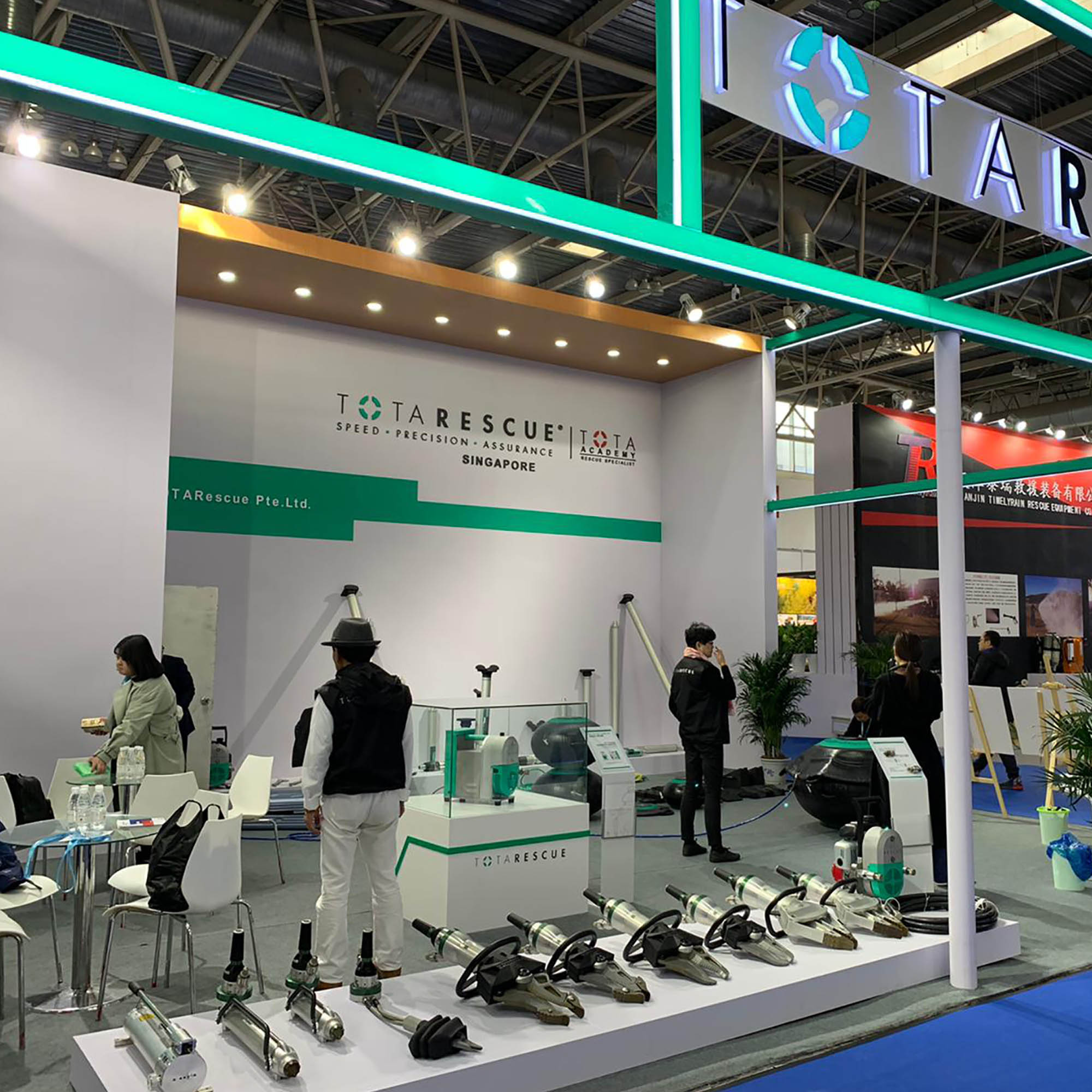
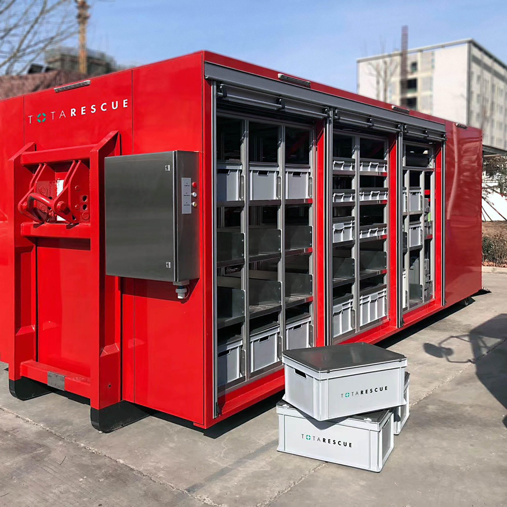
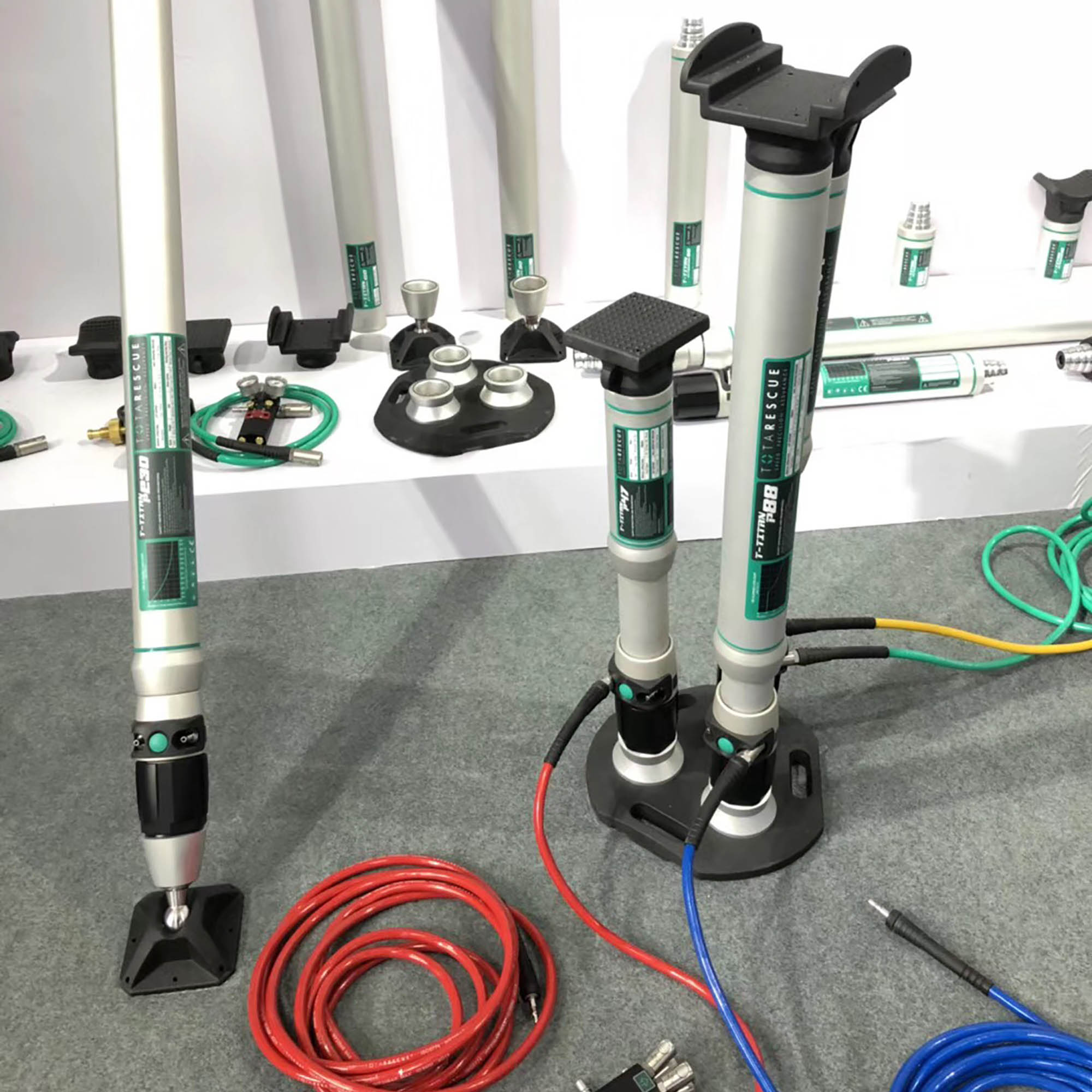
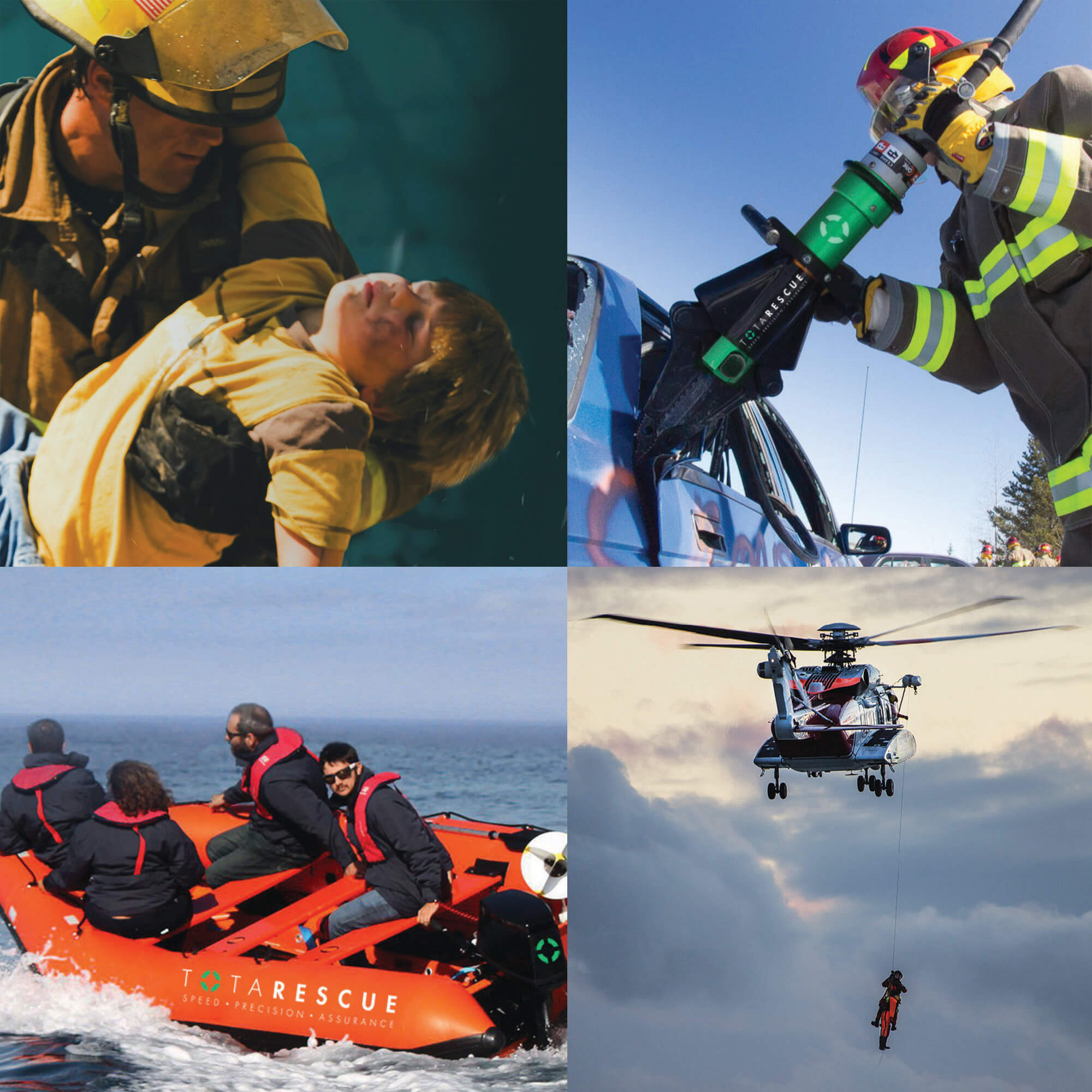
TOTARESCUE is a rescue and recovery equipment supply organisation. The company aims to supply their products to organisations that have their own emergency response department, which is susceptible to facing hazards or emergencies on-site. Some of its customers include – factories, airports, and even civil defence institutions.
Challenges
The rescue and recovery equipment industry is a niche market. Hence, it is difficult for new entrants to compete in. TOTARESCUE has to be differentiated and identifiable so that its brand awareness and recall can be enhanced. The company also envisioned a training programme that will equip organisations with the skill necessary for handling emergencies.
Solutions
Adwright was appointed to craft and differentiate TOTARESCUE brand assets for the brand’s operations.
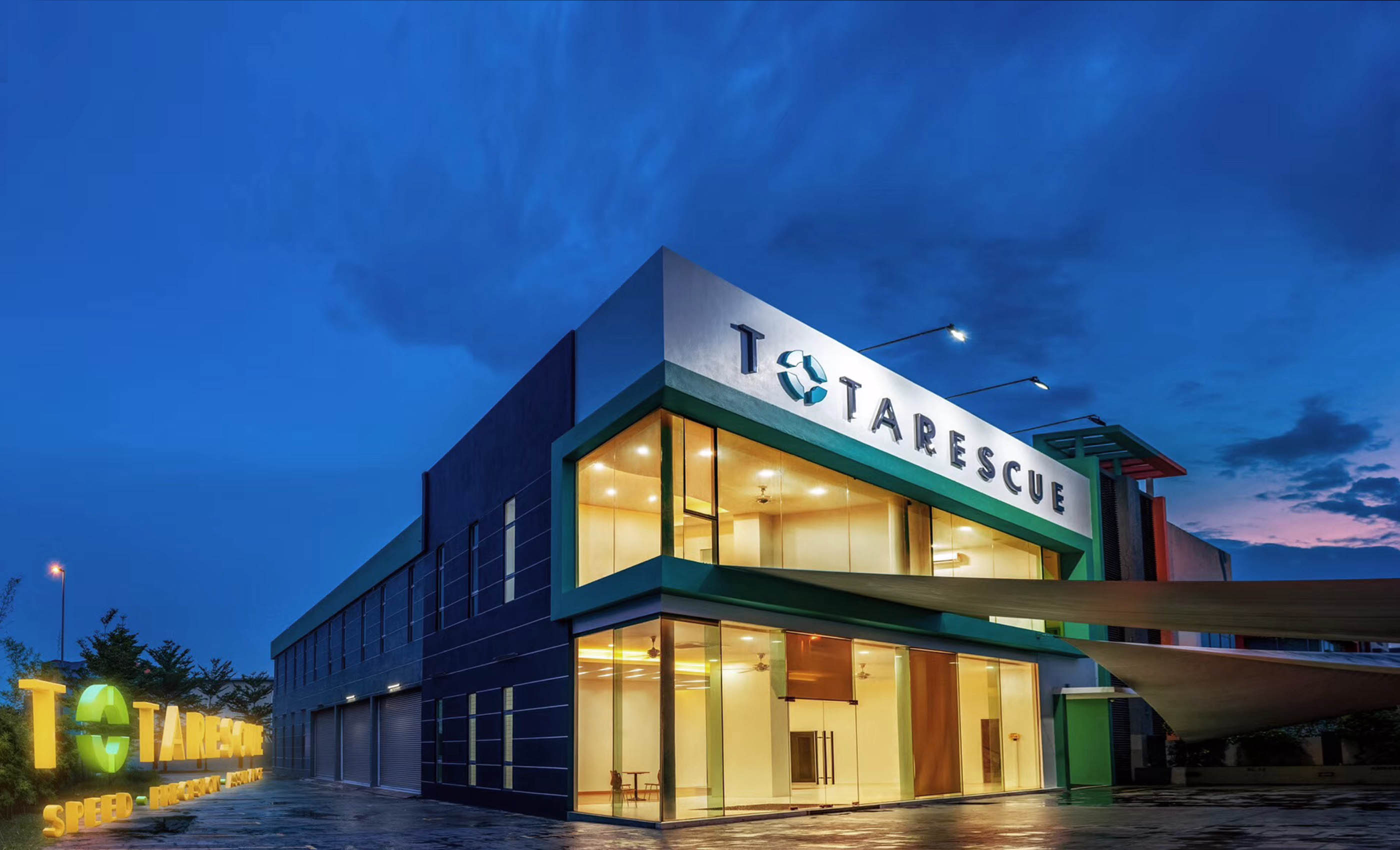
The TOTARESCUE logo was designed with the inspiration of optical sight and lifebuoy. The two elements are illustrated as one to symbolise the importance of precision and immediacy in rescue and recovery operations. The logo was used in the form of an “O” in TOTARESCUE’s brand name.
A tagline was crafted as an embodiment of TOTARESCUE’s belief and values to its target audiences. The tagline used to represent the brand succinctly was – “Speed. Precision. Assurance”. These three keywords are traits that are imperative in every emergency and rescue situation.