Shaping the Flaire Brand
Acorn Marketing & Services is an established brand of mass market ceiling fan that is one of the top players in Singapore. It has researched and developed a suite of fans that are technologically advanced which provides fast and effective airflow to a room
Challenges
Acorn is well known in the mass market segment. As this is the first brand extension, it needs to be differentiated from its original position. Thus, the brand has to embody a distinct and recognisable brand persona that will strengthen its foothold in the market and resonate with its intended audience.

Solutions
Acorn approached Adwright to define and craft its premium product brand which would differentiate their product offering from other competitors in the premium fan industry.
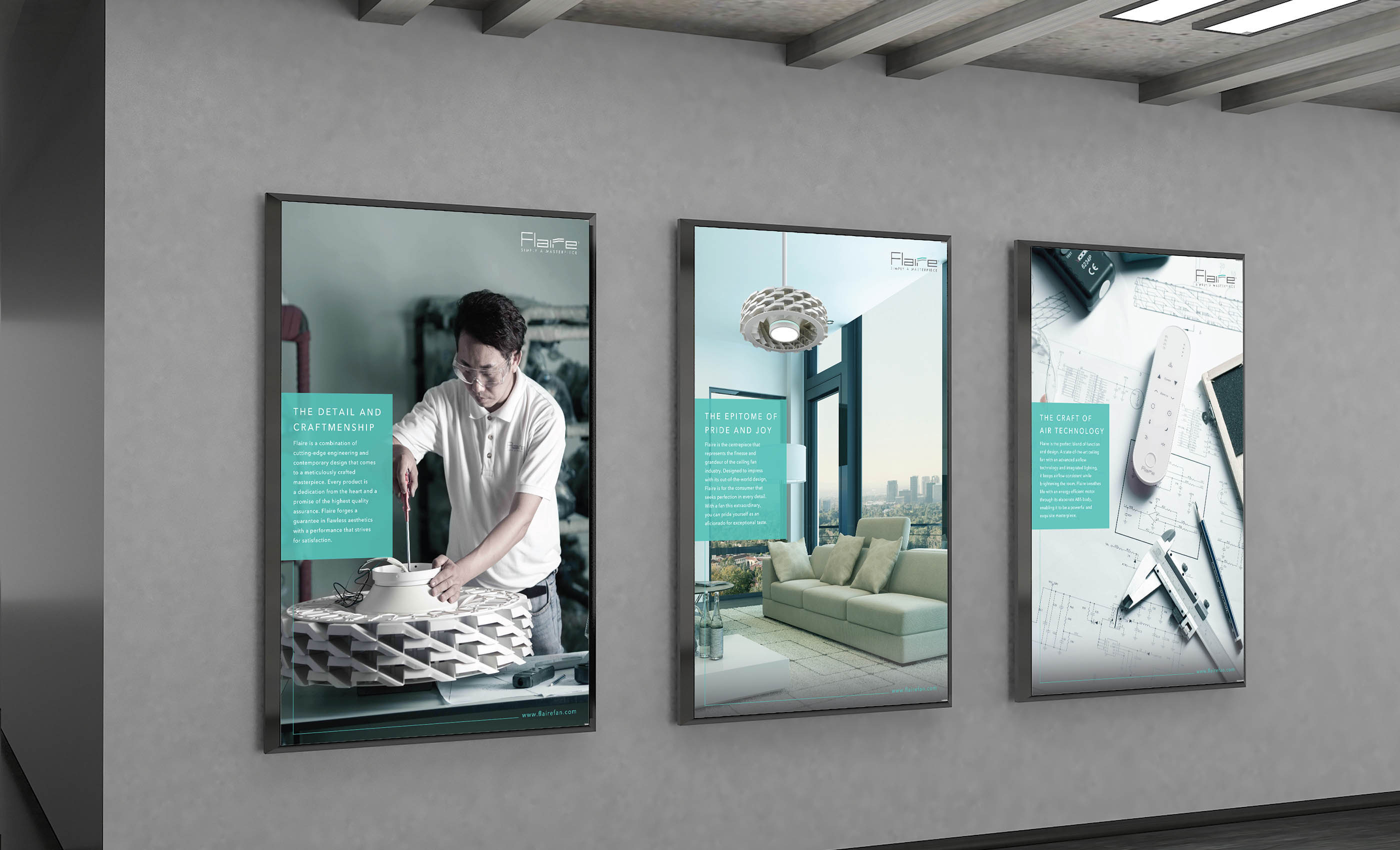
A set of traits and themes inspired by Acorn’s premium fans were used to define Acorn’s new brand. They were, “Elegance”, “Clean”, “Timeless Classic”, “Performance”, and “Assertiveness”. Adwright then translated these broad lexicons into brand value proposition that formed the structure and belief of the brand. The value proposition would serve to inspire, guide, and lead Acorn’s premium brand communications and messages.
Brand Name
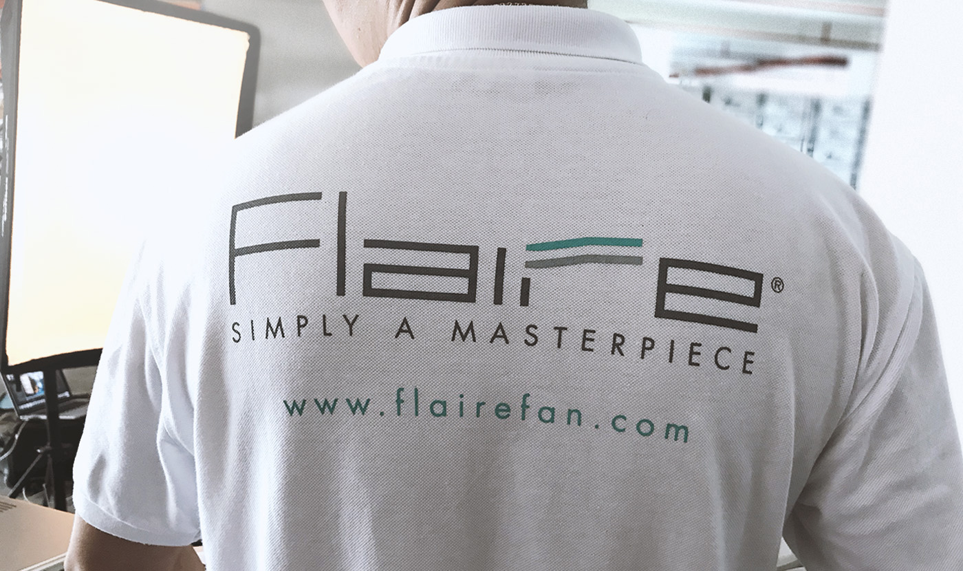
With the brand value proposition, Adwright identified various names that managed to exemplify the purpose of the brand and its values. Acorn finalised on the name ‘Flaire’, which was derived from the combination of ‘Flair’ and ‘Flare’.
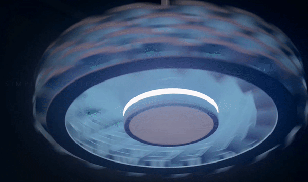
‘Flaire’ encompassed three elements: flair, flare, and air. These elements illustrated how Acorn’s premium fans provide airflow with the greatest flair. The ‘flare’ element alludes to a burst of light – which is in-line with the extravagance of this fan, especially the ceiling fan is luminous.
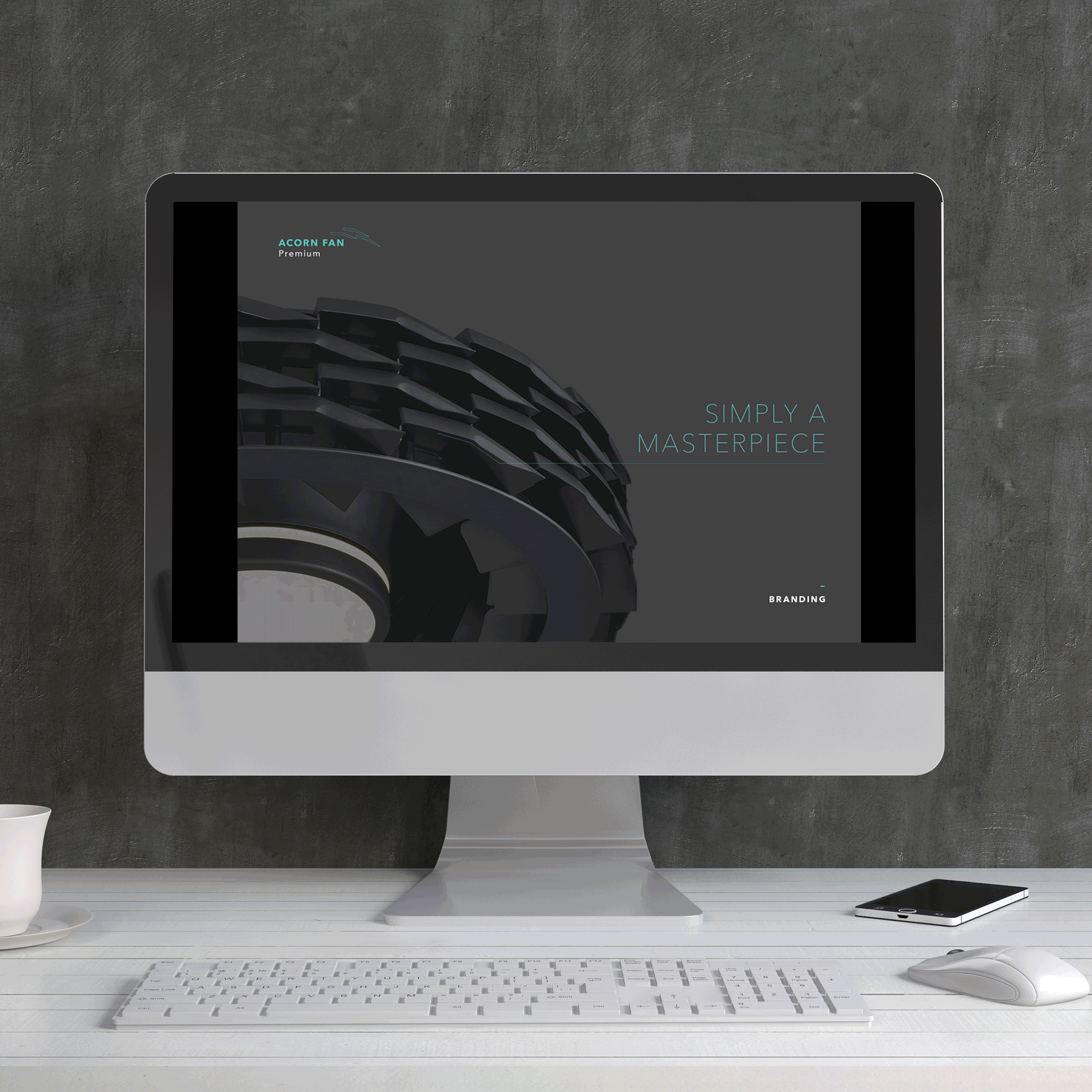
Brand Identity
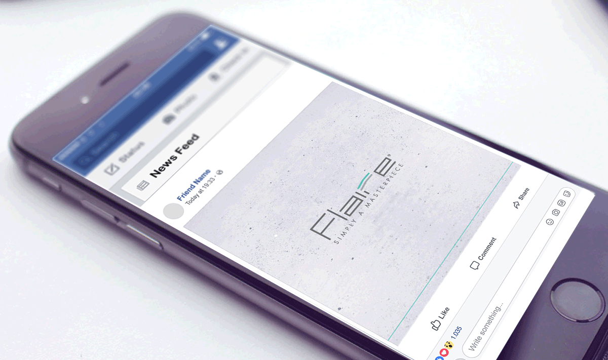
Flaire’s logo design embodied the distinctive lines from its signature bladeless fan. The logo also used clean fine lines which exuded the brand’s association to refinement and elegance.
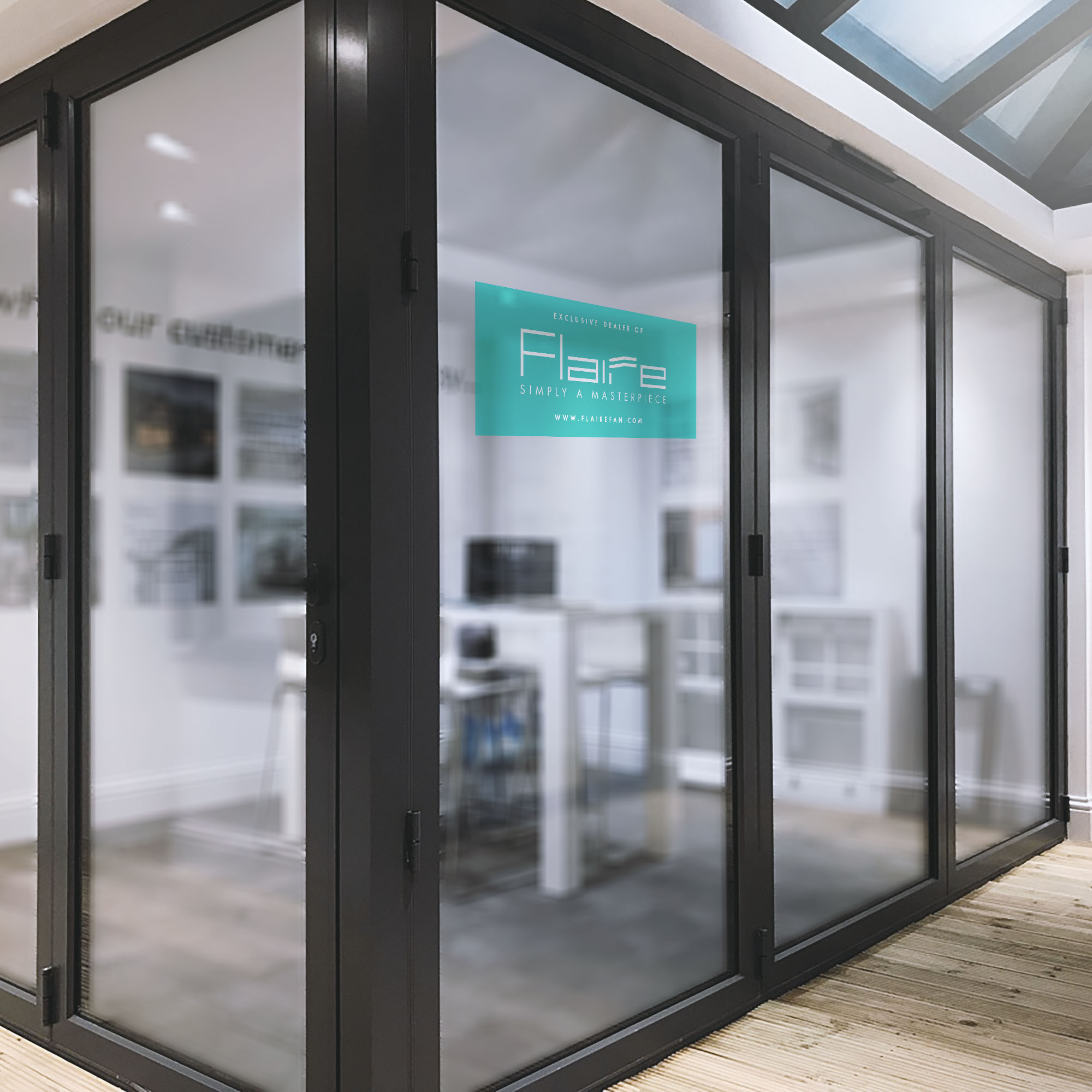
The tagline “Simply A Masterpiece” further portrayed Flaire ceiling fans as the masterpiece that blend both form and function.
A light Turquoise green colour was used to accentuate Flaire. The colour tone was chosen as it best depicted the brand traits, “Elegance”, “Clean”, and “Timeless”.
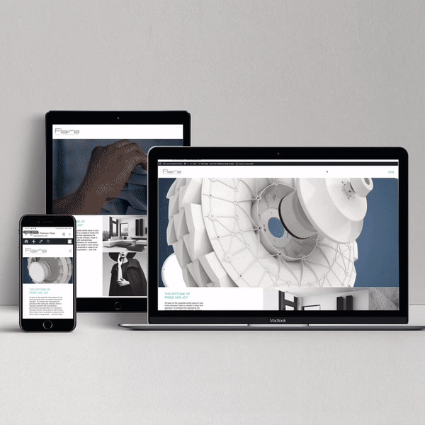
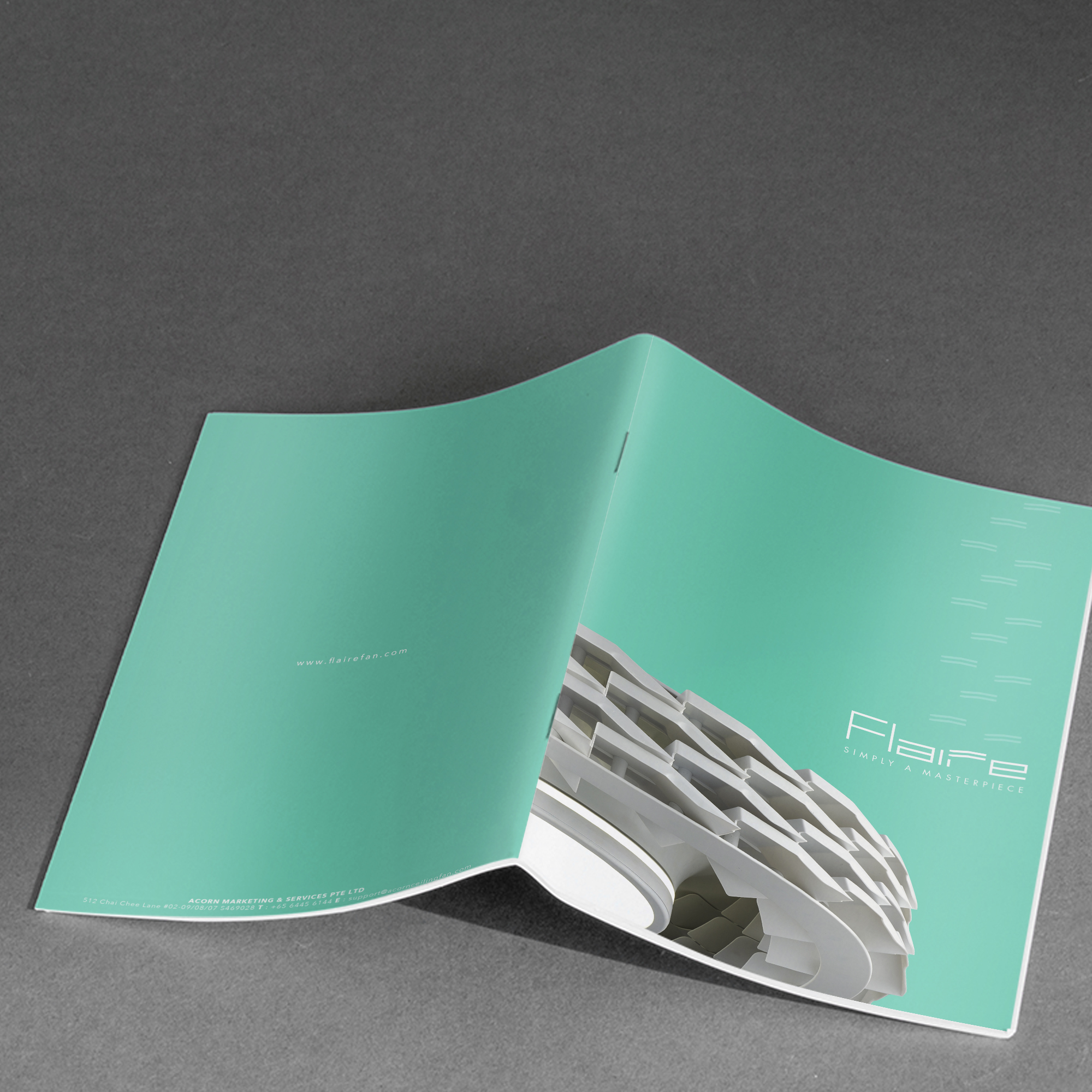
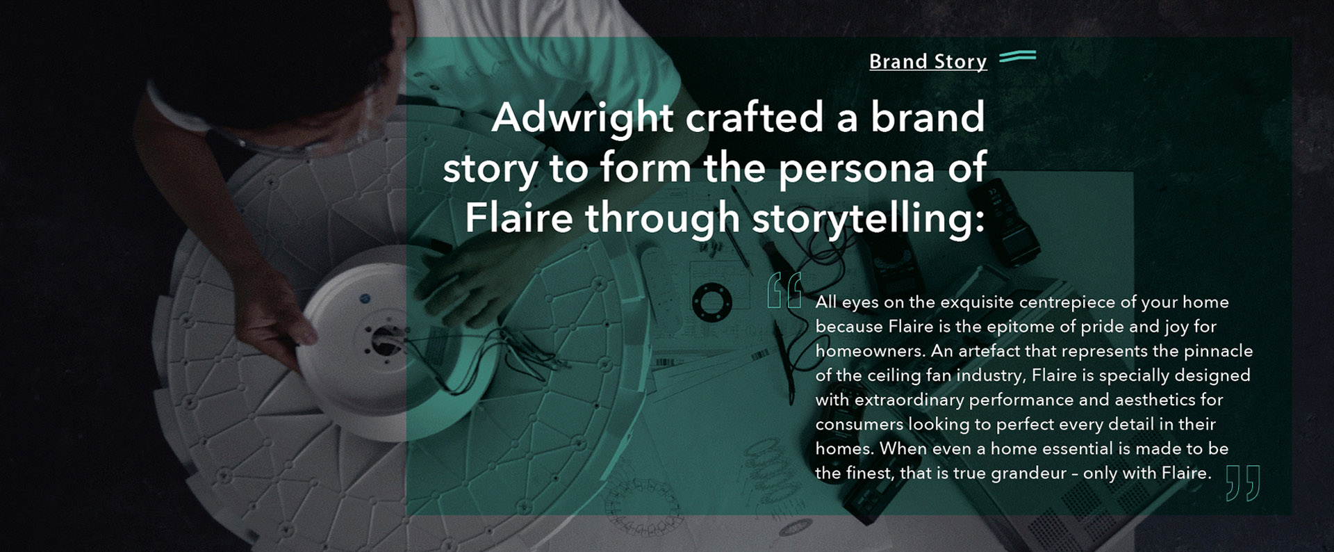
Brand Microsite
Flaire’s brand equity was used in distinguishing the brand’s microsite which was intended for potential customers. The microsite was also designed with behind-the-scene photographs of the creation process behind Flaire’s fans.
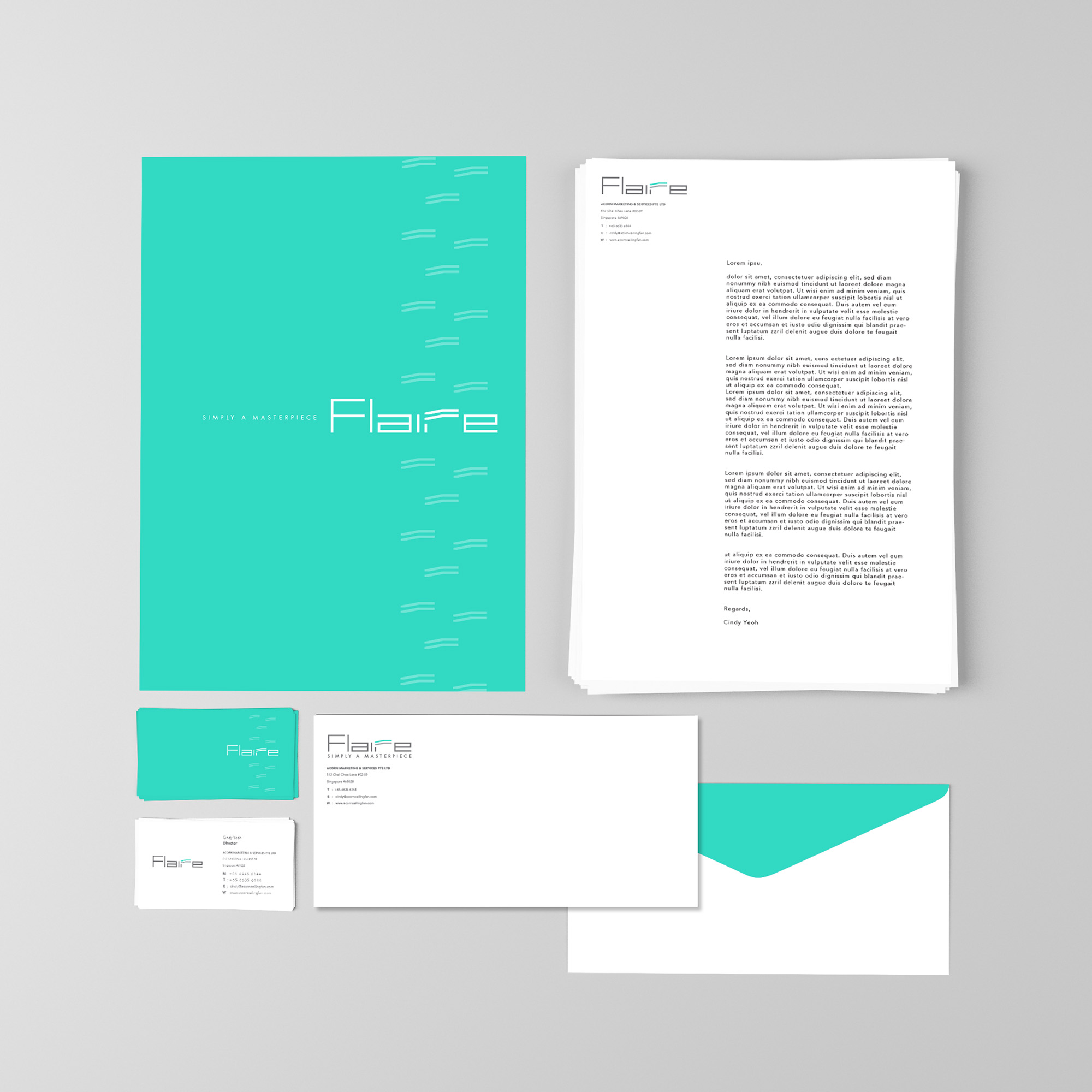
Corporate Stationery Set
- Business Cards
- Letterhead & Continuation
- Sheet
- Envelope (C4/DL)
- Complimentary Slip
- Receipt/Invoice/Delivery
- Order
- Email Sign-off Template

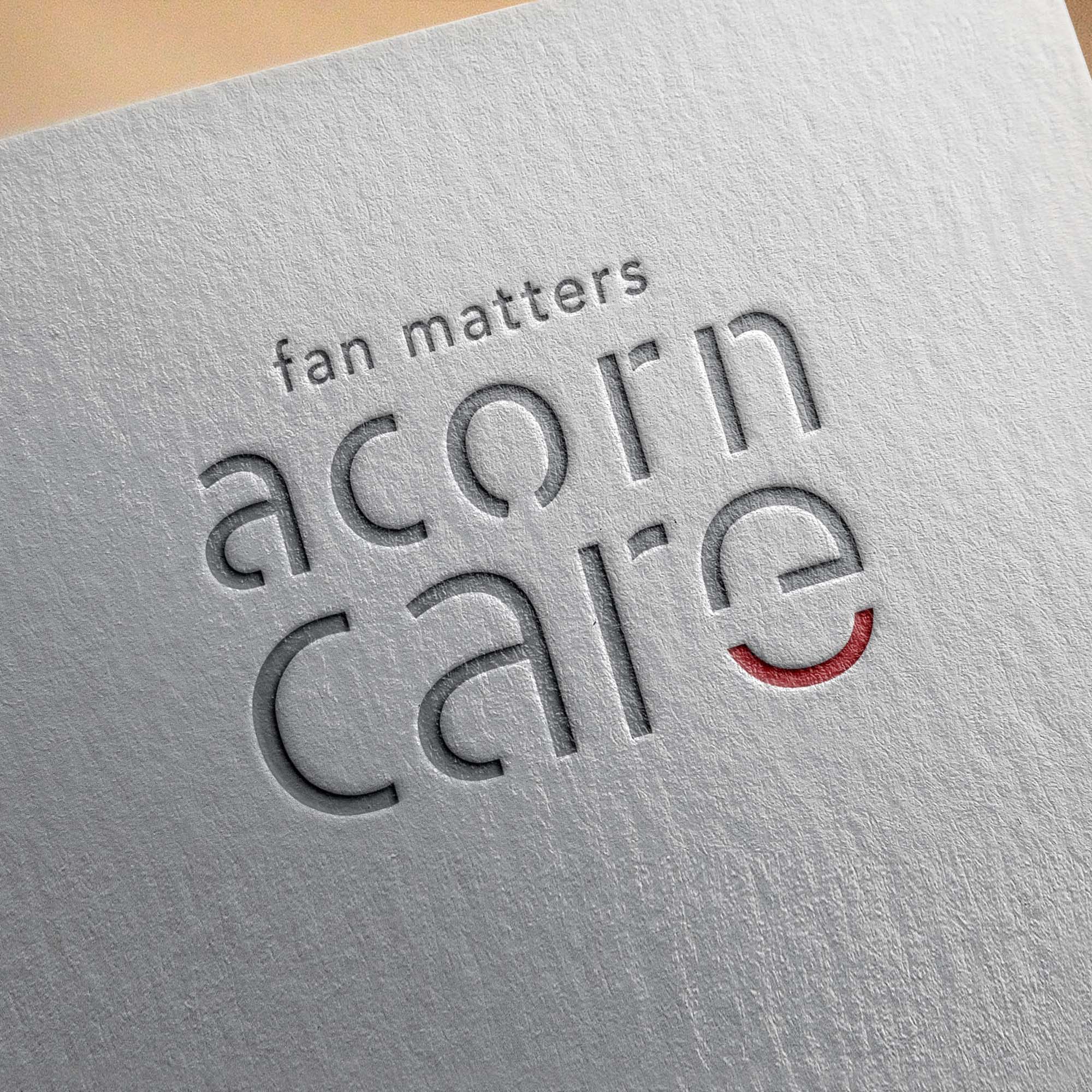
Adwright was also assigned to create a logo and tagline for Flaire’s parent company — Acorn. The modern metallic look of the logo exuded a sense of quality and high craftsmanship. The tagline, “fan matters” puts a succinct point across that Acorn is all about fans and the way it is built.