Building the SP Homes Brand
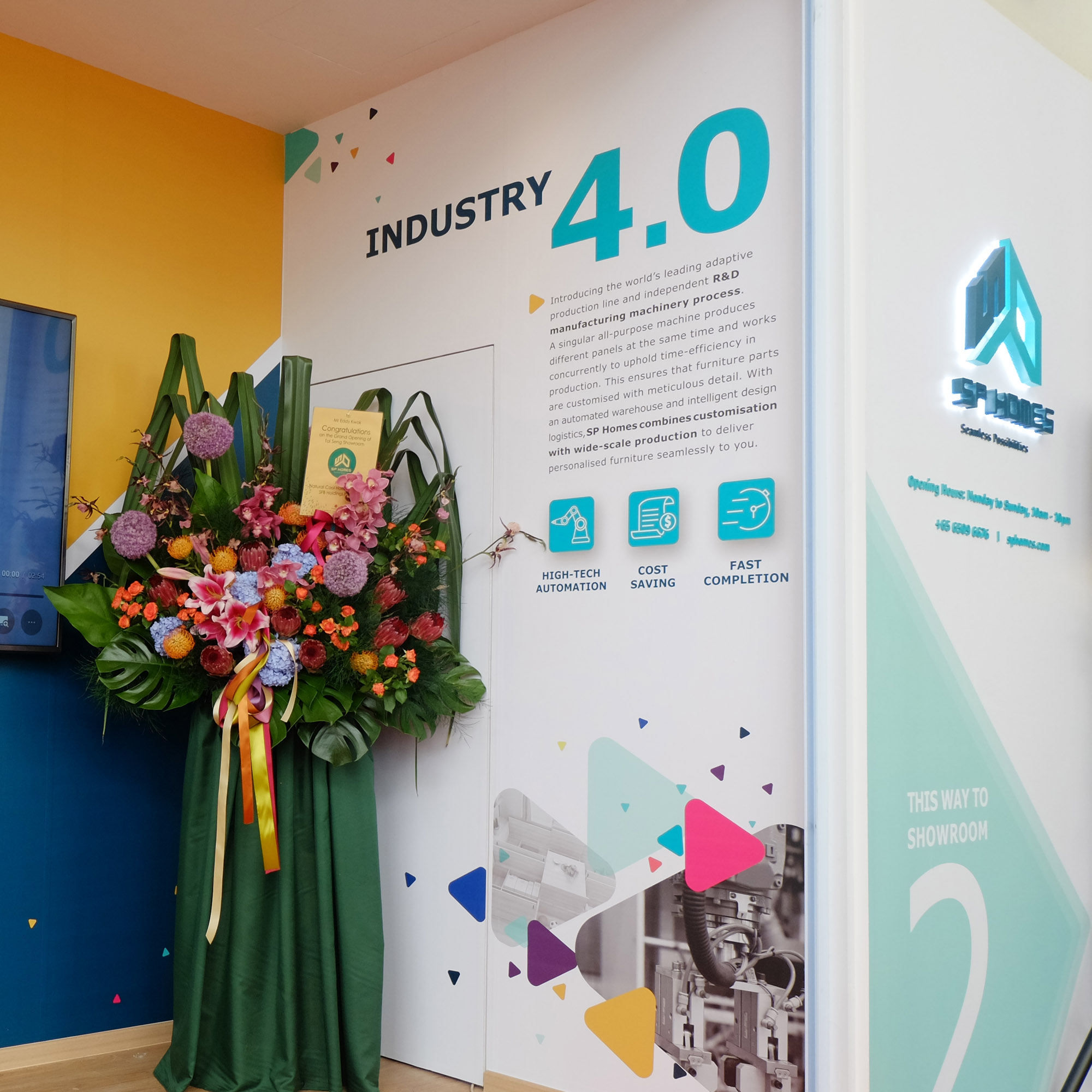
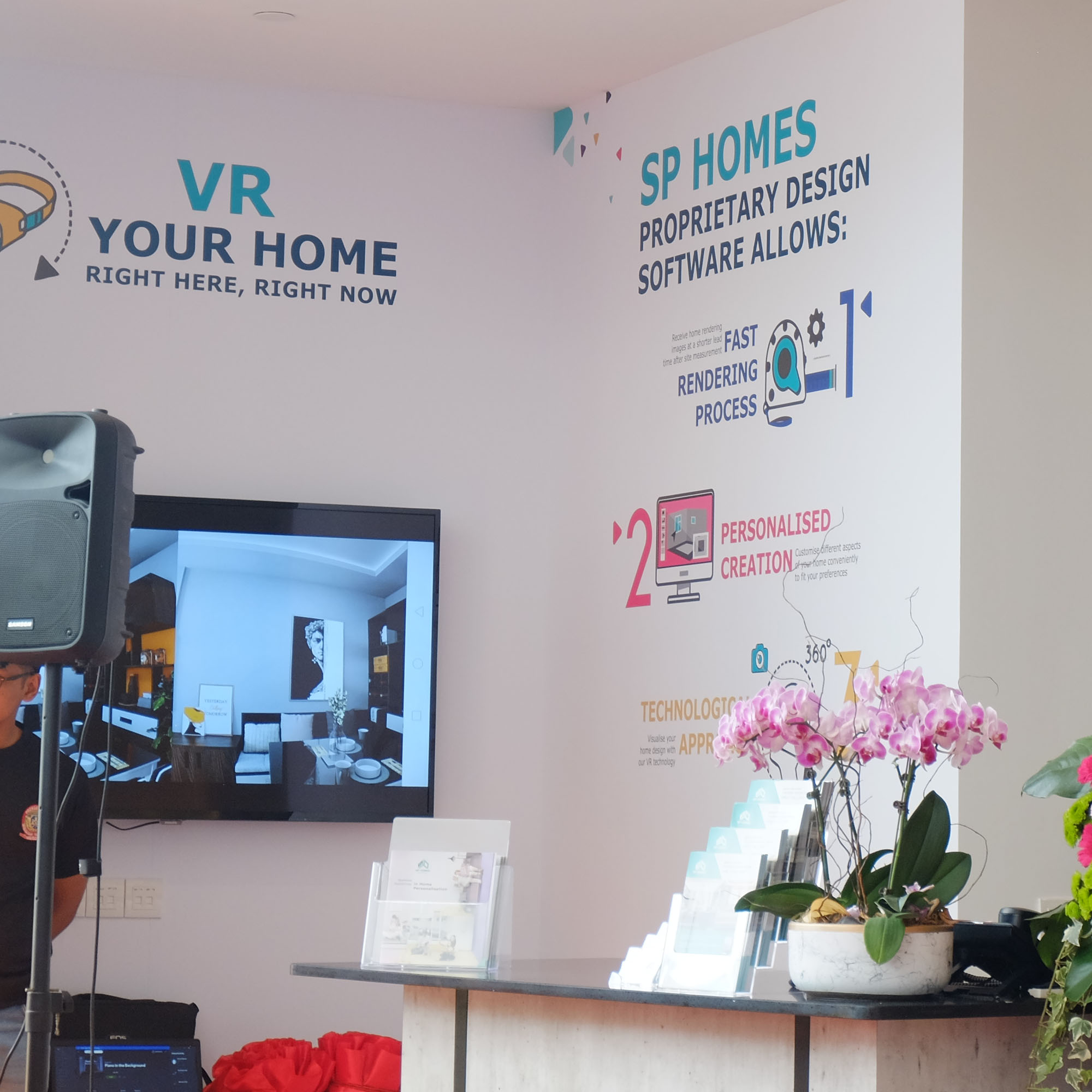
SP Homes is a new home creation company. It offers an all-in-one solution for homeowners to achieve their dream home through home personalisation. SP Homes’ unique selling point is their ability to undertake and execute every stage of the house building process – space planning, interior designing, carpentry and renovation. Hence, the need for multiple third-party contractor interactions is eliminated, giving homeowners the ease and convenience in creating their ideal home. SP Homes also has its own proprietary home design software that can be adapted to technological advancements such as VR technology to let homeowners visualise their completed dream home. After presenting and meeting a homeowner’s expectations, SP Homes will start the home creation process with their team of experienced designers and proprietary “Industry 4.0” manufacturing process which can personalise and customise furniture to fit the needs of any homeowner.
Challenges
SP Homes aims to be differentiated from conventional interior design firms. They had to communicate to the mass audiences succinctly about their expertise in undertaking the start-to-finish process of home personalisation.

Solutions
Adwright conducted a brand audit with the founders and stakeholders of SP Homes to understand the purpose and philosophy of the brand. The brand prides itself in offering a personalise and holistic solution to home creation which would enable homeowners to envision and actualise their ideal home efficiently. Adwright then conceptualised a brand positioning angle which highlighted SP Homes’ ability to personalise homes for all ages and life phases.
Crafting a compelling Brand Story and Tagline
Adwright crafted a brand story for SP Homes which detailed the brand’s purpose in providing home personalisation that fits all ages — from a working professional to a senior retiree. A technical brand story was also crafted which emphasised on SP Homes’ features and benefits. Adwright created the tagline, “Seamless Possibilities in Home Personalisation” which embodied the wide variety in home design and furniture customisation that SP Homes provides. The tagline aimed to translate SP Homes’ USP in a succinct manner.

Conceptualising and creating the SP Homes Identity and Tone of Voice
Adwright structured a brand imagery deck for SP Homes. In the brand imagery, the functional benefits of the brand were defined with keywords such as ‘Convenient’, ‘Transparent’, and ‘Fastidious’. Empowering words like ‘Fulfilling’ and ‘Assuring’ were chosen to represent the SP Homes’ emotional benefits. The brand imagery was also used to craft SP Homes’ brand persona, which was translated to the brand communication tone and also influenced the services provided by its employees. The sight, taste, smell, and tonality of the brand were depicted with images which evoked a spectrum of senses that resonated with how SP Homes wanted to be perceived and felt by its customers.
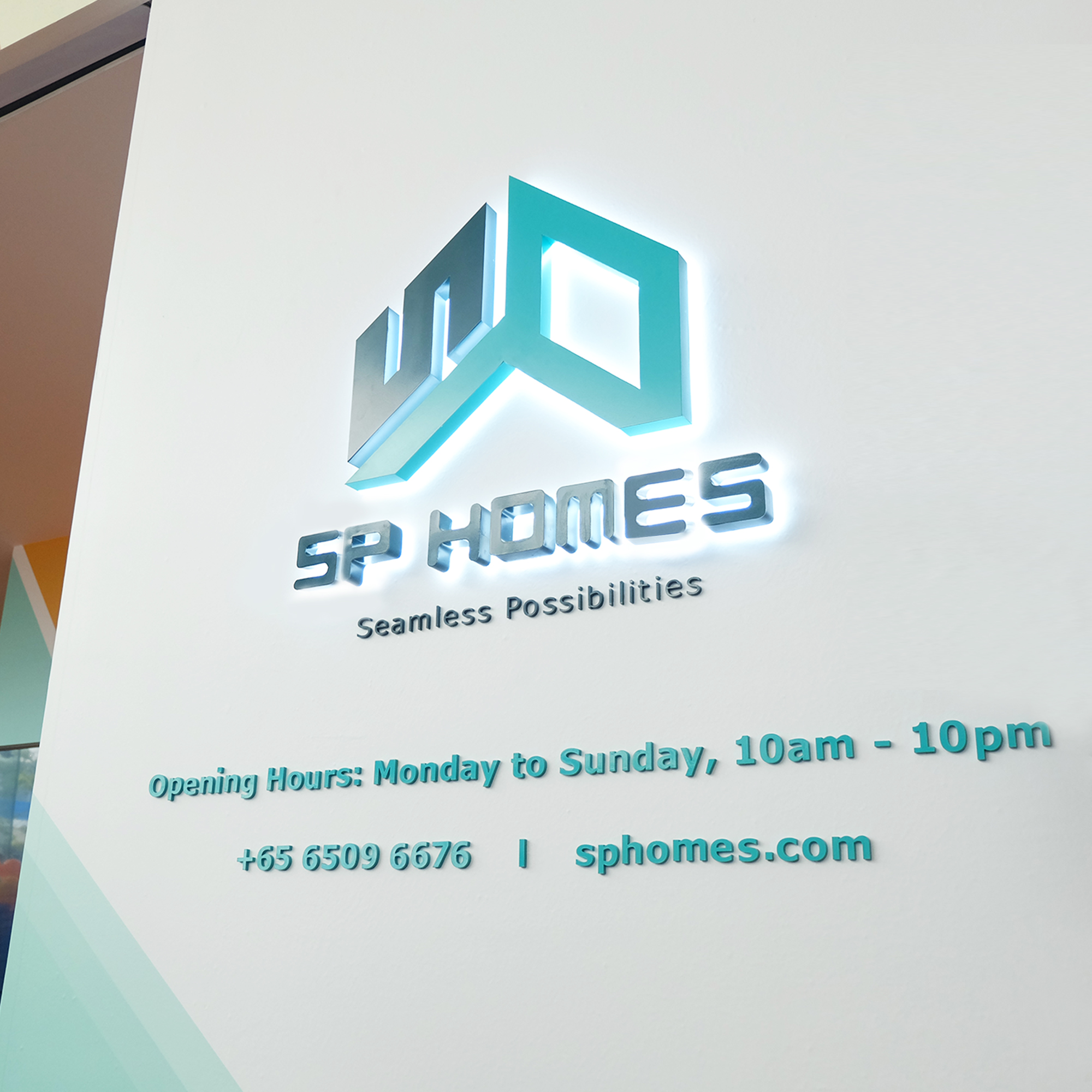
Designing a Brand Logo that embodies ‘home’
Adwright designed a logo that showcased an interior design of a home with the letters ‘S’ and ‘P’. It presented the geometric symmetry in interior design where every furniture has to fit seamlessly. The design elements were then designed together in a style that closely resembles a house key.

Positioning SP Homes’ life stages concept with a Brand Poster
After the thorough conceptualisation and creation of SP Homes’ story and brand imagery, Adwright designed a brand poster for SP Homes’ brand communication assets and showroom launch. The poster featured a working professional, a couple, a family, and an elderly couple enjoying and relaxing in their home. The poster evoked a sense of continuity and progression from different staged of life. The poster aimed to educate audiences on the brand’s capability to personalise and customise homes suited to a homeowner’s life stage.
Appealing to different age segmentations
The brand poster was expanded and created into a set of age category posters to enable the audiences to resonate with SP Homes on a personal level.
Professional
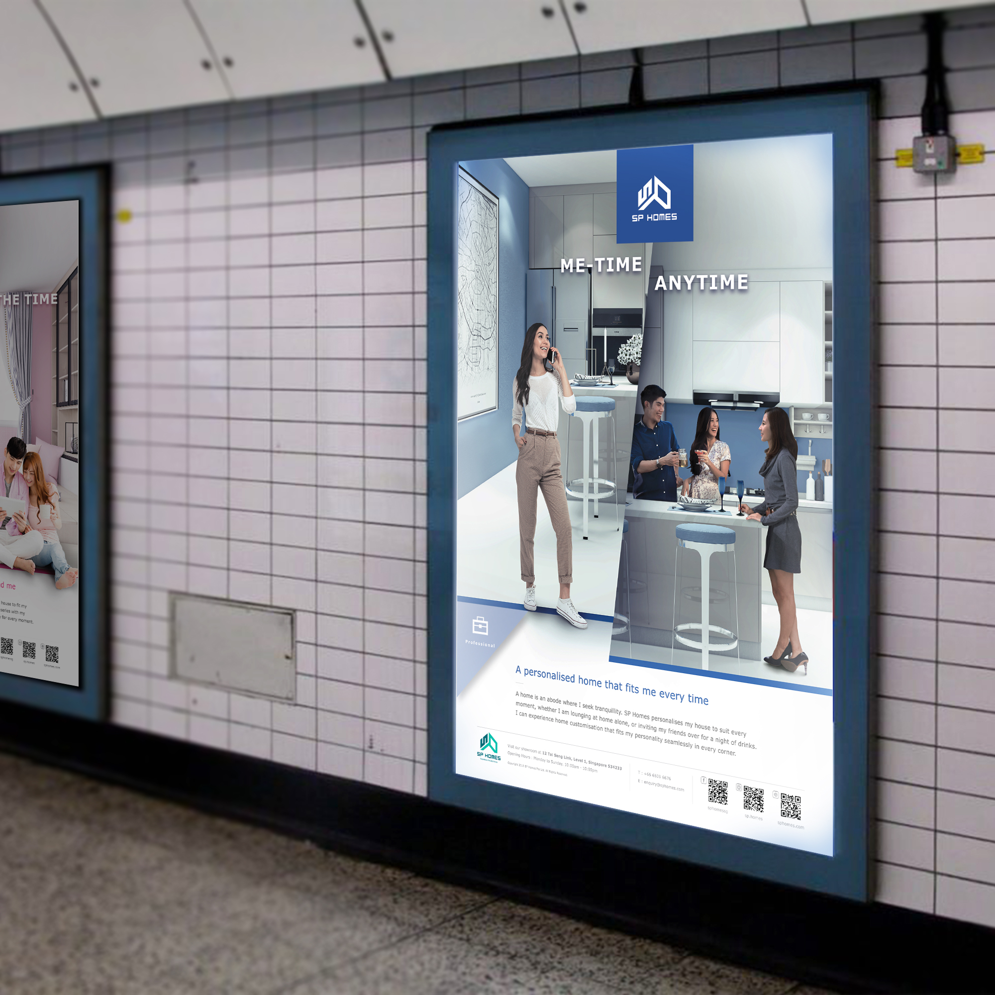
This poster was designed to target young working professionals, who live independently. The headline, “Me-Time Anytime” was coupled with the tagline, “A Personalised Home That Fits Me Every Time” aimed to embody the positive feeling that was experienced by a customer with home personalisation. The body copy highlighted the various lifestyle activities commonly faced by working professionals and how SP Homes’ home personalisation could enable homeowners to feel comfortable while enjoying their activities at home.
Family
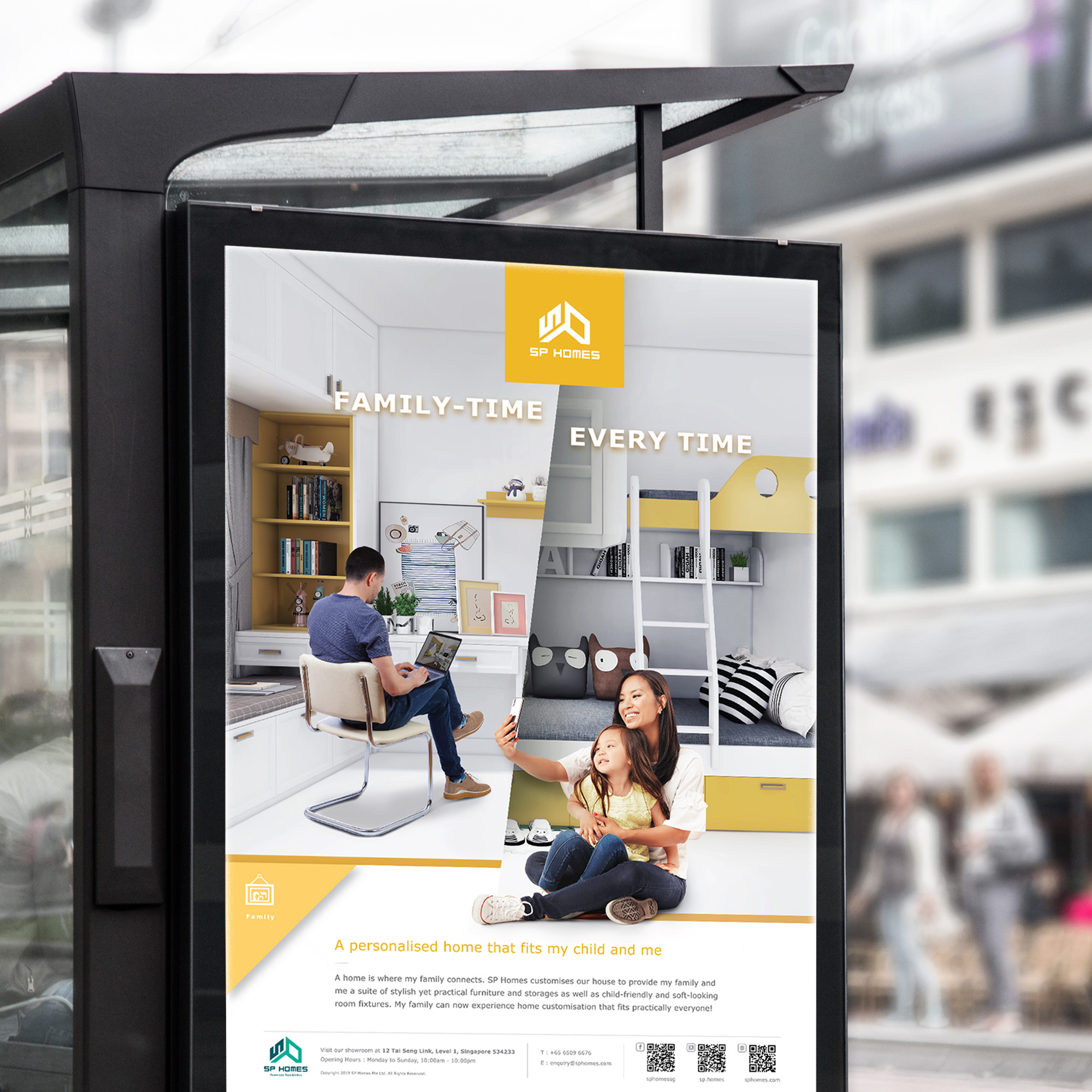
This poster was created to resonate with audiences who have a family with young children. The headline, “Family-Time Every Time” and tagline “A Personalised Home That Fits My Child and Me” sparked a sense of satisfaction that the homeowner felt due to SP Homes’ child-friendly home personalisation. The body copy detailed how home design could be customised to be child-friendly yet appealing to adults too.
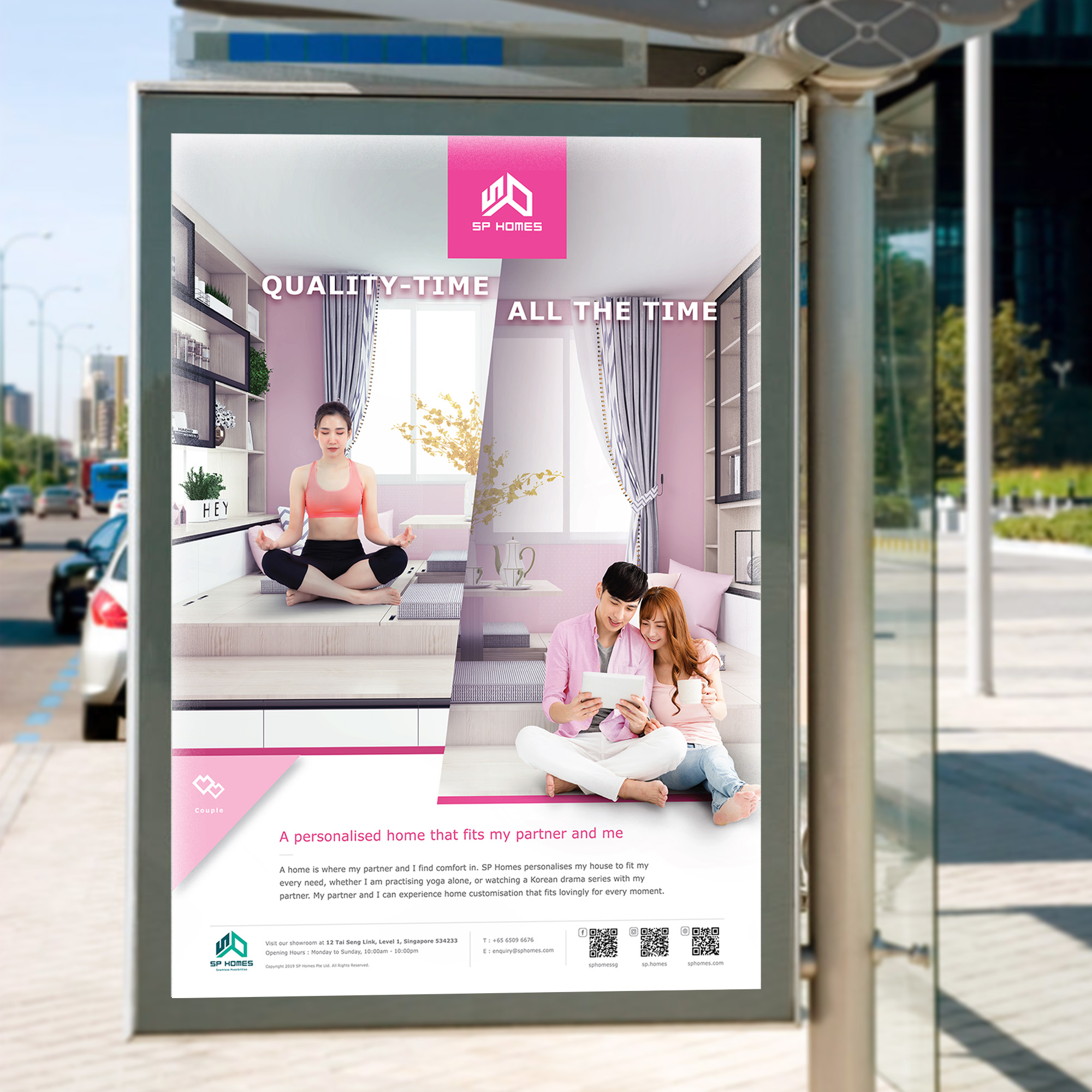
Couple
This poster was designed to target young working professionals, who live independently. The headline, “Me-Time Anytime” was coupled with the tagline, “A Personalised Home That Fits Me Every Time” aimed to embody the positive feeling that was experienced by a customer with home personalisation. The body copy highlighted the various lifestyle activities commonly faced by working professionals and how SP Homes’ home personalisation could enable homeowners to feel comfortable while enjoying their activities at home.
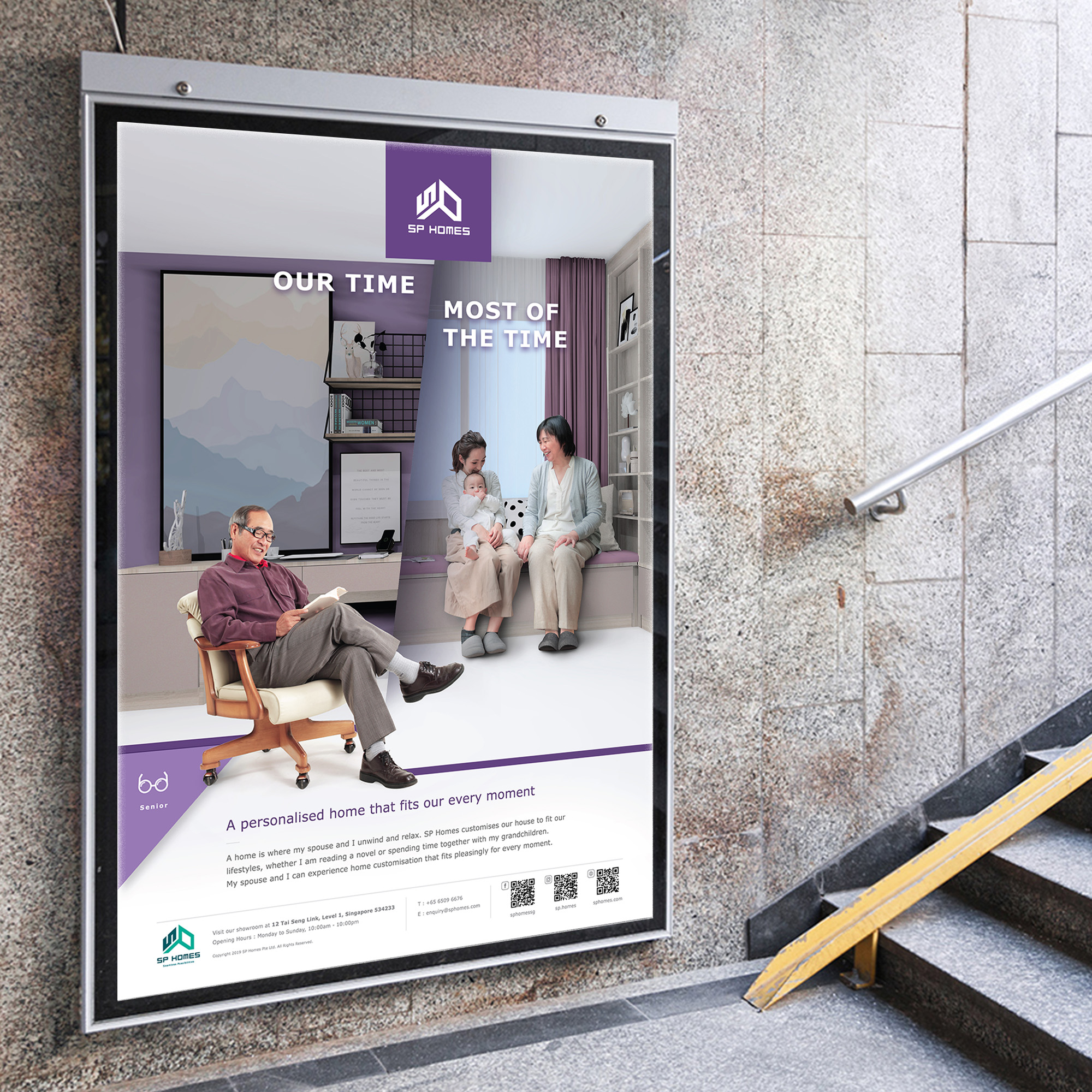
Senior
This poster was catered to elderlies who spend more time relaxing and enjoying at home. The headline, “Our Time Most Of The Time” and tagline “A Personalised Home That Fits Our Every Moment” exuded a carefree and laid-back tone. The headline and body copy inferred that elderly couples could still enjoy spending time together in their personalised home even when their relatives are visiting them.
Informing consumers on SP Homes traits
Adwright created a set of attribute icons that represented the functional traits of SP Homes. These icons were designed with illustrations that depicted each trait clearly. A short copy was also written for each icon to educate the target audiences with succinct information. The icons were placed in SP Homes’ brand communication assets such as the brochure and microsite.
Four category icons were also created to portray the four demographics – Professional, Couple, Family, and Senior. The icons were designed with stylistic graphic illustrations that depicted the four categories in their unique and distinct lifestyles.


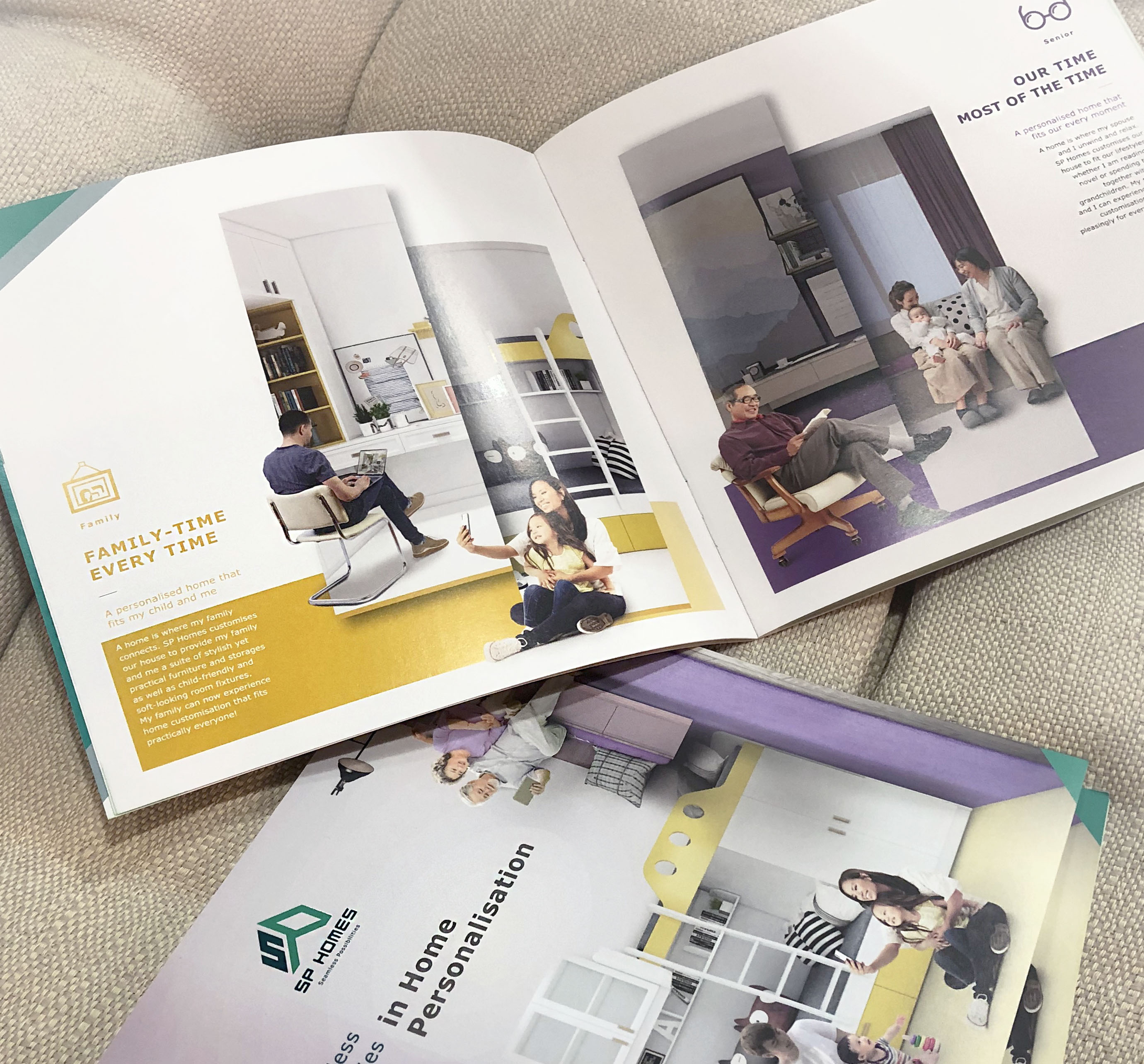
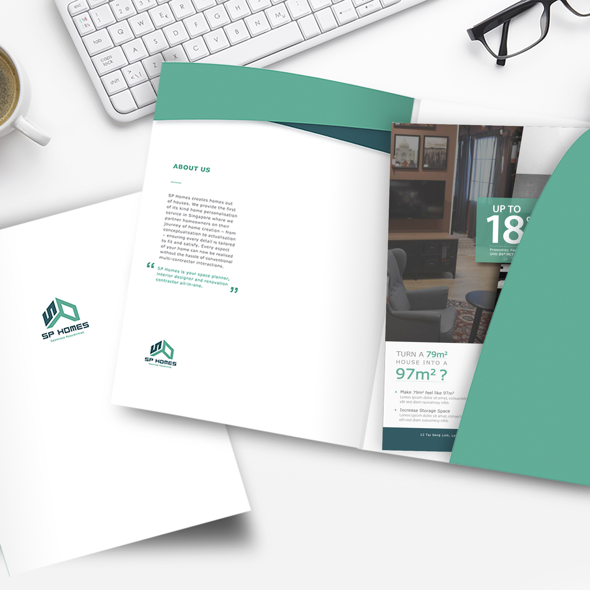
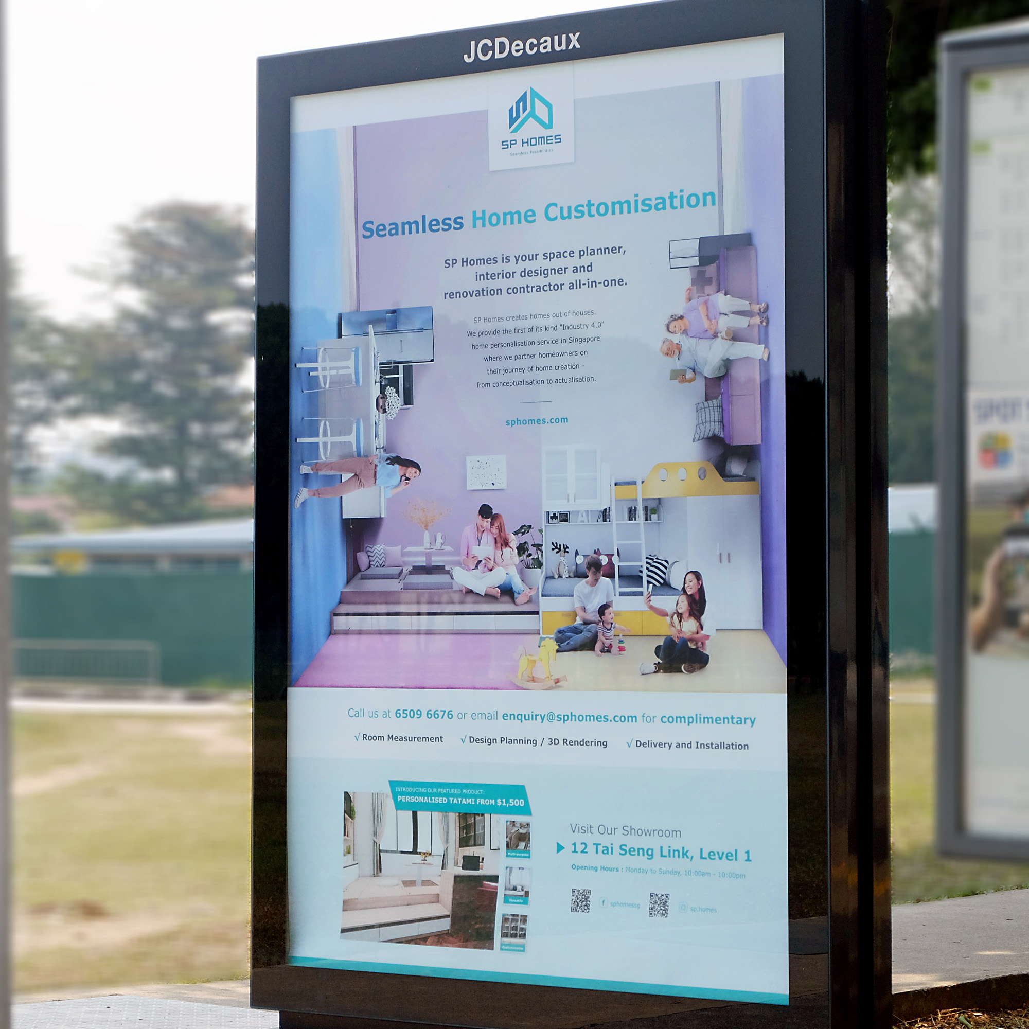
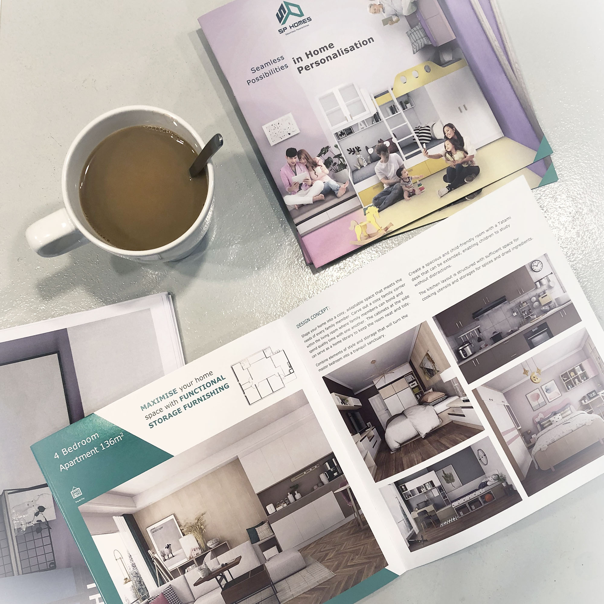
Designing a informative brand brochure for SP Homes’ showroom launch
Adwright designed and crafted a 24ppt brochure that included every brand asset which was created. It was slated to be given to potential customers alongside the showroom launch. The brochure aimed to educate consumers on SP Homes’ ability and knowledge in home creation. It was also meant to be a “Point-of-Sale” brand education material.
SP Homes’ Brochure Contents
- Brand Story
- Brand Attributes
- Home Creation Process
- Manufacturing Process
- Age Segmentation Narrative
- Different Home Category Concept
- FAQ Section

Structuring and designing SP Home’s microsite
Adwright designed a microsite for the SP Homes’ soft launch. The microsite served as a landing page for more information on SP Homes to give consumers a preview of the showroom and garner interest which would lead to showroom traffic.
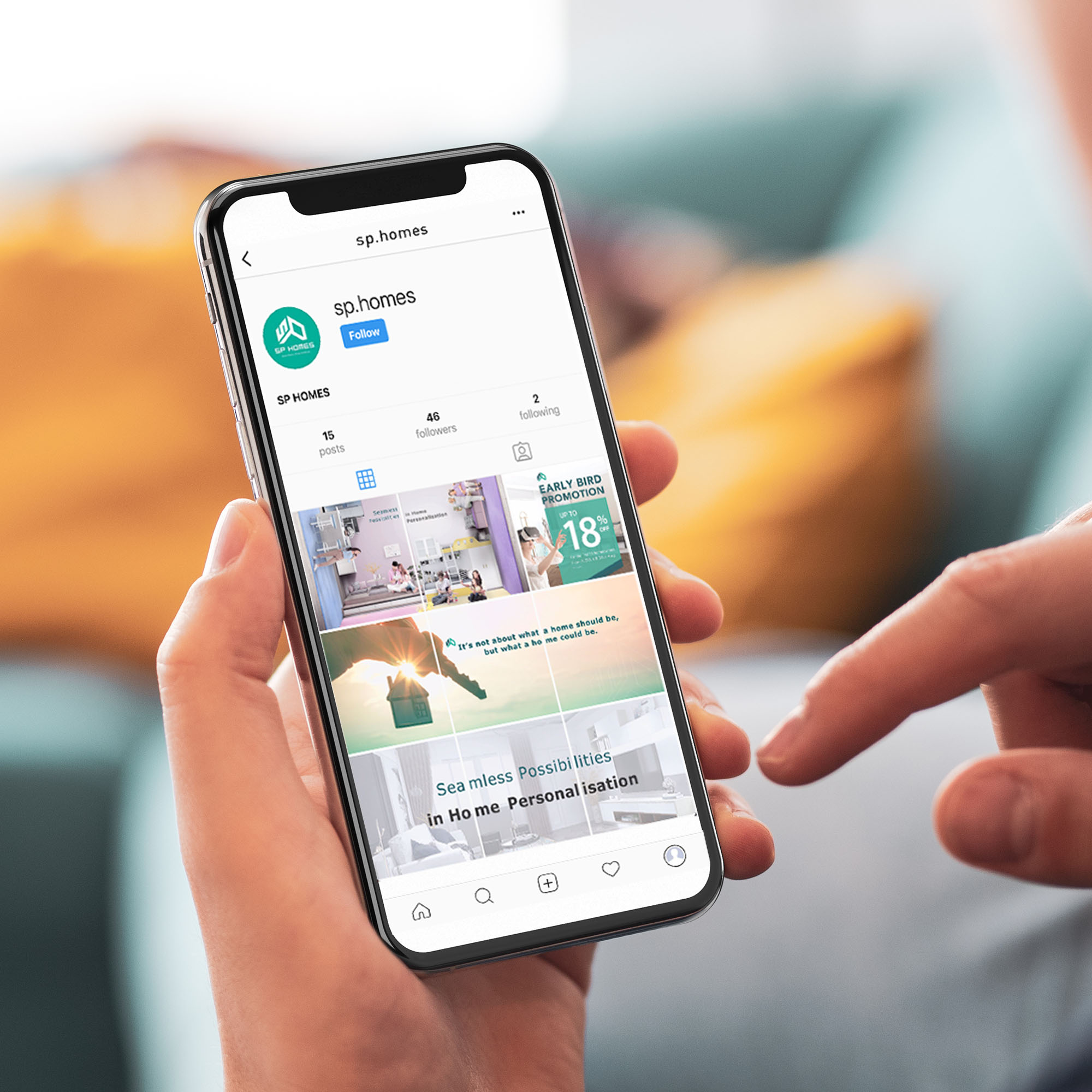
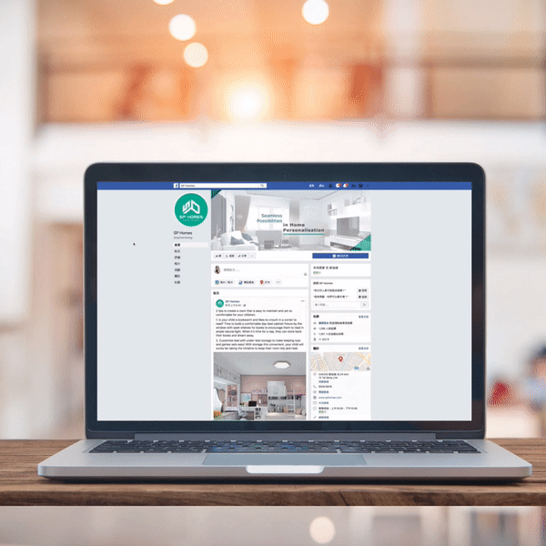
Launching SP Homes’s social media presence and engaging with audiences
Adwright conceptualised and launched SP Homes’ social media presence on Facebook and Instagram. A methodical social media calendar was created to serve as a guide for the different types of content category scheduled to be posted. The images posted contained brand assets that educated the public about the different traits and features of SP Homes’ services. The content posted varied from the brand attribute icons, seasonal festive greetings and promotions to house space planning tips, which served to build engagement with the public.
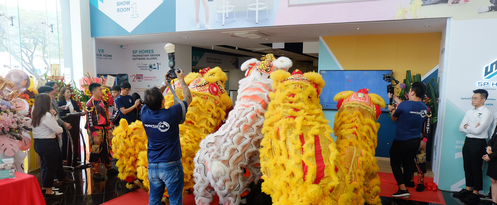
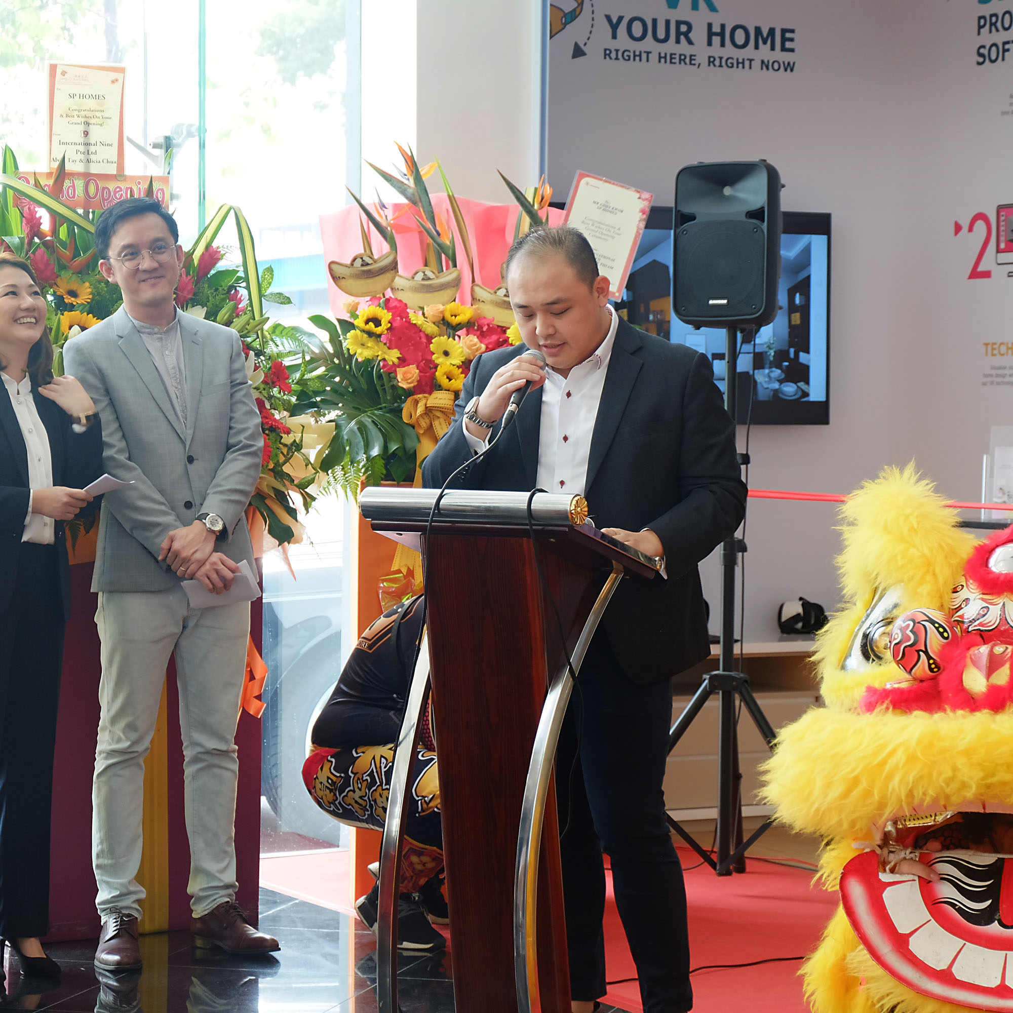
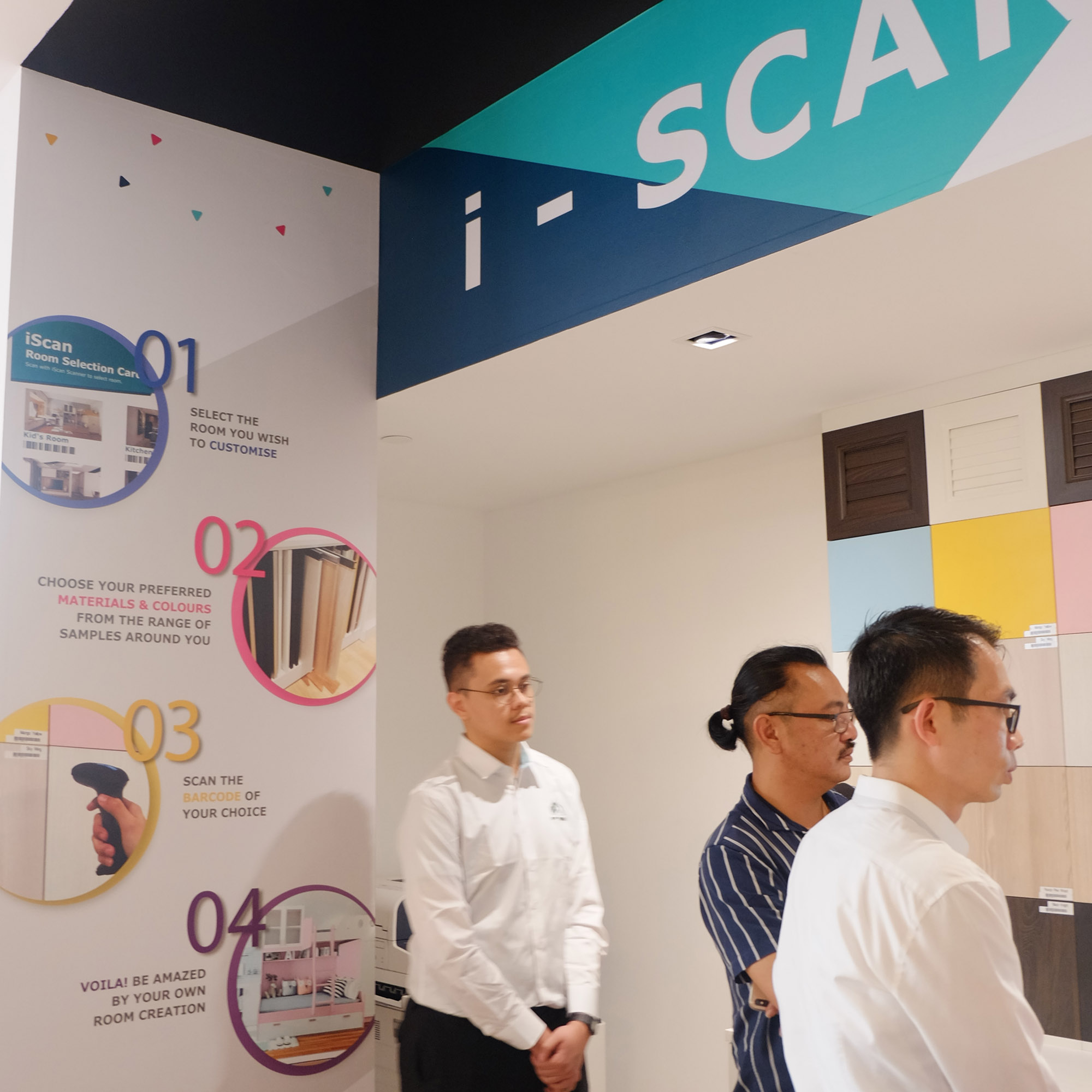
Creating essential SP Homes’ brand assets for its showroom
To prepare for the showroom launch, Adwright also aided in the creation of in-store direction signs, showroom directories, and exterior signage boards that showed potential visitors the location and turns needed to reach the showroom. These brand assets were designed in alignment with SP Homes’ holistic brand identity. In addition to showroom materials, Adwright designed name cards and corporate folders for SP Homes stakeholder and employees.
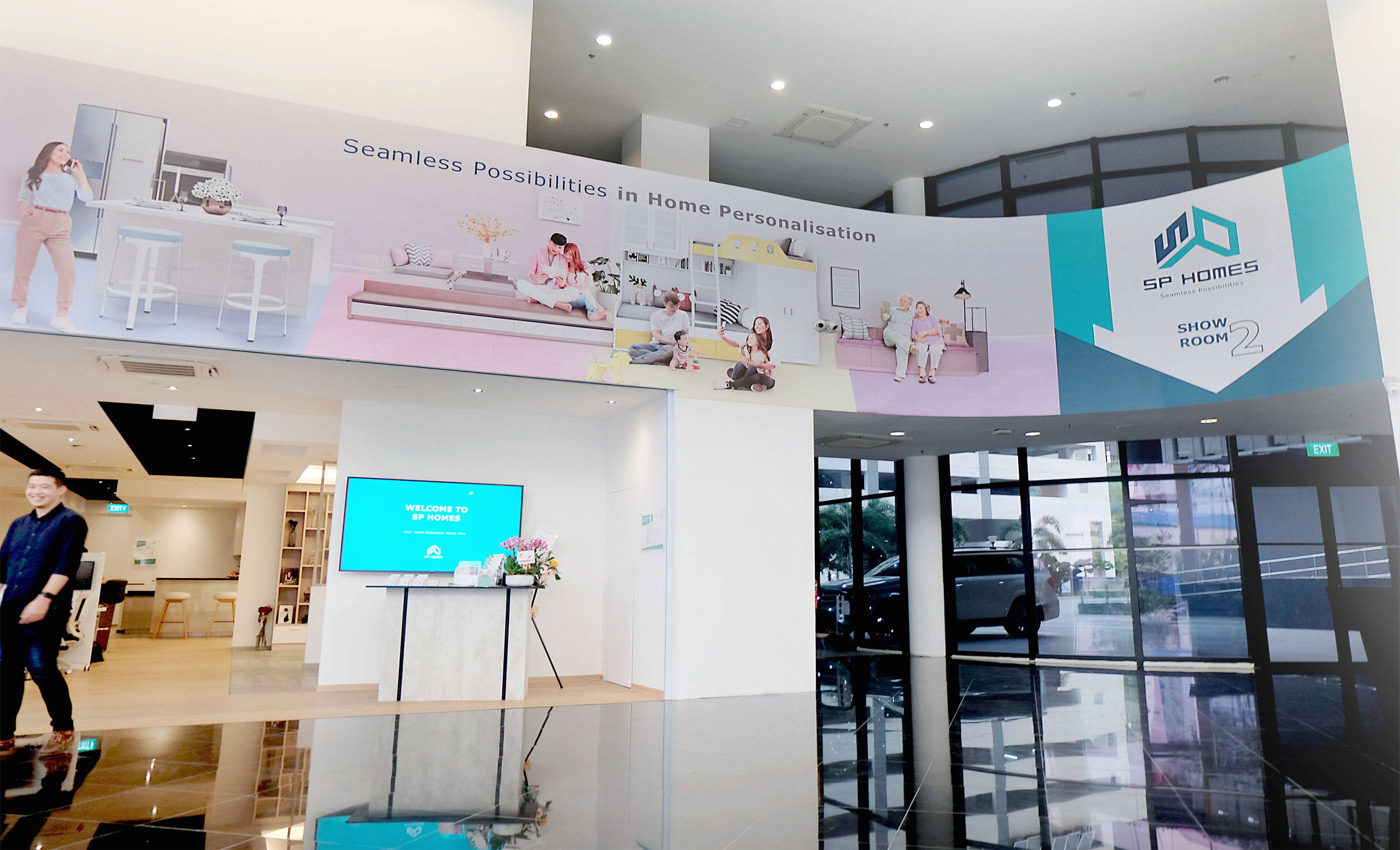
Showroom Façade banner
Adwright designed a façade brand banner spanning the exterior of the showroom. The façade banner expanded on the four age categories and showcased them in a sequential cycle from a working professional to a senior retiree. The purpose of the banner was to differentiate SP Homes as a human-centric brand compared to other showrooms which emphasised on mainly home design and furnishing.