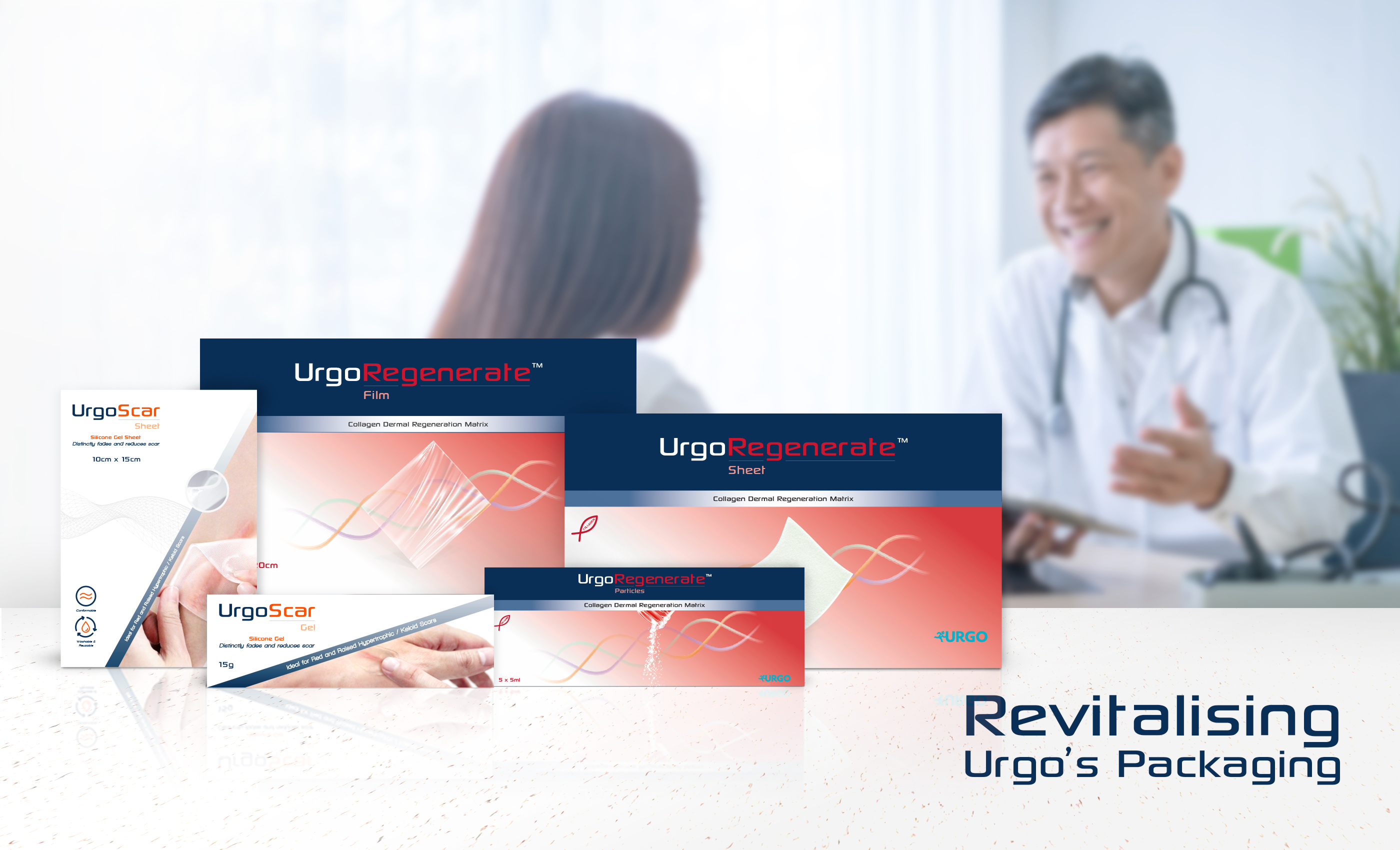
Revitalising Urgo's Product Packaging
Urgo Medical is a medical organisation in the wound healing industry specialising in recovery solutions. Urgo Medical provides innovative wound care solutions that aid with a patient’s recovery process. They are known for their wide range of pharmaceutical-grade skin treatment products, medicating various forms of superficial injury effectively.
Challenges
Urgo Medical had researched and developed two new product extensions – Urgo Scar and Urgo Regenerate, which heal wounds and reduces scars. Urgo Medical approached Adwright to develop and differentiate the brand’s product extension while adhering to its brand guidelines.

Solutions
Adwright researched Urgo Medical’s competitors and learnt that most of their products were technical-looking. The products were often designed with basic gradient colours or with simple illustrations which did not portray the product’s functions and benefits clearly to its target audience. Equipped with the research information, Adwright conceptualised functional design-driven packaging for Urgo Scar and Urgo Regenerate.
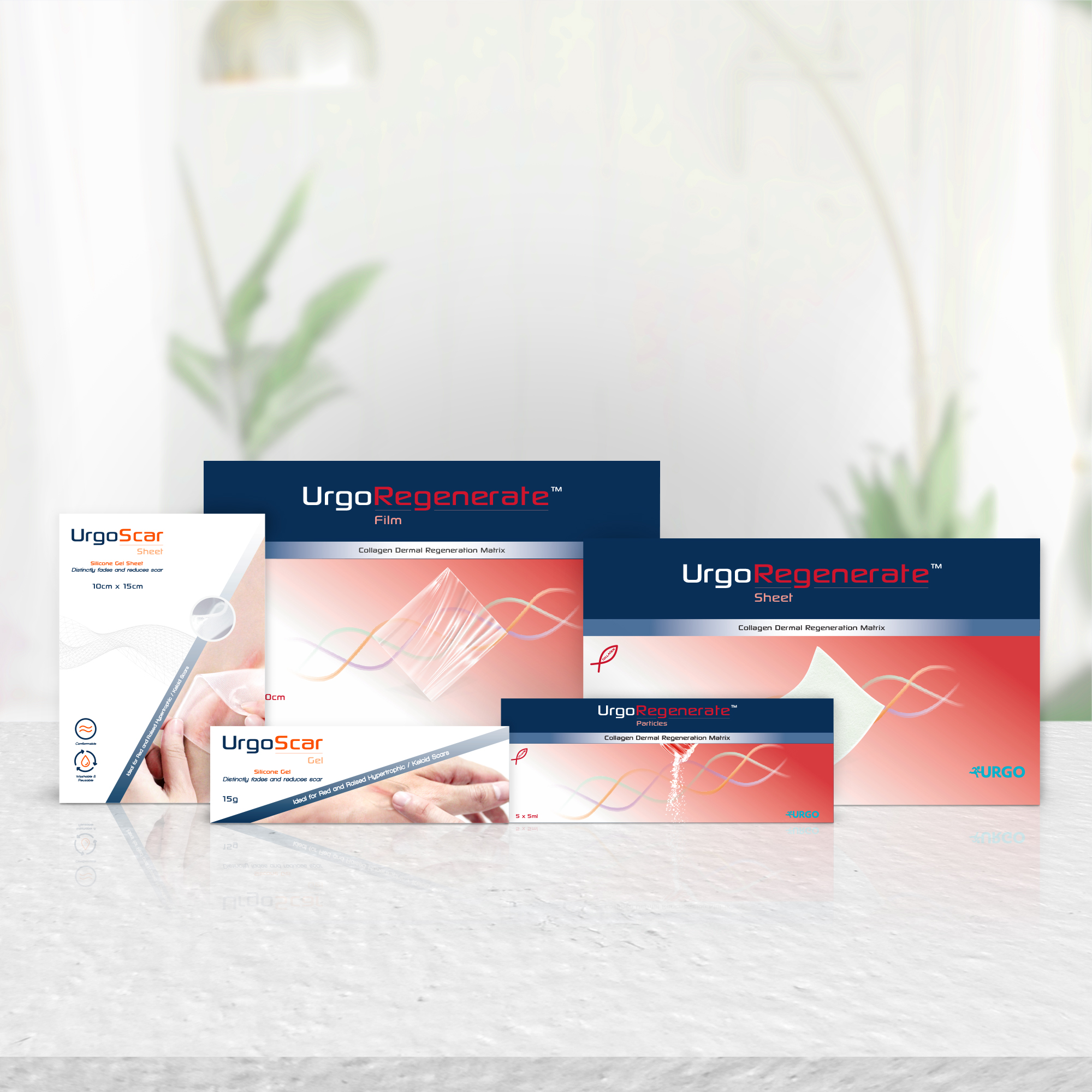
Urgo Scar
Urgo Scar packaging was designed with the intent of a user’s application in mind as it was meant to be sold over-the-counter. Hence, Adwright designed its packaging to depict how the product looked like and how it should be used. Product function icons were created to highlight the product’s unique selling point – Conformable, Washable and Reusable. These function design aspects were then implemented on a revitalised symmetrical grid which aligned with Urgo Medical’s brand equity and product packaging designs.

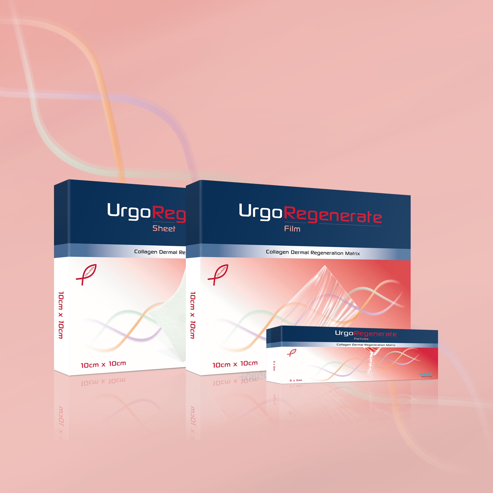
Urgo Regenerate
Urgo Regenerate is a collagen-infused product for serious burn injuries. Adwright designed its packaging visual with a DNA-inspired cell design which symbolised the scientific prowess that forms the product. The graphic also exudes the cell-formation benefits that collagen provides for burn victims.
An Urgo Regenerate film was showcased on the packaging, showing the intended consumer how the product look like. The design was merged with the redesigned Urgo Medical’s signature grid to align with the brand’s packaging style.
Urgo Attribute Icons
Adwright formulated and designed two attribute icons to highlight Urgo’s product benefits. To amplify the collagen feature of Urgo Scar, a fish-like cell design was used as a logo to portray the product’s collagen properties. A scaffold-shaped icon was also designed to symbolise Urgo’s derma graft abilities.
