Branding encompasses more than logo design, brand identity design, and packaging designs. We focus on delivering high quality, strategic, and targeted marketing communications tools to achieve your key business objectives. Every client is unique and deserves a design framework that represents their challenges and needs. We believe that a curated brand narrative exuded on the various communication touchpoints is what differentiates the brand from its competitors. Here are some of our tailored brand design frameworks based on their needs and challenges.
BEFORE

AFTER

JUMBO Group of Restaurants
JUMBO Group of Restaurants is an international brand has a variety of restaurant brands to serve up multiple cuisines and local favourites, delighting consumers with their authenticity. The group was keen to pivot into consumers products to diversify its revenue stream and increase its overseas presence. Adwright determined that these aspects could be fulfilled by building a new FMCG brand to unify the various retail brands. Through the branding exercise, Love, Afare was created. The brand aims to appeal to food enthusiasts and home cooks to indulge in their love affair with local food. We are heartened that this project has also won a silver award for Excellence in Response to COVID-19 at the Marketing Excellence Awards 2021.
BEFORE
AFTER
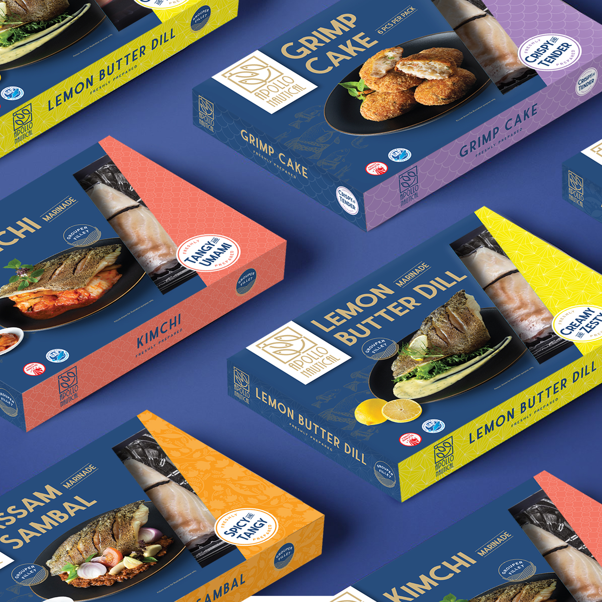
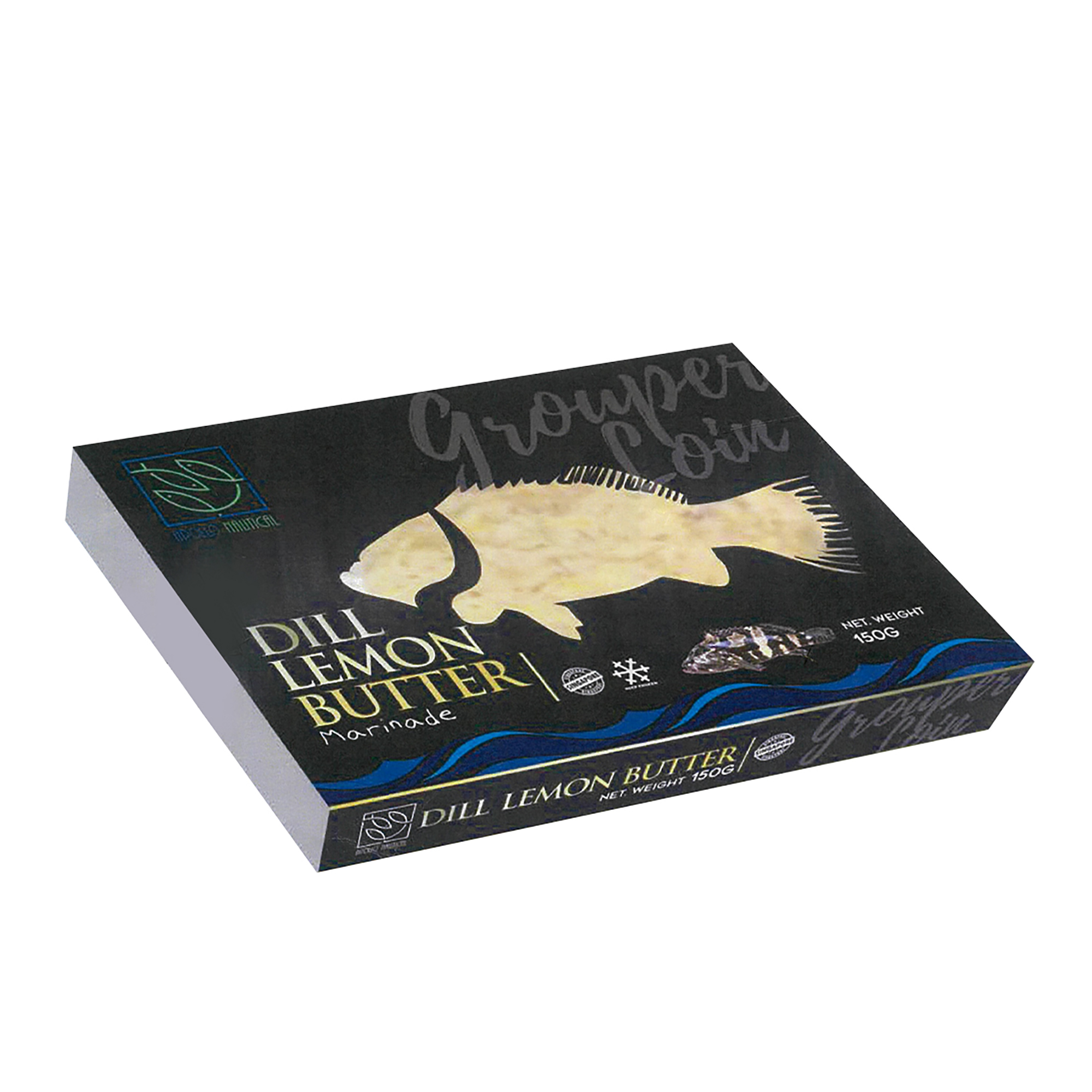
Apollo Marine Seafood
Apollo Marine Seafood is a marine live cultivation farm. They aim to launch their newly created seafood dishes made with the premium cut of groupers. To give each of the flavours a distinct look and feel, Adwright designed the packaging to exude the cultural aspect of each unique flavours. The packaging theme was also kept consistent with a navy blue background and light gold typography to present a premium feel, aligned with the overarching brand.
BEFORE
AFTER
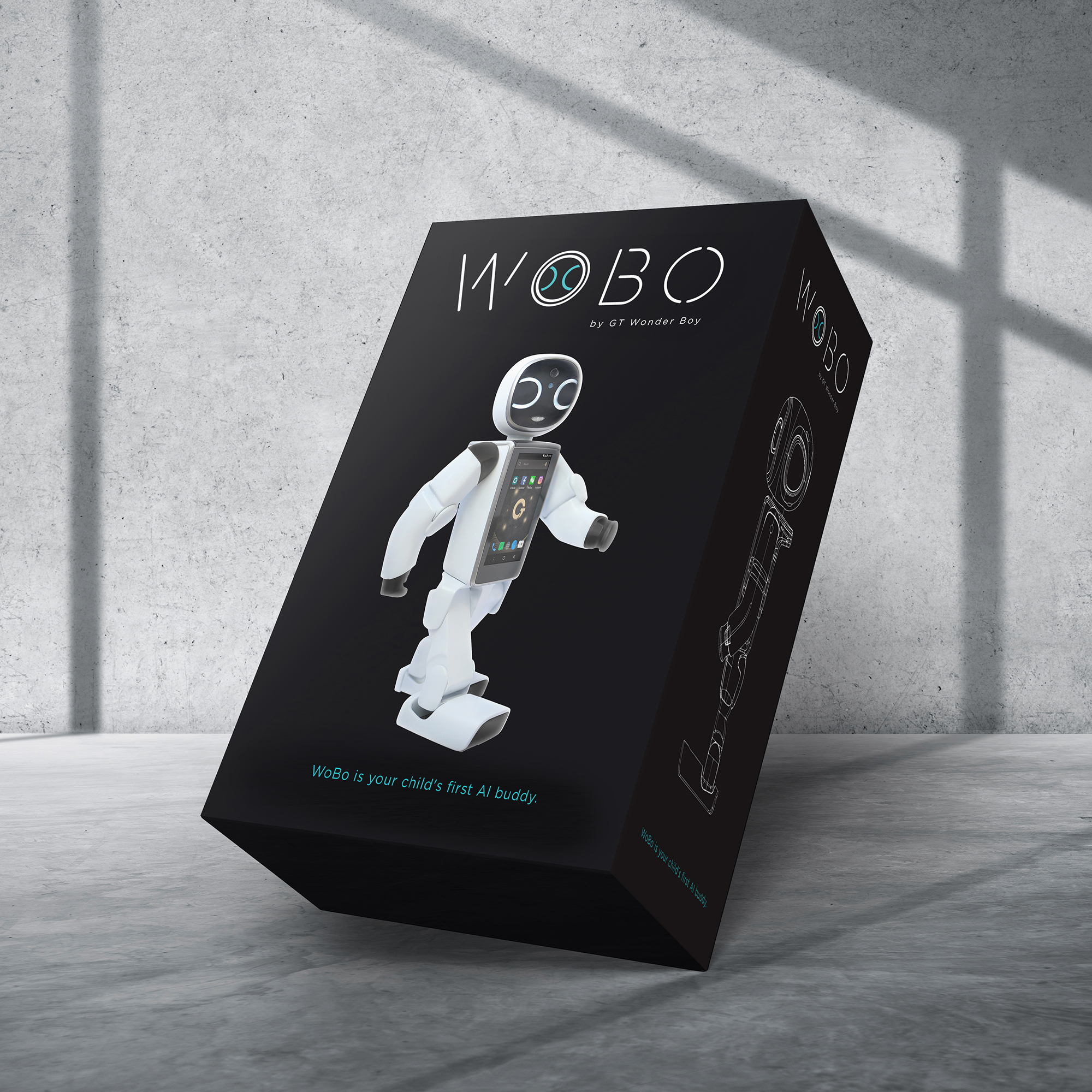
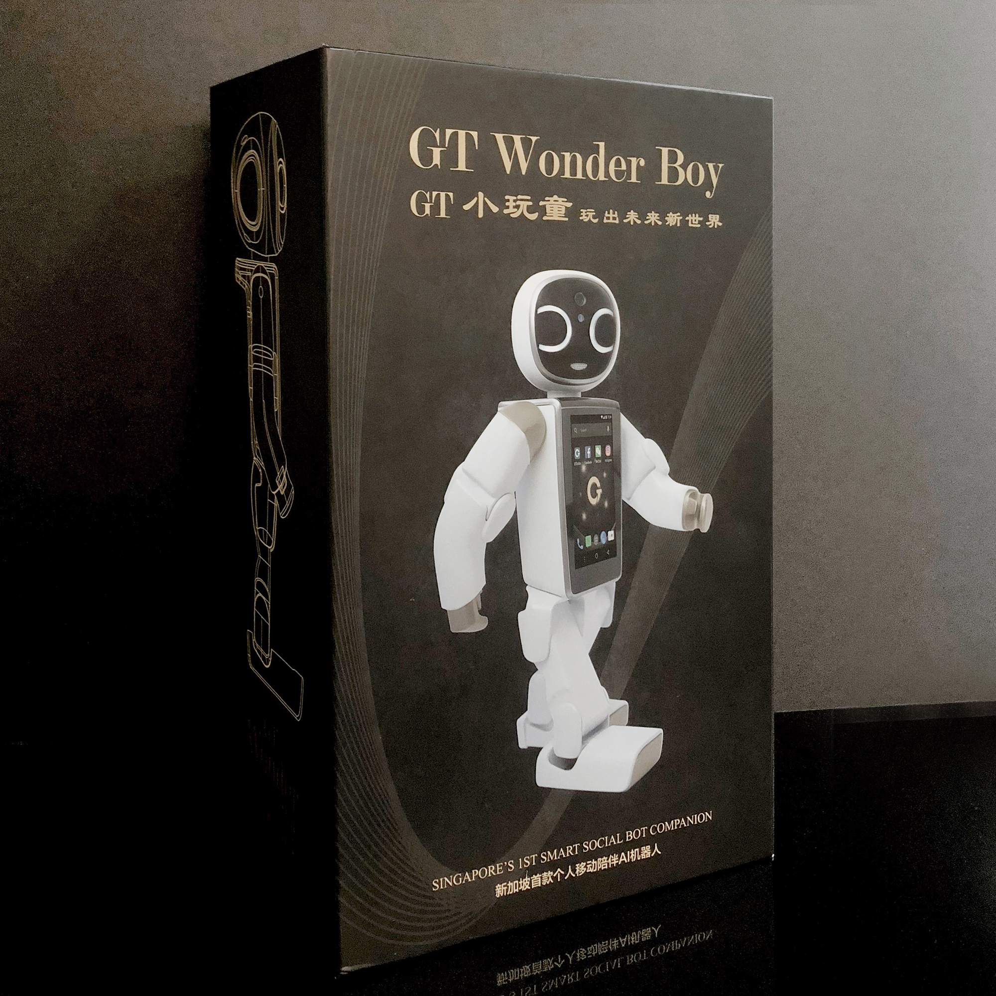
WoBo
GT Wonder Boy is an AI companion that can adapt, interact, and grow with children. To facilitate its new Funan COURTS launch, Adwright had to revamp its product name and packaging to fit a technologically advanced look. Through the rebranding exercise, the new name “WoBo” was conceptualised and a futuristic packaging was also designed to fit. Overall, the launch became a PR success with articles covered in various news sites.
BEFORE
AFTER
Seaco
Seaco’s old icon did not resonate with consumers and could not communicate what the brand was about. Hence, the logo was redesigned to look simple and modern with a fish symbol which conveyed Seaco’s identity as a seafood company.
BEFORE
AFTER
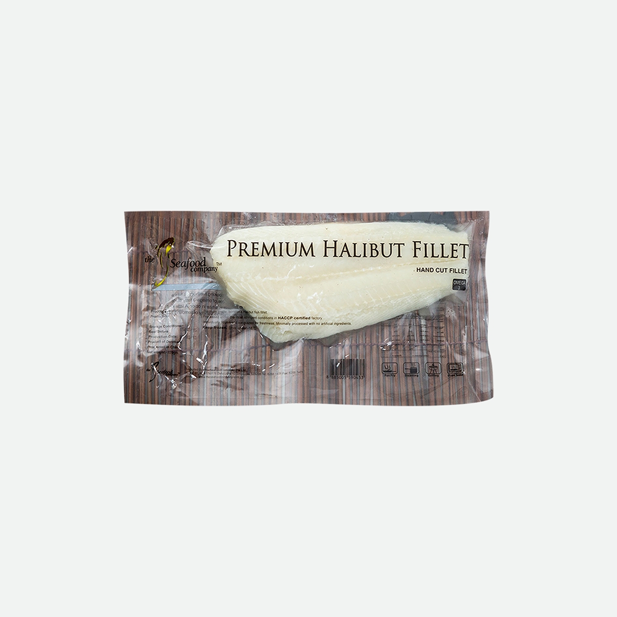
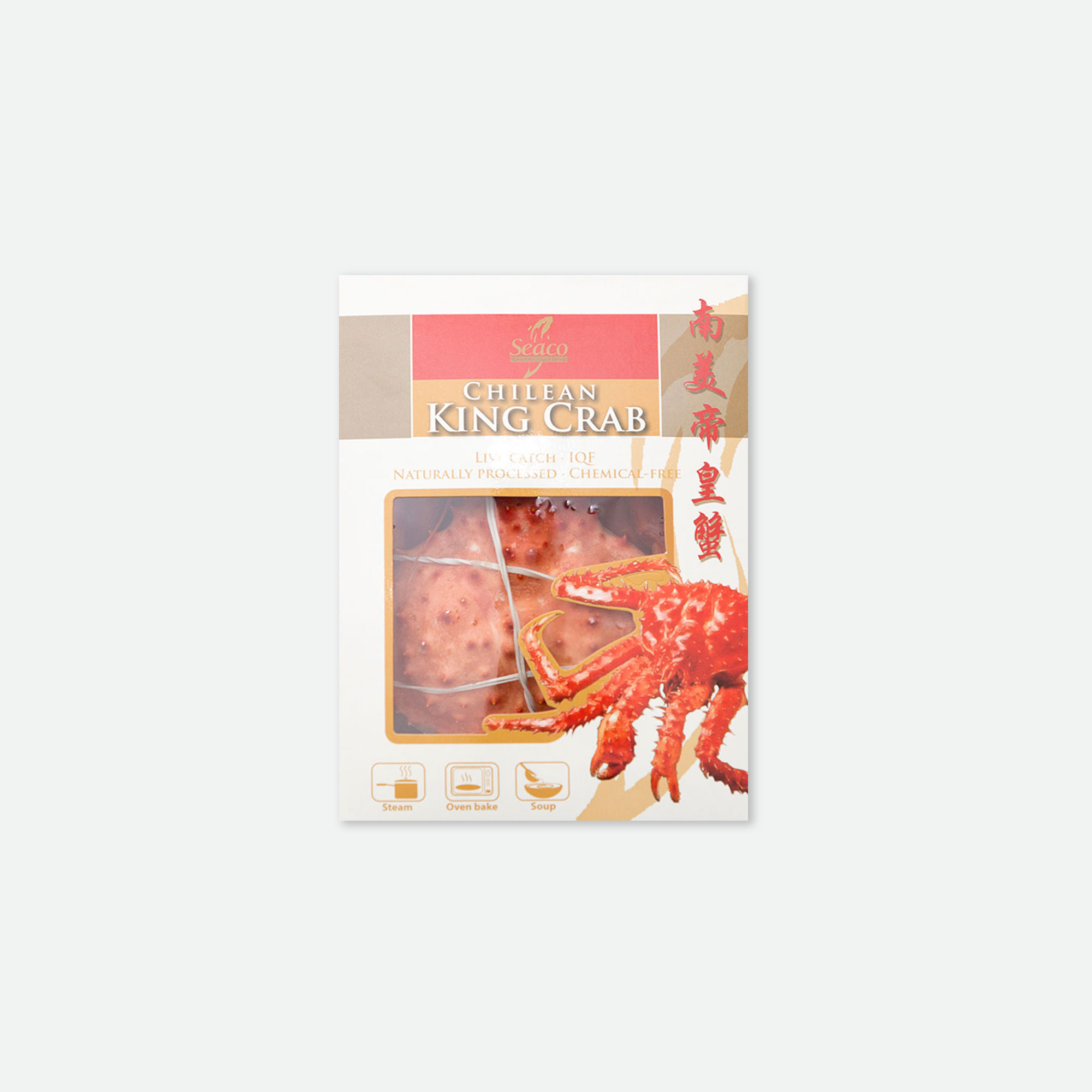
Seaco
Seaco’s old packaging was undifferentiated and lacked visual appeal. The redesigned packaging was more attractive and allowed consumers to visualise the final outcome that they were purchasing – a sumptuous seafood meal.
BEFORE
AFTER
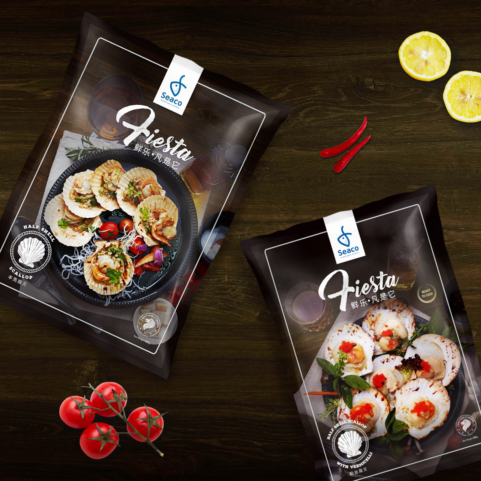
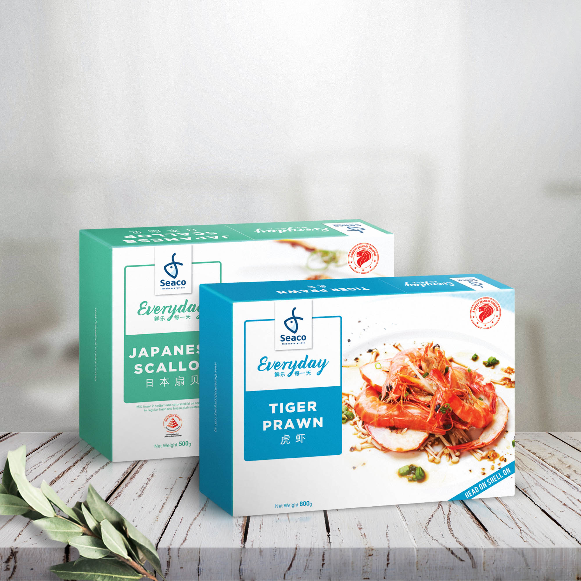
Seaco
Seaco’s old packaging was undifferentiated and lacked visual appeal. The redesigned packaging was more attractive and allowed consumers to visualise the final outcome that they were purchasing – a sumptuous seafood meal.
BEFORE
AFTER
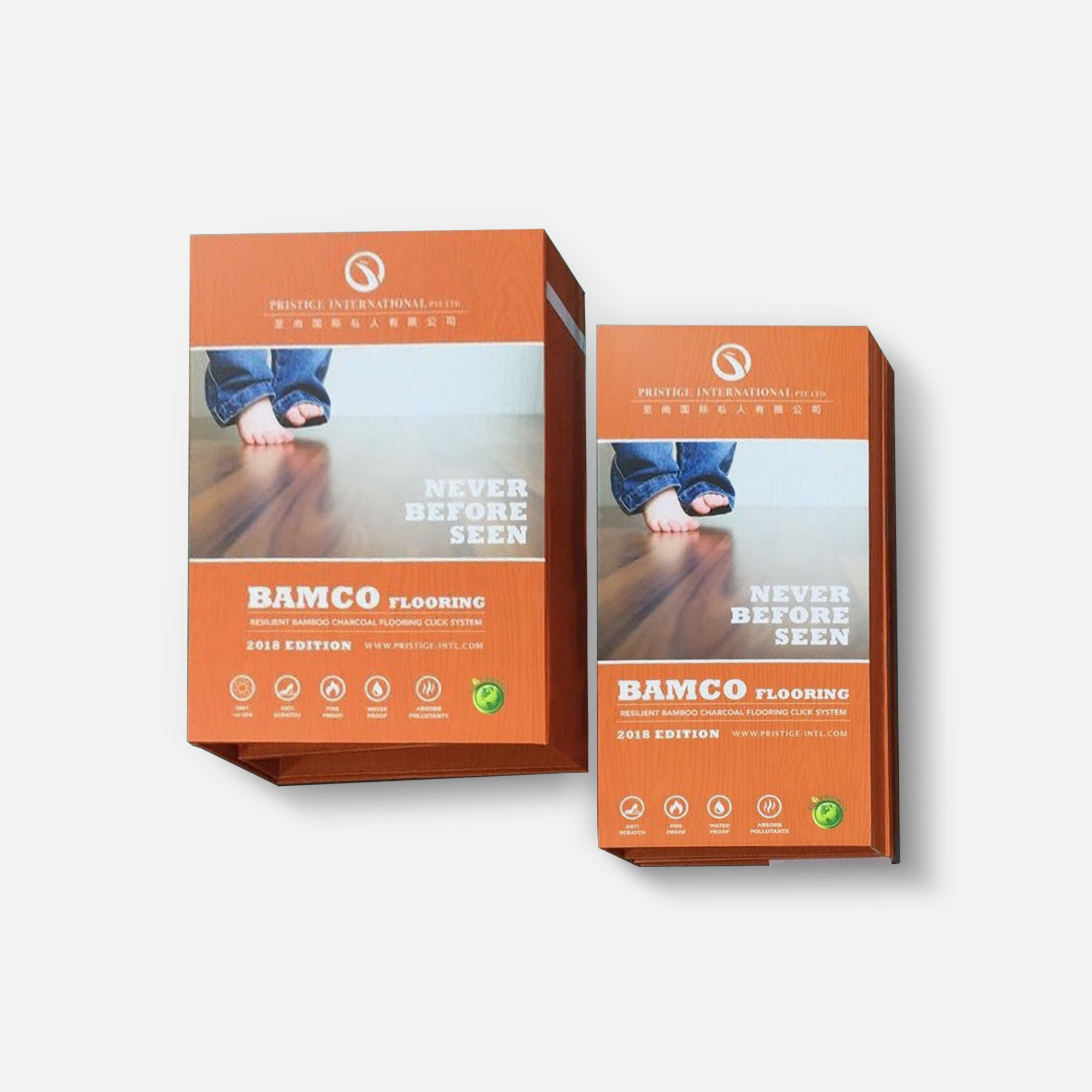
Bamco
Bamco’s old logo was unrepresentative of the company. The revamped logo utilises a colour scheme and stair image that allude to Bamco’s main product – eco-friendly Bamboo Charcoal flooring.
BEFORE
AFTER
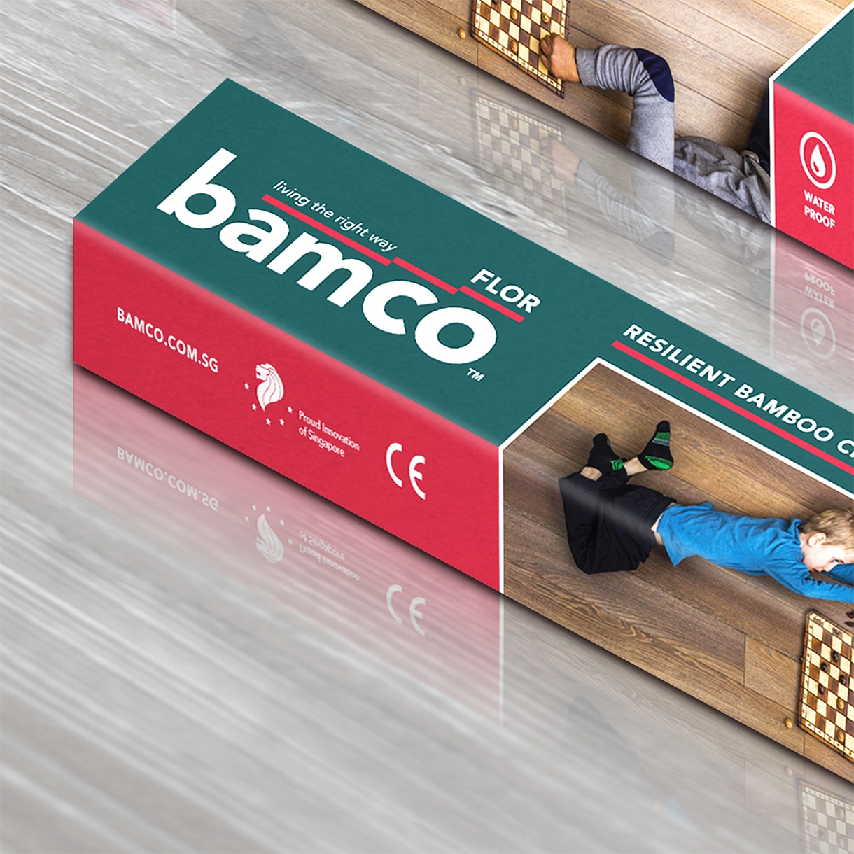
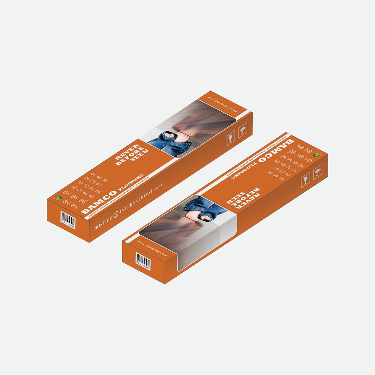
Bamco
The new BamcoFlor packaging was designed according to the newly chosen brand colours – forest green and red. Green was chosen to associate BamcoFlor to environmental-friendliness and safety. The fixed brand colours also serve to create design consistency and boost Bamco’s brand image.
BEFORE
AFTER
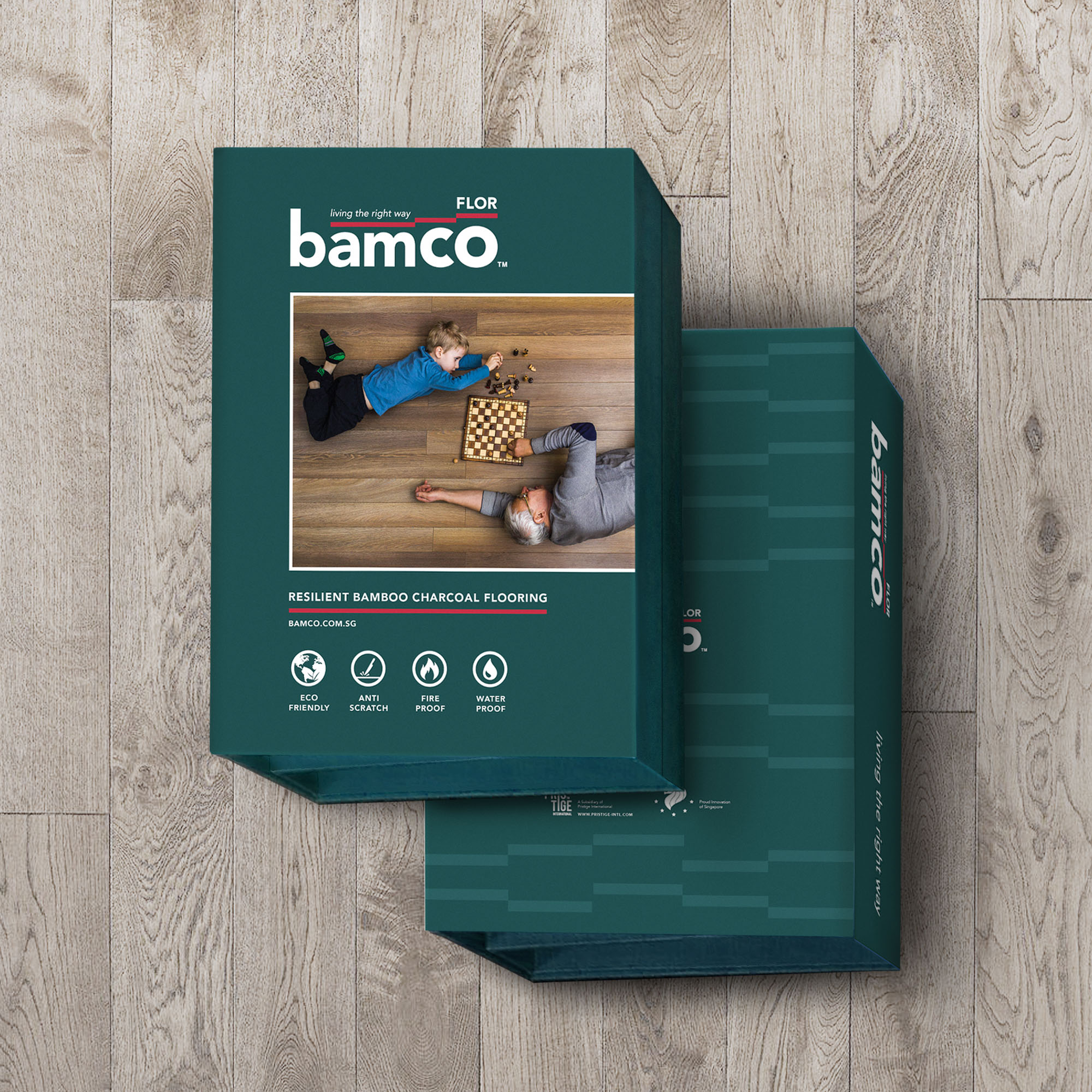
Bamco
Similarly, BamcoFlor’s stationery was redesigned in line with the aforementioned elements. On top of that, 4 icons depicting the unique attributes of BamcoFlor were added into the design.
BEFORE
AFTER
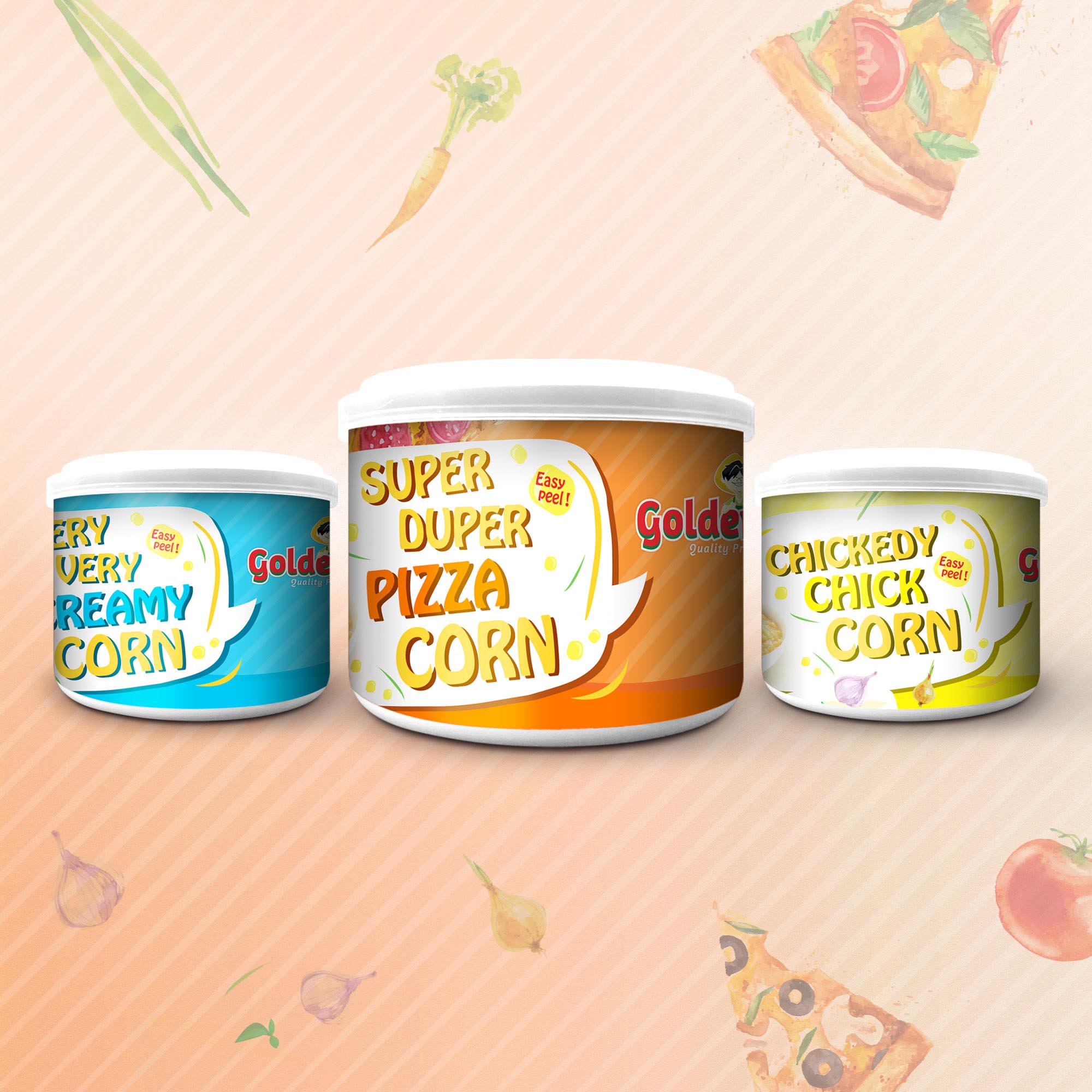
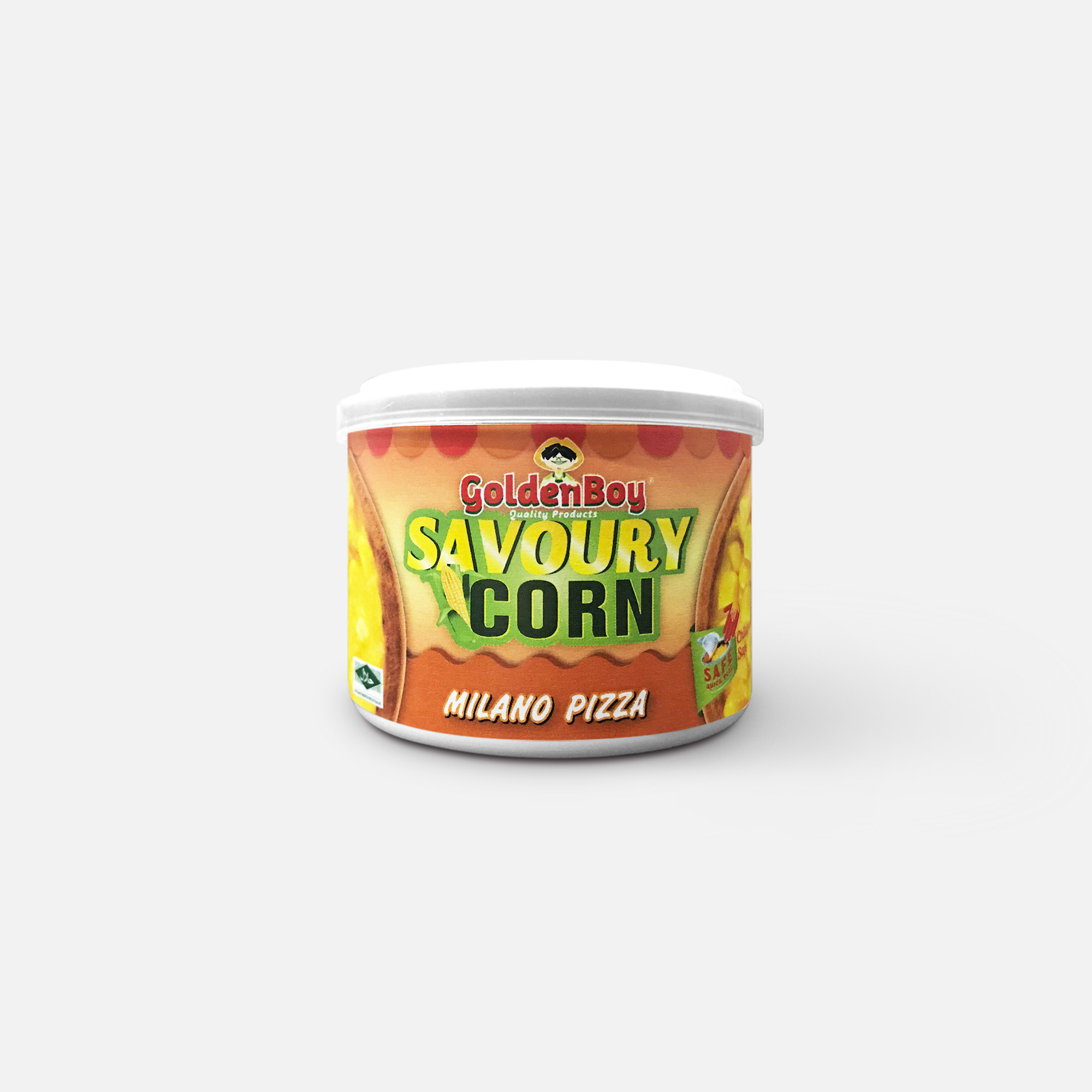
GoldenBoy
GoldenBoy’s Savoury Corn old packaging did not make the product look appetising, especially in comparison to other snacks. After the packaging was redesigned, the product looked livelier and its unique taste is more clearly illustrated.
BEFORE
AFTER
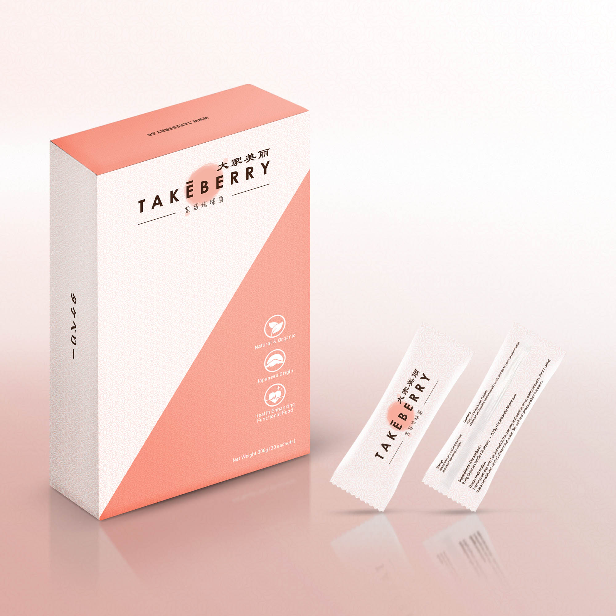
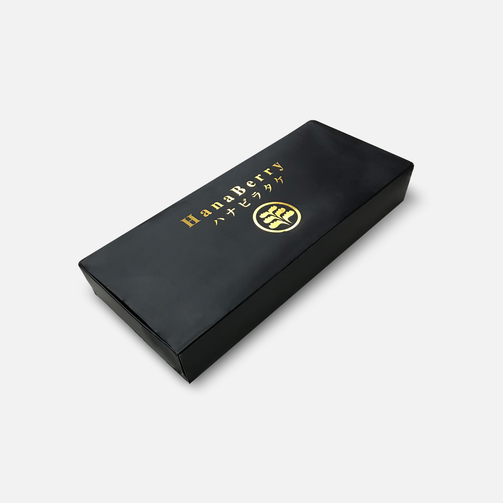
TakeBerry
The old TakeBerry (used to be known as HanaBerry) packaging, while luxurious-looking, did not convey the essence of TakeBerry’s product as a health supplement. In the new design, salmon pink was used to represent renewed vitality in the consumption of TakeBerry’s drink, and product features were also clearly depicted with icons.
BEFORE
AFTER
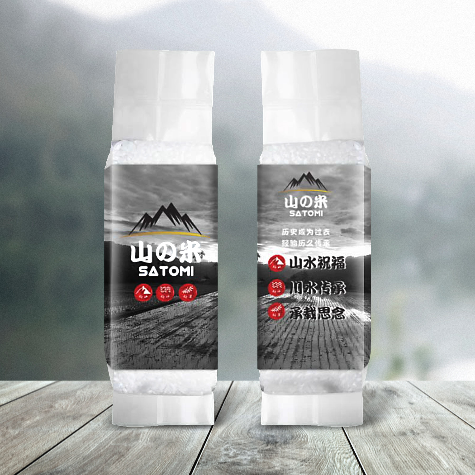
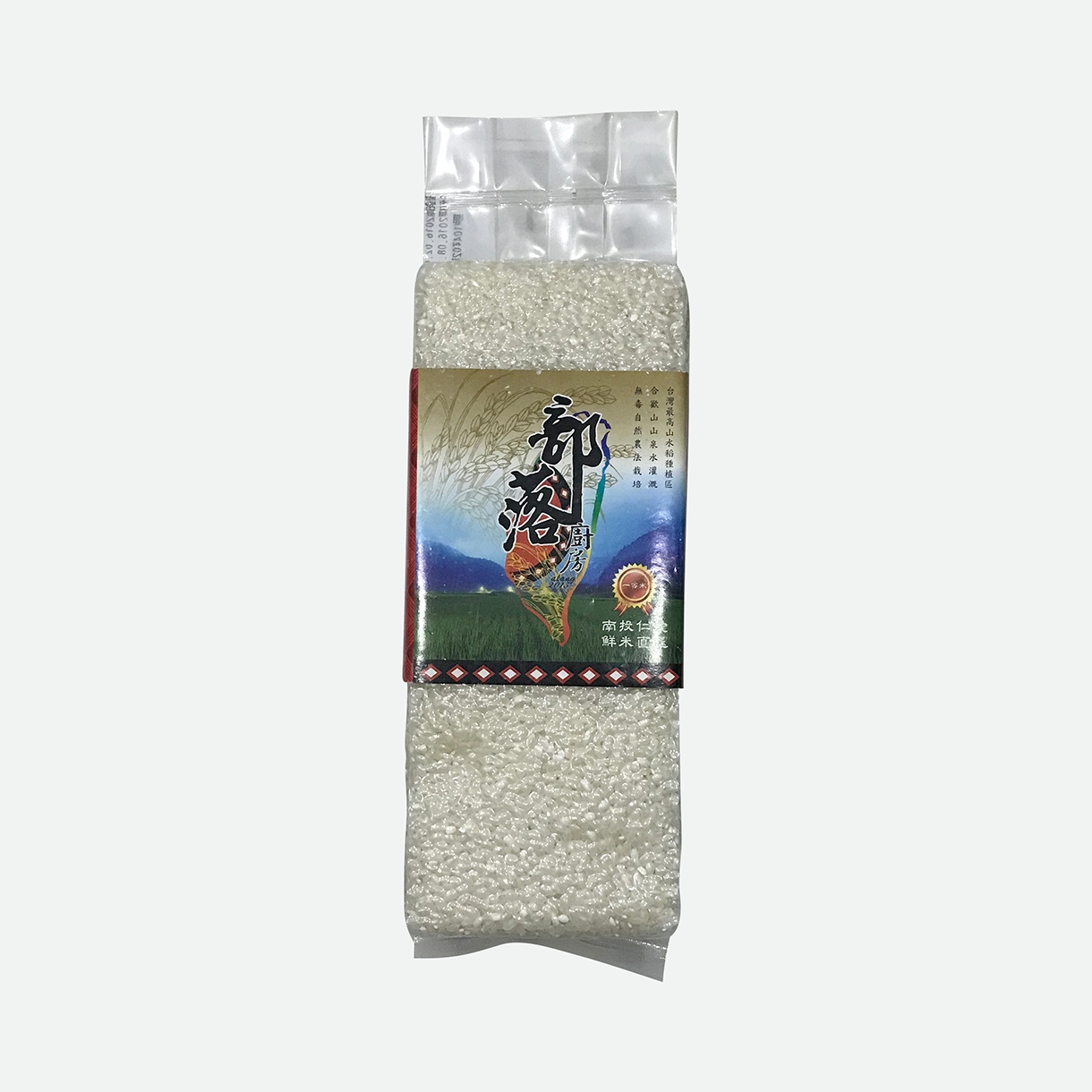
Satomi
Satomi’s old packaging brought out the product’s indigenous heritage, but just like every other rice brand, their traditional appeal was irreconcilable with the present-day aesthetic. To stand out from competitors, the new design was made to look contemporary and stylish while retaining the traditional elements of mountains and paddy fields.
BEFORE
AFTER
Pasture
Pasture’s original logo did not embody the nurturing spirit behind Pasture’s pharmaceutical business. After the makeover, their logo looked colourful but with a gentle touch, which gives Pasture an amiable and benevolent brand appearance. Refer to Case Study
BEFORE
AFTER
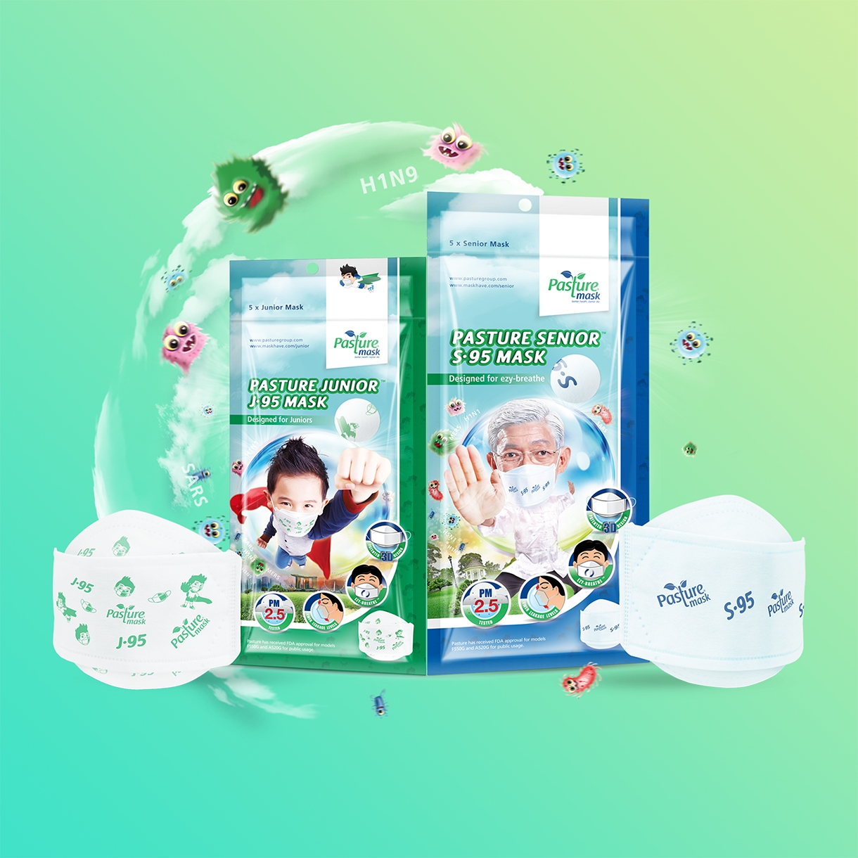
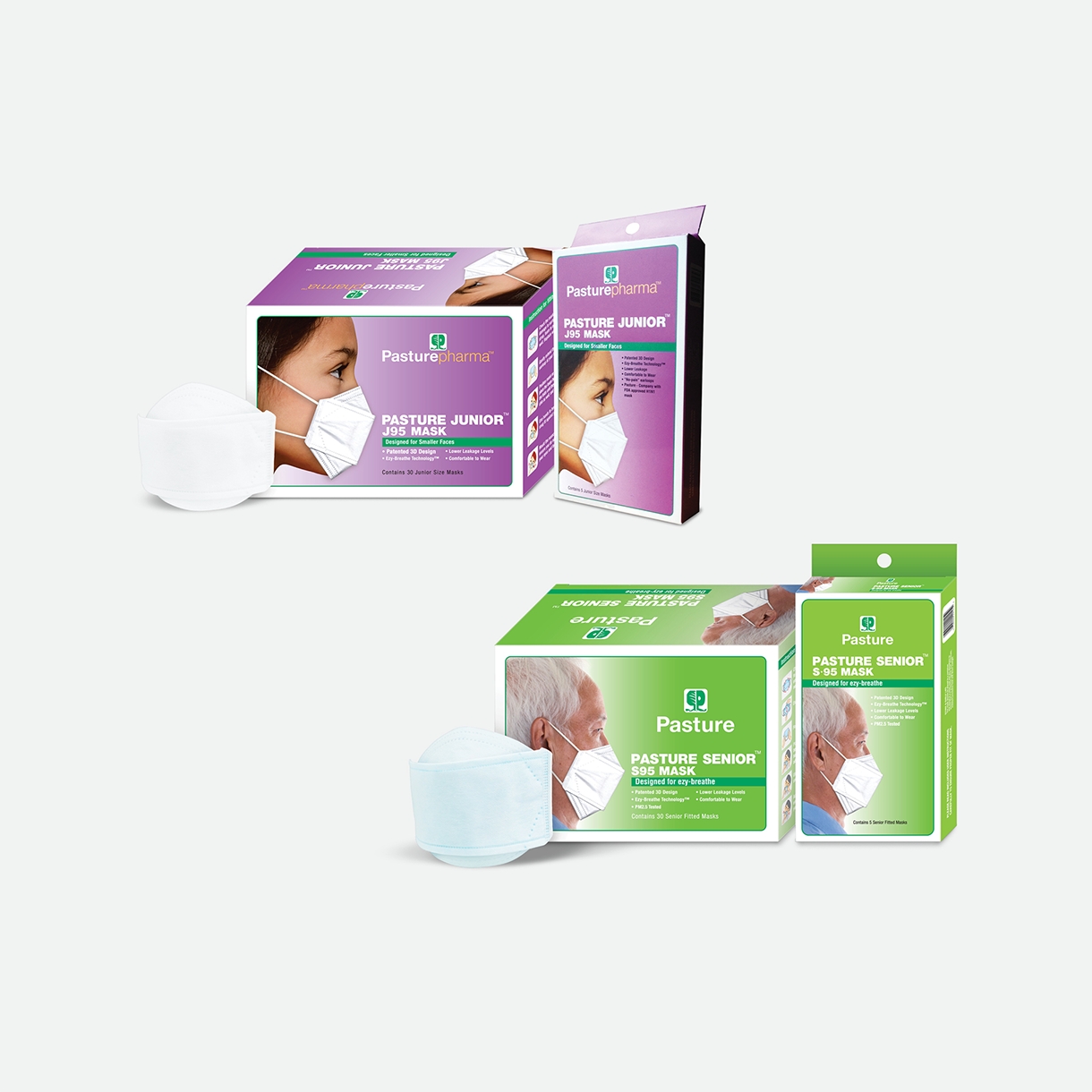
Pasture
Previously, Pasture’s junior and senior masks had standard run-of-the-mill designs, they lacked concept and vibrancy. The redesigned packaging brought in the idea of how Pasture masks can help vulnerable children and elderly evolve into superheroes, which creates emphasis on the power of Pasture masks. Refer to Case Study
BEFORE
AFTER
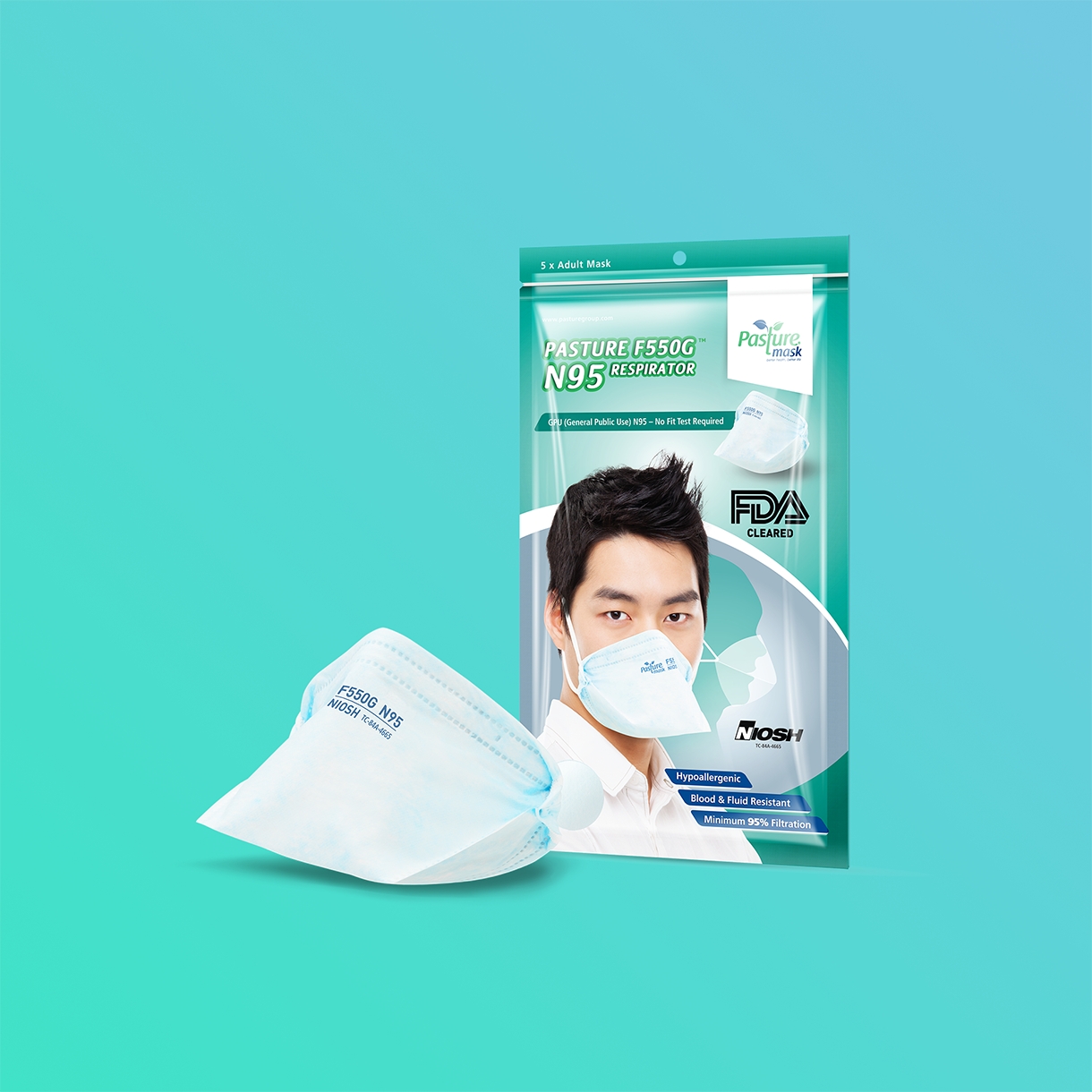
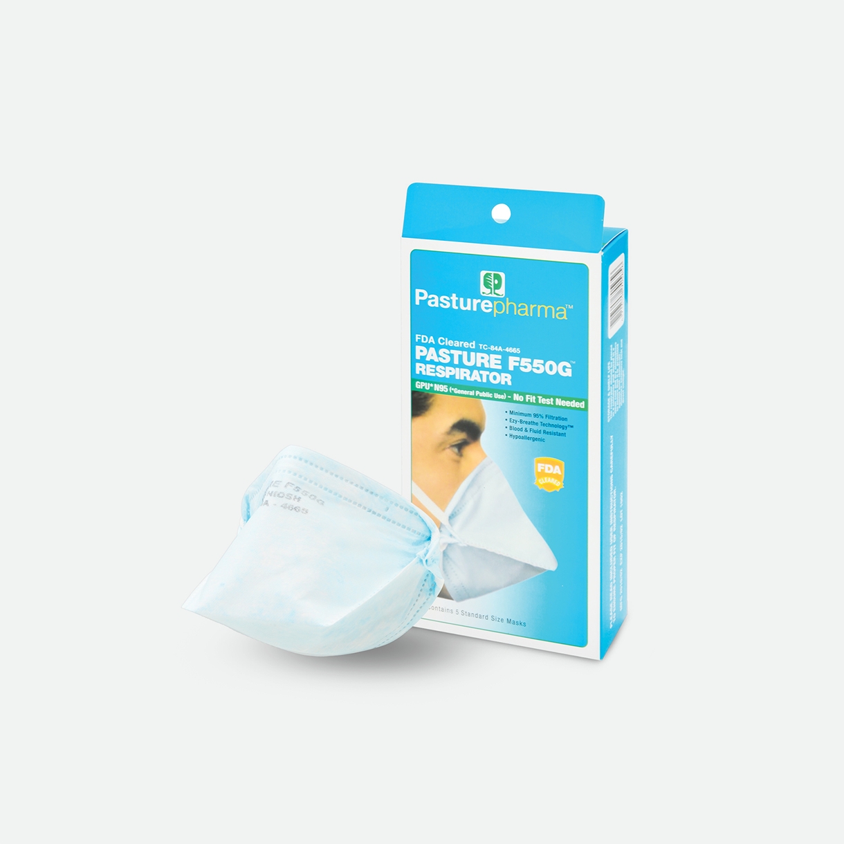
Pasture
The packaging of regular Pasture Pharma masks was given a new Asian face to relate to Asian audiences and achieve brand localisation. The colours and design layout also made the new packaging appear more dynamic and attractive. Refer to Case Study
BEFORE
AFTER
Hup Huat
Before the transformation, Hup Huat’s packaging and logo designs were inconsistent – the colours were garish and this reduced the product’s credibility. After the transformation, all the product ranges consistently donned a distinctive new look that still retained Hup Huat’s Chinese heritage with rice coloured packaging and Chinese words. Refer to Case Study
BEFORE
AFTER
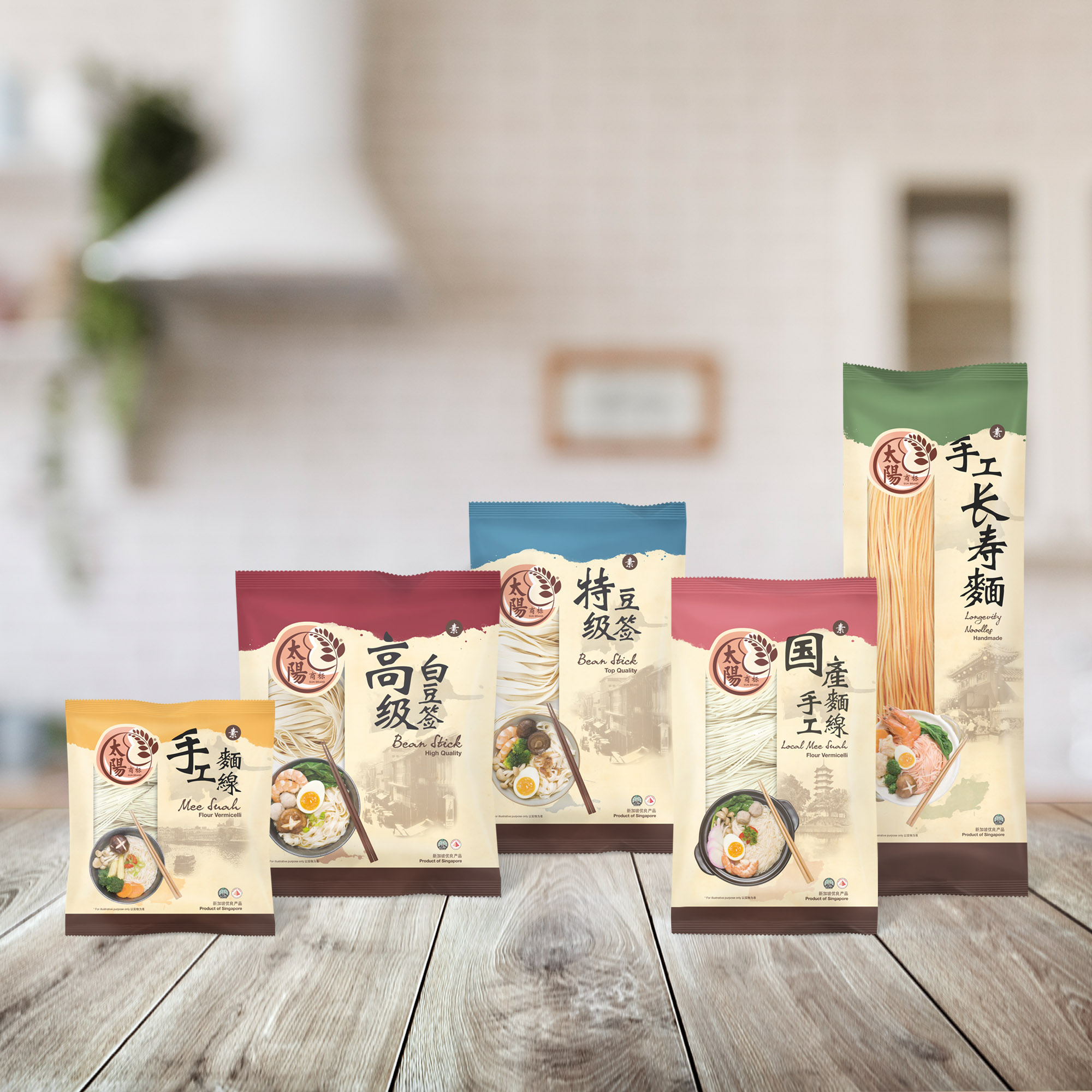
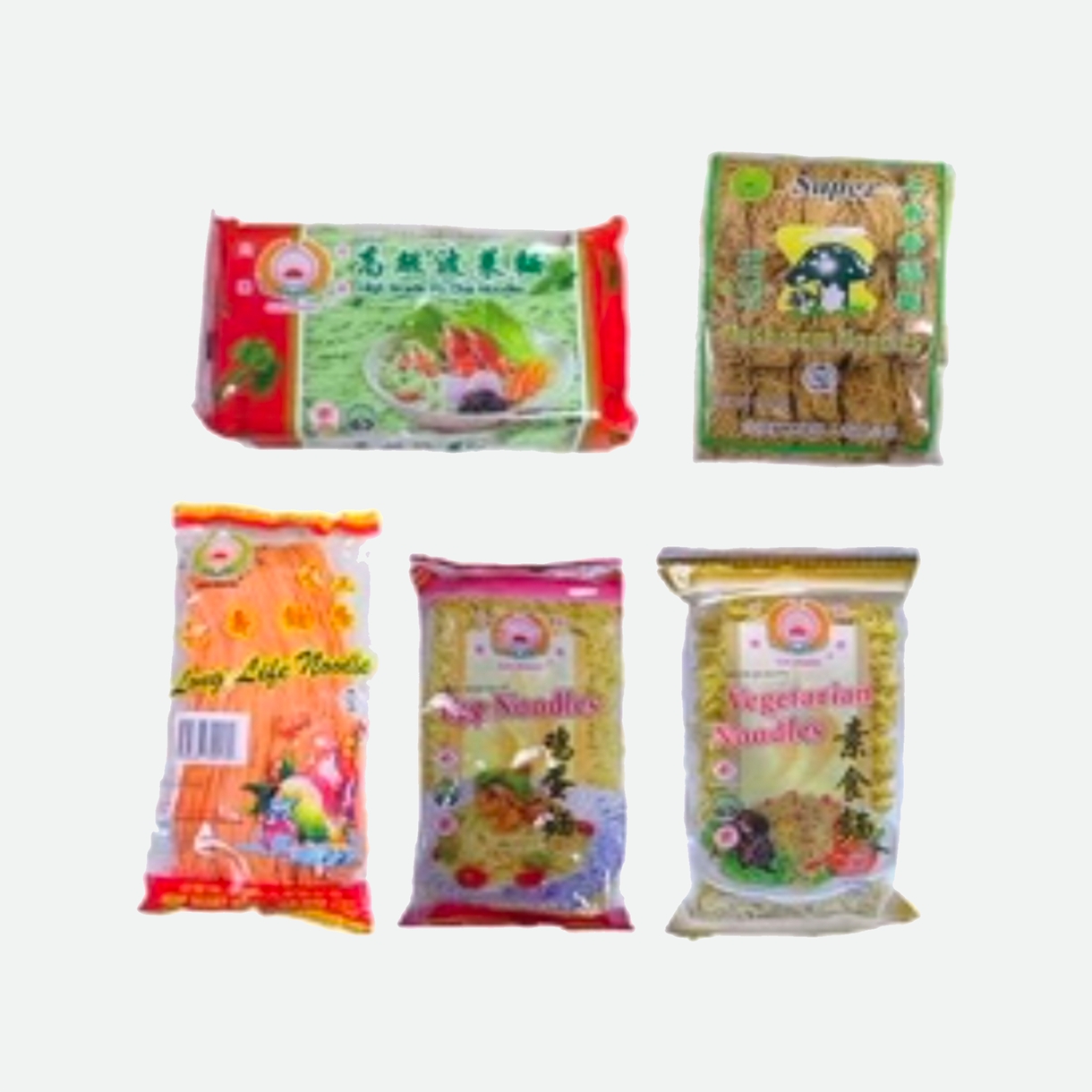
Hup Huat
Originally, Hup Huat had more than 200 SKUs with inconsistent packaging which dilutes the brand’s visibility and credibility. After the transformation, all the product ranges consistently donned a distinctive new look that still retained Hup Huat’s Chinese heritage with rice coloured packaging and Chinese words. Refer to Case Study
BEFORE
AFTER
Qavar
Before the transformation, QAVAR’s logo did not exude the essence of their business. During the transformation, the Q of “QAVAR” was adapted into a search icon, while “A” and “V” were creatively modified to look like arrows, and the tagline “get sorted” was added below the name of the company to accentuate the nature of QAVAR’s business. QAVAR’s symbolic colours were also given greater emphasis when adapted into the new logo. Refer to Case Study
BEFORE
AFTER
Haleywood
Haleywood’s old logo was completely unrepresentative of the company’s business, the symbol was too vague to aid in brand recognition and recall. After the overhaul, the new logo comprised of Haleywood’s name, and donned a sleek look which suits the essence of Haleywood’s business – a modern furniture provider. Refer to Case Study
BEFORE
AFTER
Financial Alliance
Initially, Financial Alliance (FA)’s logo was too generic and did not communicate anything about the company. In the new version, the logo was no longer confined in a square and there was an added component of an upward arrow. This made the logo look more lively and dynamic, highlighting FA’s position as a leading company in the industry. Refer to Case Study
BEFORE
AFTER
DEG
DEG’s original logo did not express the modernity and dynamicity of DEG’s service and philosophy. The new logo utilised an element of a plant/windmill to exhibit the company’s eco-friendliness and energy efficiency with an added tagline “where engineering gets better” to clarify the company’s identity. Refer to Case Study
BEFORE
AFTER
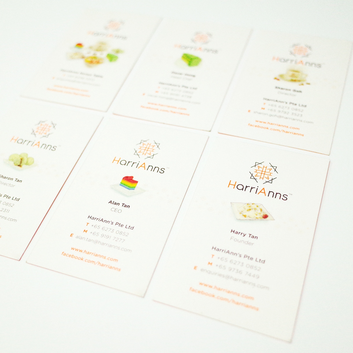
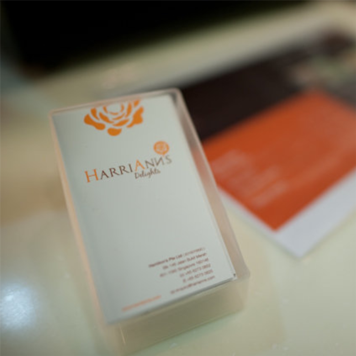
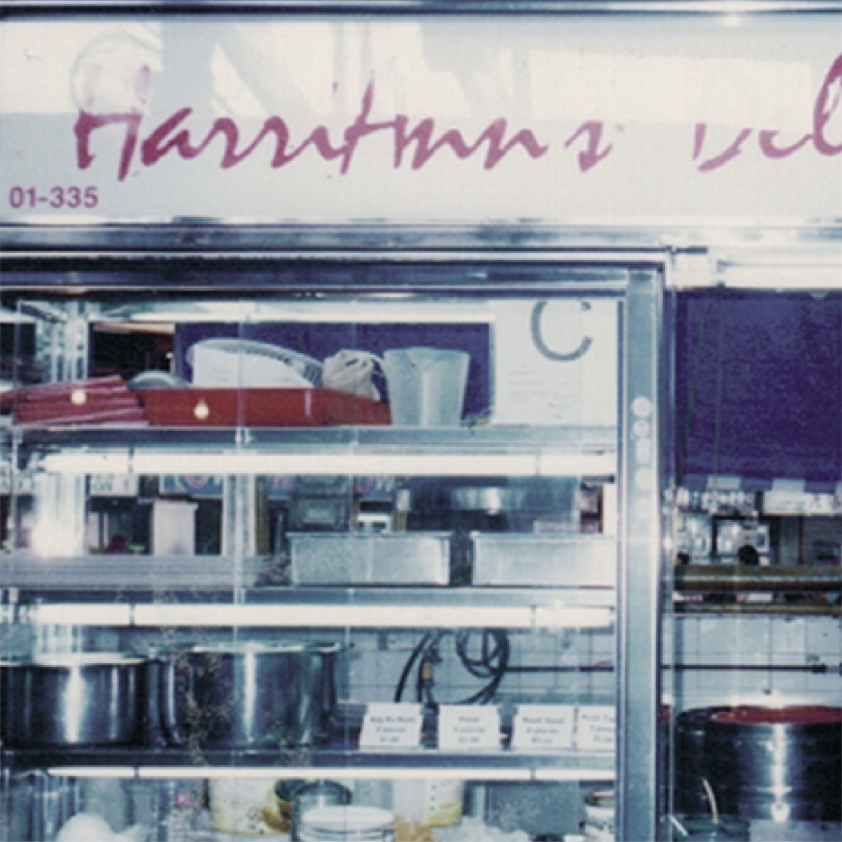
HarriAnns
HarriAnn’s old name card could not portray the brand’s business nature and distinctive identity. In the new name card design, there were colourful depictions of Nonya delicacies designed by hand, and this gave the name cards a personal touch which alluded to the uniqueness of handmade Nonya delights. Refer to Case Study
BEFORE
AFTER
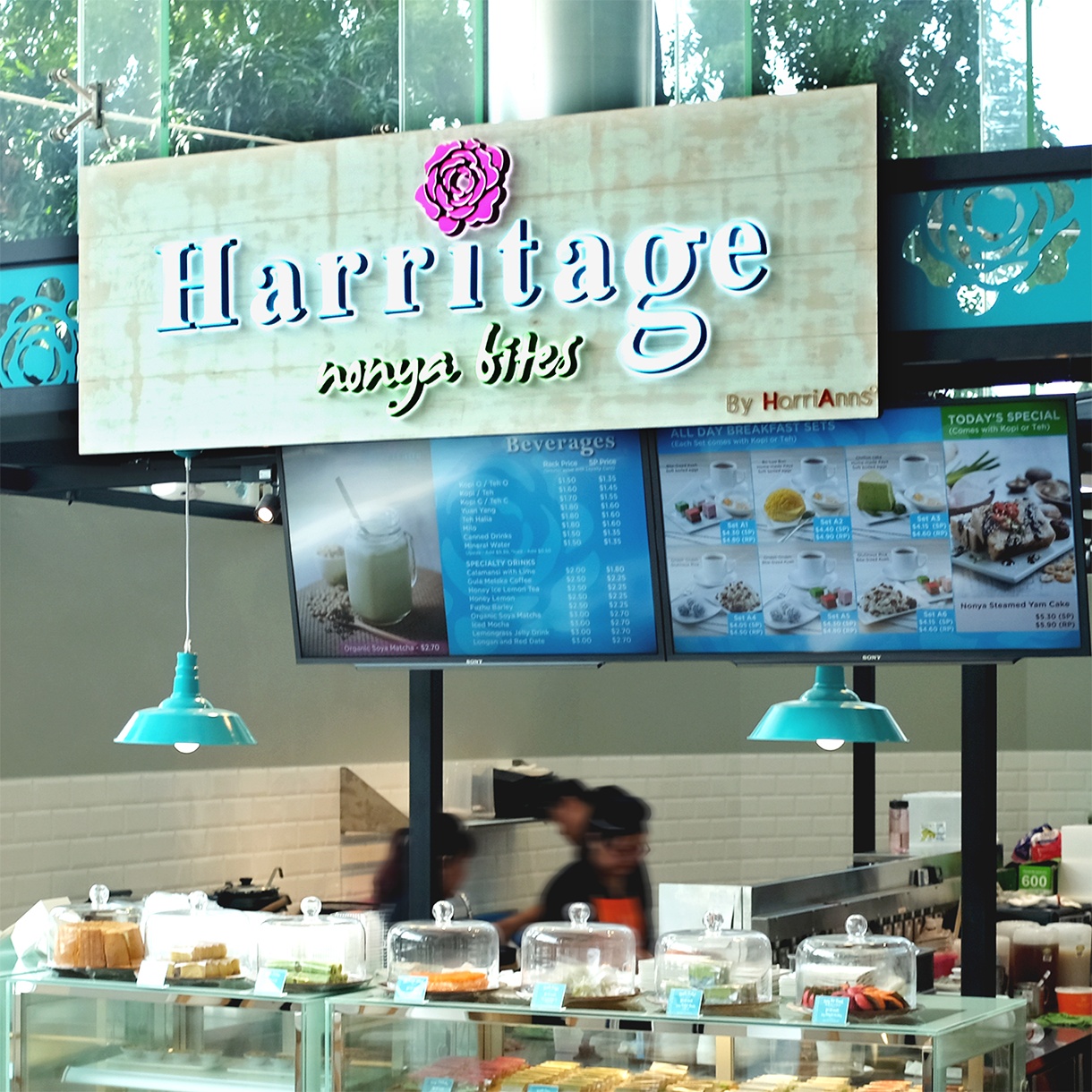
HarriAnns
When HarriAnns expanded its business unit to delve to become Halal ready for one of its new outlets, it needed a distinctive branding away from the original HarriAnns logo. Therefore, a new logo design is created to differentiate the new business from HarriAnns yet retaining familiar elements. Refer to Case Study
BEFORE
AFTER
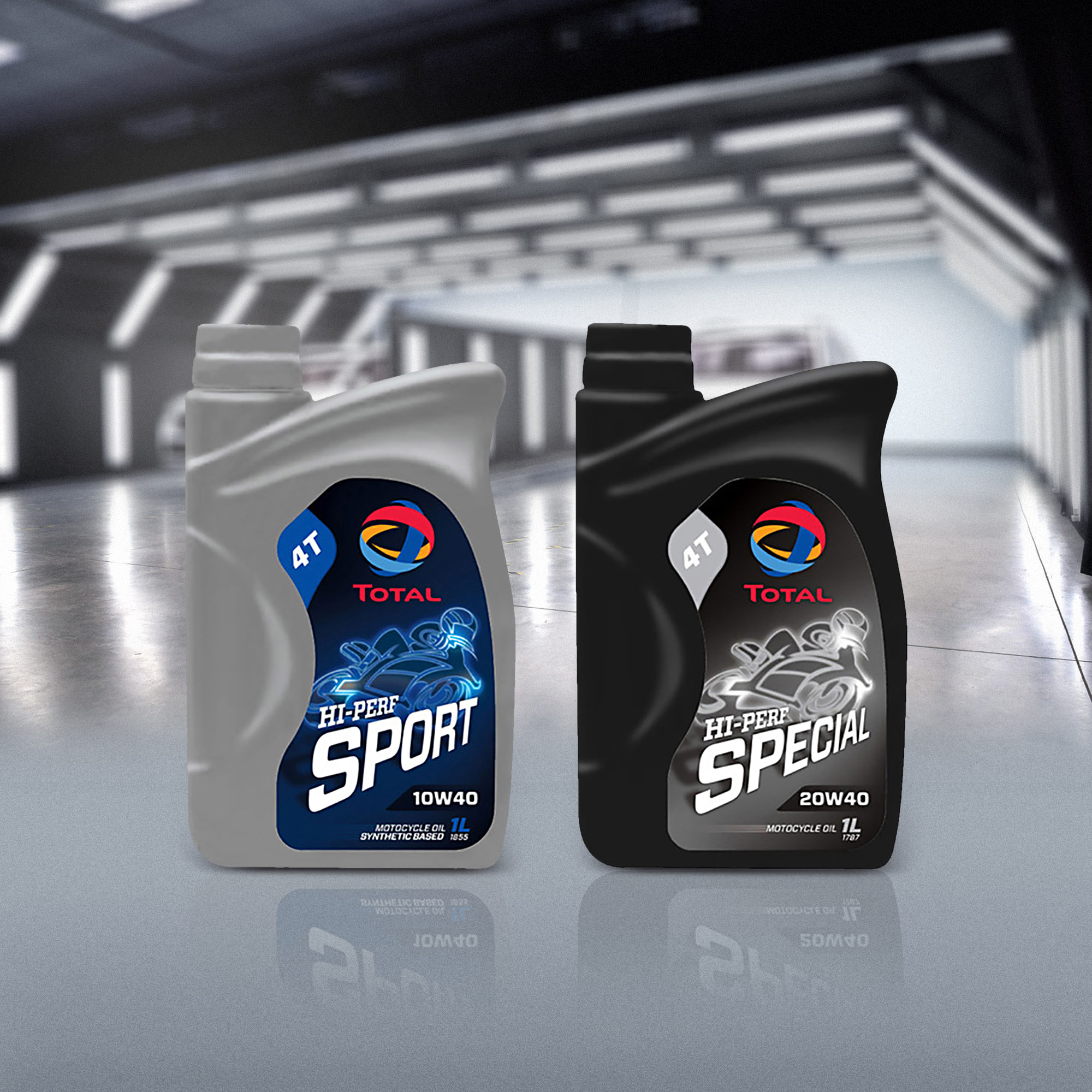
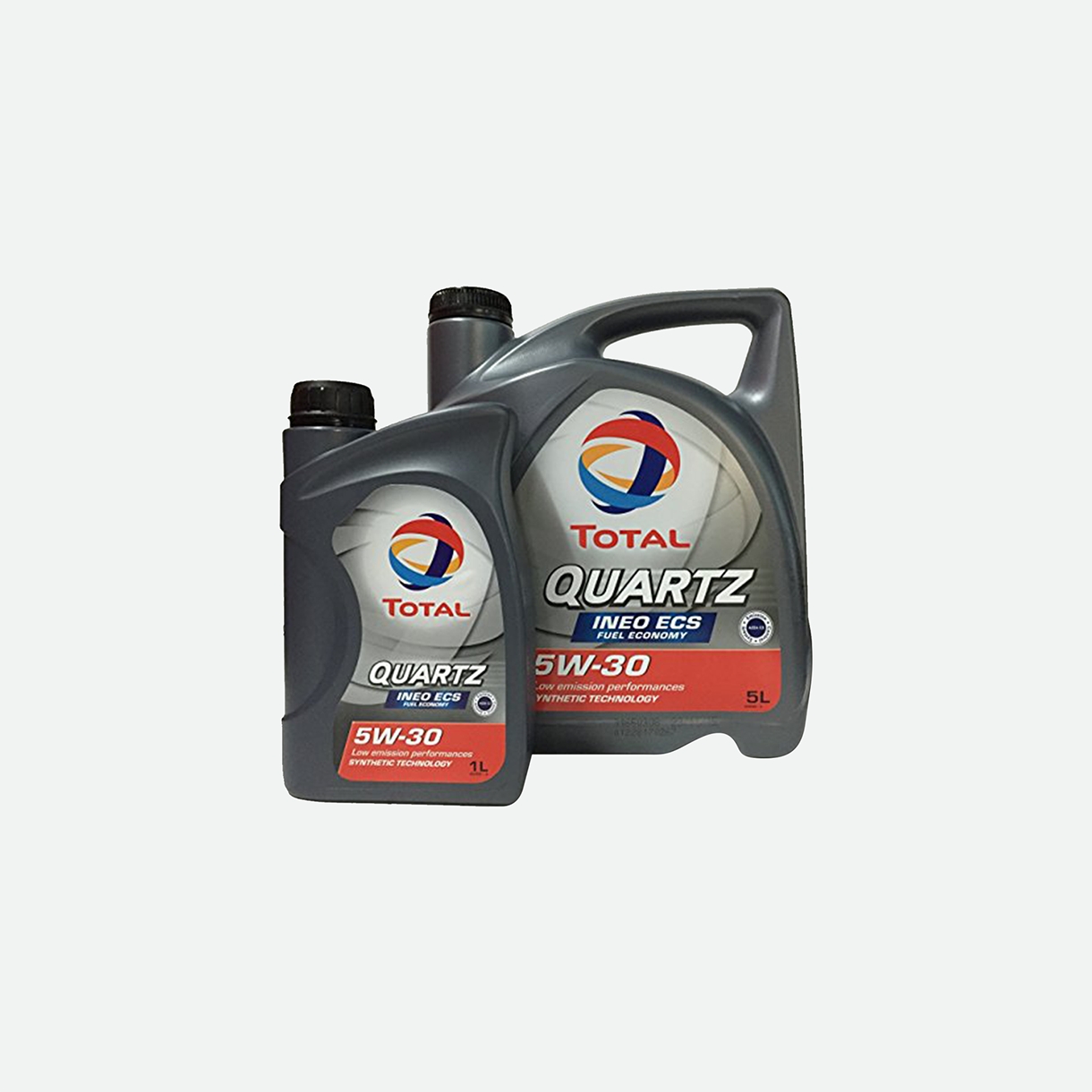
Total
Originally, Total Lubricants’ product packaging did not have any specific visual elements and it contained technical terms which may confuse average consumers. The new design incorporated an image of a motorcyclist that work with layman terms to help consumers understand the product. The newly designed product also looked livelier and more exciting. Refer to Case Study
